Dear all,
I am trying to give each y tick label a different colour in my plot below. For example, I want to show “Very Poor” in Red, “Poor” in Orange, “Fair” in Yellow, “Good” in Green and “Very Good” in Blue. Is there a way to do this with Bokeh?
I can set all y tick labels to one colour but not to different colours. As a workaround, I tried having 5 y axes, each with one label, so I can set colour of them individually. But it seems I cannot control axis position to make them overlap.
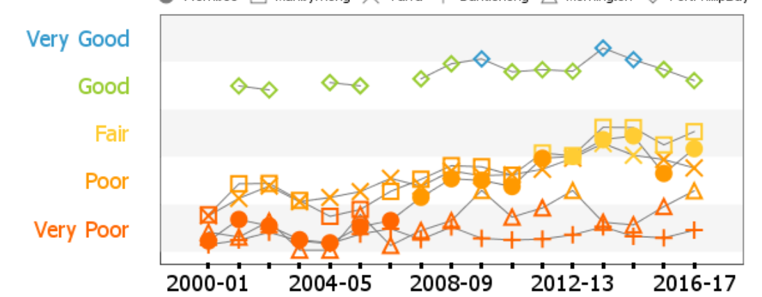
This is an example of what I am trying to achieve for y axis tick labels.
And this a toy problem (code) if you would like to give it a go.
from bokeh.plotting import output_file, show,figure
from bokeh.models.sources import ColumnDataSource
from bokeh.transform import linear_cmap
from bokeh.models import Range1d, FuncTickFormatter
import json
import pandas as pd
output_file(“fancylabels.html”)
#Get the data
score=[4.5, 9.32, 3.4, 7.1,1.4]
df = pd.DataFrame(score, columns = [‘Score’])
df.index = pd.to_datetime([‘2000-12-30 22:00:00’,‘2001-12-30 22:00:00’,‘2002-12-30 22:00:00’,‘2003-12-30 22:00:00’,‘2004-12-30 22:00:00’])
df.index.name = ‘Date’
df.sort_index(inplace=True)
source = ColumnDataSource(df)
#Prepare the plot area
p = figure(x_axis_type=“datetime”, plot_width=800, plot_height=500)
p.y_range = Range1d(0, 10)
def custom_label():
new_labels = [“Very Poor”, “Poor”, “Fair”, “Good”, “Very Good”]
return new_labels[(tick-1)/2 ]
p.yaxis.ticker = [1, 3, 5,7,9]
p.yaxis.formatter = FuncTickFormatter.from_py_func(custom_label)
mapper = linear_cmap(field_name=‘Score’, palette=[“red”, “orange”,“yellow”,“green”,“blue”] ,low=0 ,high=10)
p.circle(‘Date’, ‘Score’, source=source, line_width=5, line_color=mapper,color=mapper)
p.line(‘Date’, ‘Score’, source=source, line_width=2, line_color=“gray”,color=mapper, line_alpha = 0.5)
``
Thank you,
Bhagya