Heatmap force color below threshold

Hello everyone.

I’m trying to fill a heatmap following two different rules:
All values below x: color ‘yellow’
The remaining values: color follows ‘LinearColorMapper’ (from x to y)

Given the concrete unemployment heatmap example I would like to:

  • Have all values with df.rate < 3 to be filled as yellow and not showing up in the colorbar
  • All values between 3 and df.rate.max() be filled following a LinearColor transformation.

I have a gist (based on the same example) that already performs partially what I want (it’s missing the fill with yellow part for values below 3).

Is there any way to do what I desire? And if so, could you let me know how?
Thanks

I think there are only two options:

  • Create a custom color mapper that would do what you want, but it requires some JavaScript/TypeScript and NodeJS installed on all machines that will run the Python script
  • Split the data in two and create two renderers with different color parameters
1 Like

@afonsobspinto

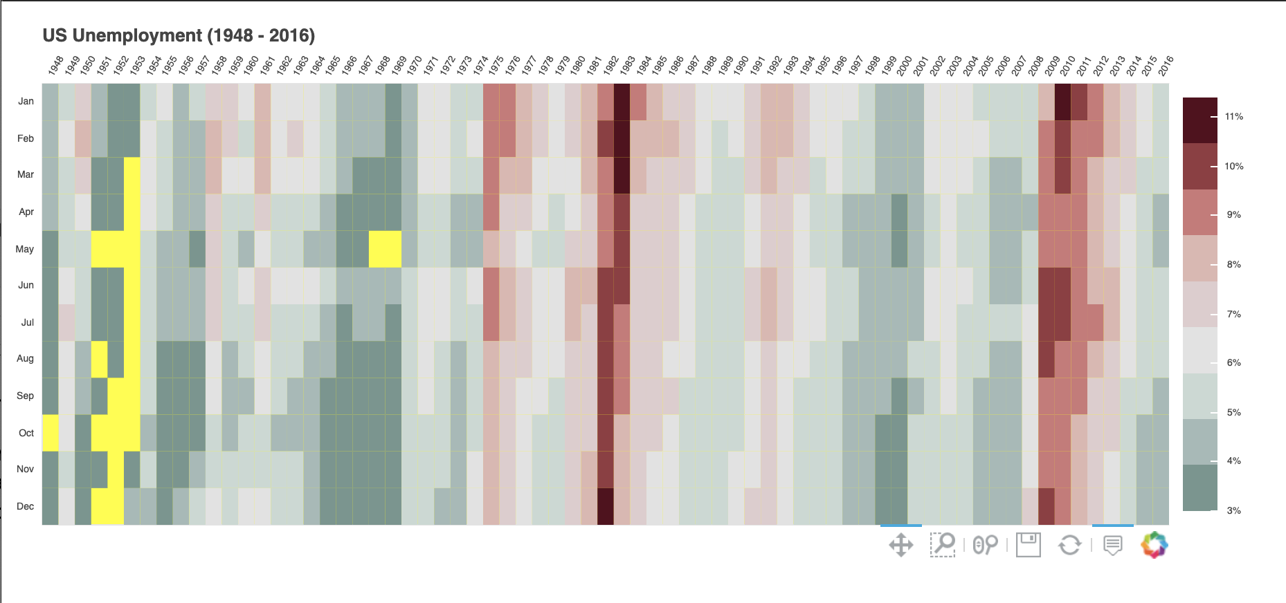
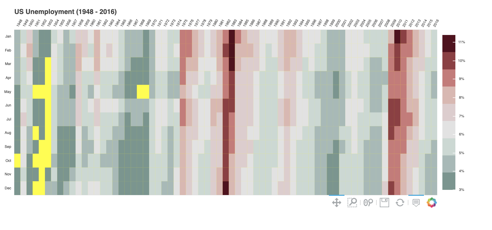
The following is another option using the unemployment example to illustrate.

Create a column that has the rect fill-alpha property dependent on the threshold, 3.0 as the lower-bound in your example, which makes all those entries with df.rate < 3.0 transparent.

For consistency, also set the colorbar lower-limit to the 3.0 threshold for this illustrative example.

Lastly, set the background color of the figure to yellow to have those below-the-threshold sites show up with the desired color.

from math import pi

import pandas as pd

from bokeh.io import show
from bokeh.models import BasicTicker, ColorBar, LinearColorMapper, PrintfTickFormatter
from bokeh.plotting import figure
from bokeh.sampledata.unemployment1948 import data

data['Year'] = data['Year'].astype(str)
data = data.set_index('Year')
data.drop('Annual', axis=1, inplace=True)
data.columns.name = 'Month'

years = list(data.index)
months = list(data.columns)

# reshape to 1D array or rates with a month and year for each row.
df = pd.DataFrame(data.stack(), columns=['rate']).reset_index()

# lower-bound
lb = 3.0
df = df.assign(alpha = df.rate.apply(lambda x: 0.0 if x < 3.0 else 1.0))

# this is the colormap from the original NYTimes plot
colors = ["#75968f", "#a5bab7", "#c9d9d3", "#e2e2e2", "#dfccce", "#ddb7b1", "#cc7878", "#933b41", "#550b1d"]
mapper = LinearColorMapper(palette=colors, low=lb, high=df.rate.max())

TOOLS = "hover,save,pan,box_zoom,reset,wheel_zoom"

p = figure(title="US Unemployment ({0} - {1})".format(years[0], years[-1]),
           x_range=years, y_range=list(reversed(months)),
           x_axis_location="above", plot_width=900, plot_height=400,
           tools=TOOLS, toolbar_location='below',
           tooltips=[('date', '@Month @Year'), ('rate', '@rate%')],
           background_fill_color="yellow")

p.grid.grid_line_color = None
p.axis.axis_line_color = None
p.axis.major_tick_line_color = None
p.axis.major_label_text_font_size = "7px"
p.axis.major_label_standoff = 0
p.xaxis.major_label_orientation = pi / 3

p.rect(x="Year", y="Month", width=1, height=1,
       source=df,
       fill_color={'field': 'rate', 'transform': mapper},
       fill_alpha="alpha",
       line_color=None)

color_bar = ColorBar(color_mapper=mapper, major_label_text_font_size="7px",
                     ticker=BasicTicker(desired_num_ticks=len(colors)),
                     formatter=PrintfTickFormatter(format="%d%%"),
                     label_standoff=6, border_line_color=None, location=(0, 0))
p.add_layout(color_bar, 'right')

show(p)      # show the plot
2 Likes

It might works in this case. But there are downsides that people should be aware of:

  • It’s not scalable - you cannot have an additional color for some other boundary
  • It fills every gap with yellow, and consequently neighboring yellow cells don’t have any separation between them
  • Obviously, it’s not possible to set any other background color if it’s needed for some reason (e.g. incomplete data)
1 Like

These are instructive points as always. If any of those issues make the original example unworkable, the following is another solution that gets to the second option in the original reply, viz.

from math import pi

import pandas as pd

from bokeh.io import show
from bokeh.models import BasicTicker, ColorBar, LinearColorMapper, PrintfTickFormatter
from bokeh.plotting import figure
from bokeh.sampledata.unemployment1948 import data

data['Year'] = data['Year'].astype(str)
data = data.set_index('Year')
data.drop('Annual', axis=1, inplace=True)
data.columns.name = 'Month'

years = list(data.index)
months = list(data.columns)

# reshape to 1D array or rates with a month and year for each row.
df = pd.DataFrame(data.stack(), columns=['rate']).reset_index()

# lower-bound unemployment rate
lb = 3.0

# this is the colormap from the original NYTimes plot
colors = ["#75968f", "#a5bab7", "#c9d9d3", "#e2e2e2", "#dfccce", "#ddb7b1", "#cc7878", "#933b41", "#550b1d"]
mapper = LinearColorMapper(palette=colors, low=lb, high=df.rate.max())

TOOLS = "hover,save,pan,box_zoom,reset,wheel_zoom"

p = figure(title="US Unemployment ({0} - {1})".format(years[0], years[-1]),
           x_range=years, y_range=list(reversed(months)),
           x_axis_location="above", plot_width=900, plot_height=400,
           tools=TOOLS, toolbar_location='below',
           tooltips=[('date', '@Month @Year'), ('rate', '@rate%')],
           background_fill_color="yellow")

p.grid.grid_line_color = None
p.axis.axis_line_color = None
p.axis.major_tick_line_color = None
p.axis.major_label_text_font_size = "7px"
p.axis.major_label_standoff = 0
p.xaxis.major_label_orientation = pi / 3

# In-range unemployment rate data
p.rect(x="Year", y="Month", width=1, height=1,
       source=df[df.rate >= lb],
       fill_color={'field': 'rate', 'transform': mapper},
       line_color=None)

# Below lower-bound unemployment rate data
p.rect(x="Year", y="Month", width=1, height=1,
       source=df[df.rate < lb],
       fill_color="yellow",
       line_color=None)

color_bar = ColorBar(color_mapper=mapper, major_label_text_font_size="7px",
                     ticker=BasicTicker(desired_num_ticks=len(colors)),
                     formatter=PrintfTickFormatter(format="%d%%"),
                     label_standoff=6, border_line_color=None, location=(0, 0))
p.add_layout(color_bar, 'right')

show(p)      # show the plot
2 Likes