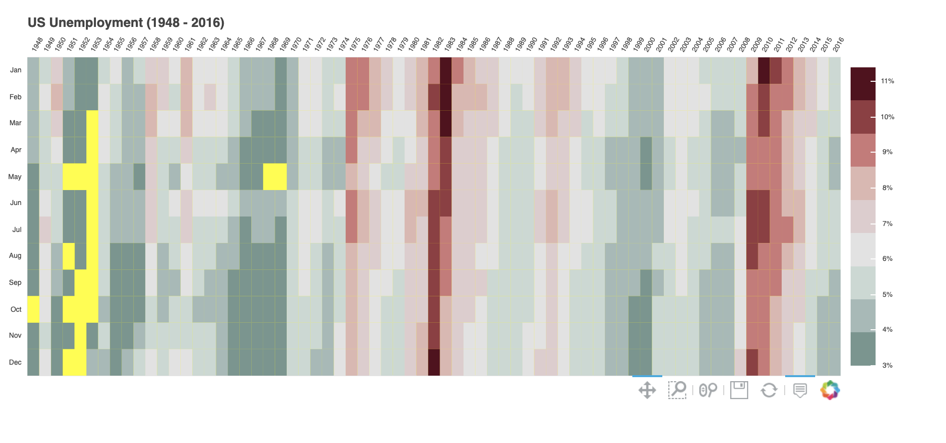
These are instructive points as always. If any of those issues make the original example unworkable, the following is another solution that gets to the second option in the original reply, viz.
from math import pi

import pandas as pd

from bokeh.io import show
from bokeh.models import BasicTicker, ColorBar, LinearColorMapper, PrintfTickFormatter
from bokeh.plotting import figure
from bokeh.sampledata.unemployment1948 import data

data['Year'] = data['Year'].astype(str)
data = data.set_index('Year')
data.drop('Annual', axis=1, inplace=True)
data.columns.name = 'Month'

years = list(data.index)
months = list(data.columns)

# reshape to 1D array or rates with a month and year for each row.
df = pd.DataFrame(data.stack(), columns=['rate']).reset_index()

# lower-bound unemployment rate
lb = 3.0

# this is the colormap from the original NYTimes plot
colors = ["#75968f", "#a5bab7", "#c9d9d3", "#e2e2e2", "#dfccce", "#ddb7b1", "#cc7878", "#933b41", "#550b1d"]
mapper = LinearColorMapper(palette=colors, low=lb, high=df.rate.max())

TOOLS = "hover,save,pan,box_zoom,reset,wheel_zoom"

p = figure(title="US Unemployment ({0} - {1})".format(years[0], years[-1]),
           x_range=years, y_range=list(reversed(months)),
           x_axis_location="above", plot_width=900, plot_height=400,
           tools=TOOLS, toolbar_location='below',
           tooltips=[('date', '@Month @Year'), ('rate', '@rate%')],
           background_fill_color="yellow")

p.grid.grid_line_color = None
p.axis.axis_line_color = None
p.axis.major_tick_line_color = None
p.axis.major_label_text_font_size = "7px"
p.axis.major_label_standoff = 0
p.xaxis.major_label_orientation = pi / 3

# In-range unemployment rate data
p.rect(x="Year", y="Month", width=1, height=1,
       source=df[df.rate >= lb],
       fill_color={'field': 'rate', 'transform': mapper},
       line_color=None)

# Below lower-bound unemployment rate data
p.rect(x="Year", y="Month", width=1, height=1,
       source=df[df.rate < lb],
       fill_color="yellow",
       line_color=None)

color_bar = ColorBar(color_mapper=mapper, major_label_text_font_size="7px",
                     ticker=BasicTicker(desired_num_ticks=len(colors)),
                     formatter=PrintfTickFormatter(format="%d%%"),
                     label_standoff=6, border_line_color=None, location=(0, 0))
p.add_layout(color_bar, 'right')

show(p)      # show the plot