I assumed both color and size variable are in same length as xs and ys. Since they aren’t, you could do the following:
source = ColumnDataSource(data=dict(
    xs = xs,
    ys = ys ,
    c = [c]*len(xs),
    sz = [sz]*len(xs)
))
A working example:
from bokeh.plotting import figure, output_file, show
from bokeh.models import ColumnDataSource
from bokeh.io import output_notebook
import numpy as np
output_notebook()
xs=np.array([0.2, 0.2, 0.2, 0.2, 0.2, 0.4, 0.3, 0.2, 0.2, 0.1, 0.2, 0.2, 0.1,
0.1, 0.2, 0.4, 0.4, 0.3, 0.3, 0.3, 0.2, 0.4, 0.2, 0.5, 0.2, 0.2,
0.4, 0.2, 0.2, 0.2, 0.2, 0.4, 0.1, 0.2, 0.2, 0.2, 0.2, 0.1, 0.2,
0.2, 0.3, 0.3, 0.2, 0.6, 0.4, 0.3, 0.2, 0.2, 0.2, 0.2, 1.4, 1.5,
1.5, 1.3, 1.5, 1.3, 1.6, 1. , 1.3, 1.4, 1. , 1.5, 1. , 1.4, 1.3,
1.4, 1.5, 1. , 1.5, 1.1, 1.8, 1.3, 1.5, 1.2, 1.3, 1.4, 1.4, 1.7,
1.5, 1. , 1.1, 1. , 1.2, 1.6, 1.5, 1.6, 1.5, 1.3, 1.3, 1.3, 1.2,
1.4, 1.2, 1. , 1.3, 1.2, 1.3, 1.3, 1.1, 1.3, 2.5, 1.9, 2.1, 1.8,
2.2, 2.1, 1.7, 1.8, 1.8, 2.5, 2. , 1.9, 2.1, 2. , 2.4, 2.3, 1.8,
2.2, 2.3, 1.5, 2.3, 2. , 2. , 1.8, 2.1, 1.8, 1.8, 1.8, 2.1, 1.6,
1.9, 2. , 2.2, 1.5, 1.4, 2.3, 2.4, 1.8, 1.8, 2.1, 2.4, 2.3, 1.9,
2.3, 2.5, 2.3, 1.9, 2. , 2.3, 1.8])
ys = np.array([1.4, 1.4, 1.3, 1.5, 1.4, 1.7, 1.4, 1.5, 1.4, 1.5, 1.5, 1.6, 1.4,
1.1, 1.2, 1.5, 1.3, 1.4, 1.7, 1.5, 1.7, 1.5, 1. , 1.7, 1.9, 1.6,
1.6, 1.5, 1.4, 1.6, 1.6, 1.5, 1.5, 1.4, 1.5, 1.2, 1.3, 1.4, 1.3,
1.5, 1.3, 1.3, 1.3, 1.6, 1.9, 1.4, 1.6, 1.4, 1.5, 1.4, 4.7, 4.5,
4.9, 4. , 4.6, 4.5, 4.7, 3.3, 4.6, 3.9, 3.5, 4.2, 4. , 4.7, 3.6,
4.4, 4.5, 4.1, 4.5, 3.9, 4.8, 4. , 4.9, 4.7, 4.3, 4.4, 4.8, 5. ,
4.5, 3.5, 3.8, 3.7, 3.9, 5.1, 4.5, 4.5, 4.7, 4.4, 4.1, 4. , 4.4,
4.6, 4. , 3.3, 4.2, 4.2, 4.2, 4.3, 3. , 4.1, 6. , 5.1, 5.9, 5.6,
5.8, 6.6, 4.5, 6.3, 5.8, 6.1, 5.1, 5.3, 5.5, 5. , 5.1, 5.3, 5.5,
6.7, 6.9, 5. , 5.7, 4.9, 6.7, 4.9, 5.7, 6. , 4.8, 4.9, 5.6, 5.8,
6.1, 6.4, 5.6, 5.1, 5.6, 6.1, 5.6, 5.5, 4.8, 5.4, 5.6, 5.1, 5.1,
5.9, 5.7, 5.2, 5. , 5.2, 5.4, 5.1])
c = '#31AADE'
sz = 9
source = ColumnDataSource(data=dict(
xs = xs,
ys = ys ,
c = [c]*len(xs),
sz = [sz]*len(xs)
))
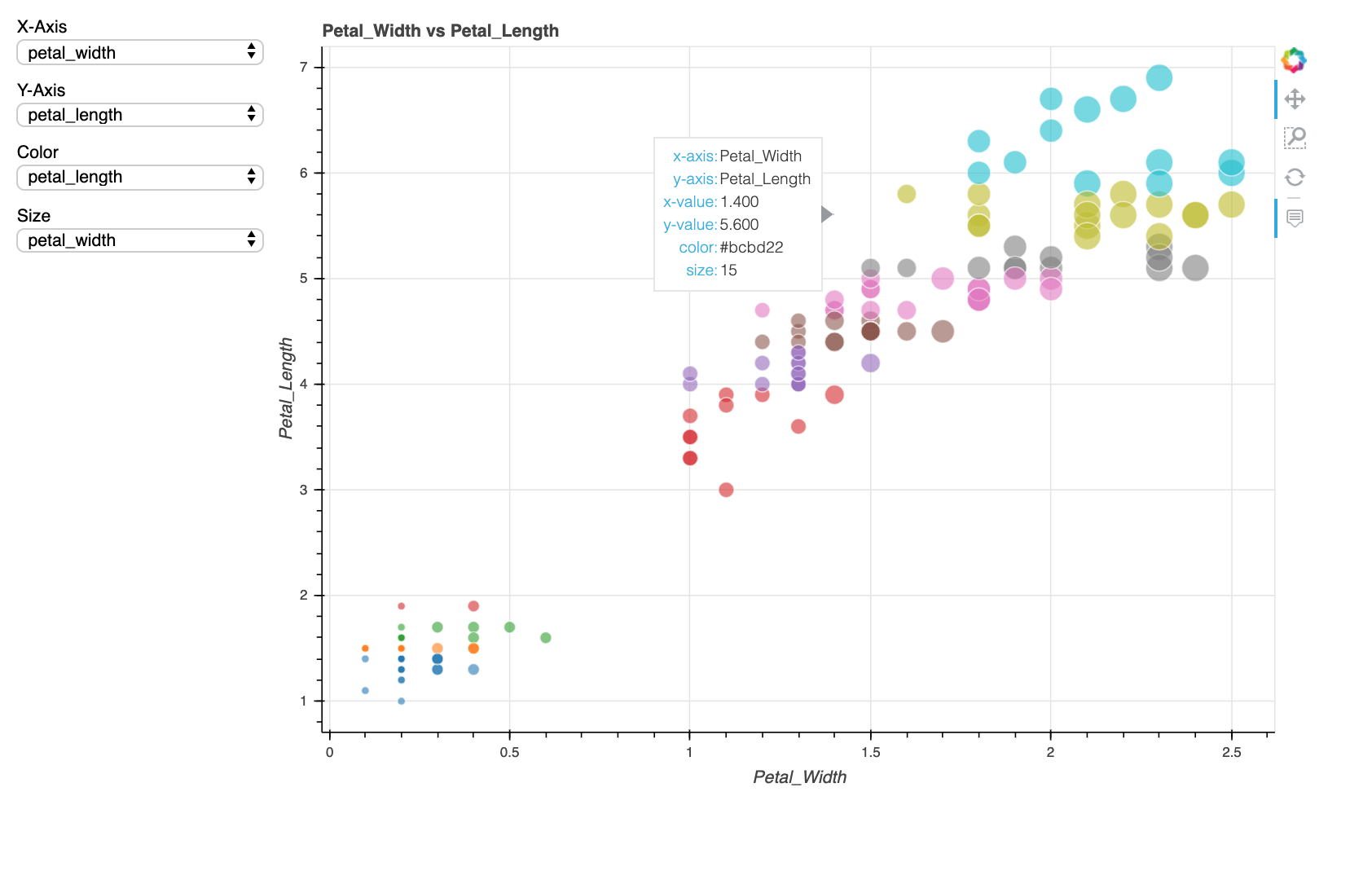
TOOLTIPS = [
("x", "@xs"),
("y", "@ys"),
("color", "@c"),
("size", "@sz")
]
p = figure(plot_width=700, plot_height=700, tooltips=TOOLTIPS,
title="Hover-tool", tools='hover')
p.circle(x='xs', y='ys', color='c', size = 'sz', source=source)
show(p)
Note: I mistakenly mentioned that # $ - numeric fields, @ - text fields but in reality $ is used for plot related values like plot coordinates, while @ is used for fields in the data source.
Field names that begin with $ are “special fields”. These often correspond to values that are intrinsic to the plot, such as the coordinates of the mouse in data or screen space.
Field names that begin with @ are associated with columns in a ColumnDataSource.
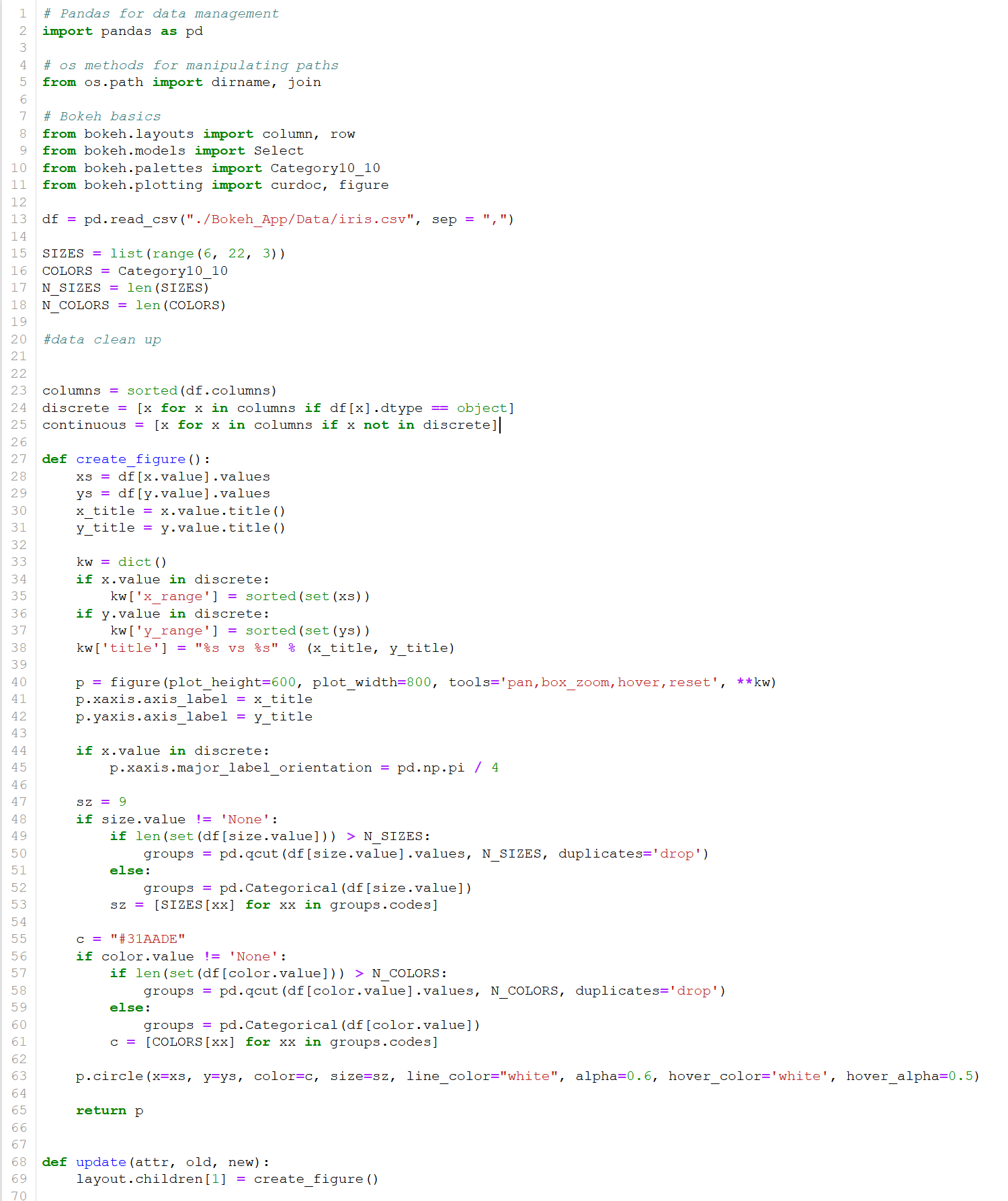
Also going through your code, I could see that the size and color will not work as expected since the size of variables c and sz could be different if the size and color dropdown values are selected. I’ve update the if/else conditions for the color and size and updated the CDS as well. Your code should be as below.
import pandas as pd

# os methods for manipulating paths
from os.path import dirname, join

# Bokeh basics
from bokeh.layouts import column, row
from bokeh.models import Select , ColumnDataSource
from bokeh.palettes import Category10_10
from bokeh.plotting import curdoc, figure

df = pd.read_csv("./Bokeh_App/Data/iris.csv", sep = ",")

SIZES = list(range(6, 22, 3))
COLORS = Category10_10
N_SIZES = len(SIZES)
N_COLORS = len(COLORS)

#data clean up


columns = sorted(df.columns)
discrete = [x for x in columns if df[x].dtype == object]
continuous = [x for x in columns if x not in discrete]


def create_figure():
    xs = df[x.value].values
    ys = df[y.value].values
    x_title = x.value.title()
    y_title = y.value.title()

    TOOLTIPS = [
    ("x-axis", x_title),
    ("y-axis", y_title),
    ("x-value", "@xs"),
    ("y-value", "@ys"),
    ("color", "@c"),
    ("size", "@sz")
    ]

    kw = dict()
    if x.value in discrete:
        kw['x_range'] = sorted(set(xs))
    if y.value in discrete:
        kw['y_range'] = sorted(set(ys))
    kw['title'] = "%s vs %s" % (x_title, y_title)

    p = figure(plot_height=600, plot_width=800, tools='pan,box_zoom,hover,reset',tooltips = TOOLTIPS, **kw)
    p.xaxis.axis_label = x_title
    p.yaxis.axis_label = y_title

    if x.value in discrete:
        p.xaxis.major_label_orientation = pd.np.pi / 4

    sz = 9

    #updated else part

    if size.value != 'None':
        if len(set(df[size.value])) > N_SIZES:
            groups = pd.qcut(df[size.value].values, N_SIZES, duplicates='drop')
        else:
            groups = pd.Categorical(df[size.value])
        sz = [SIZES[xx] for xx in groups.codes]
    else:
        sz = [sz]*len(xs)

    #updated else part

    c = "#31AADE"
    if color.value != 'None':
        if len(set(df[color.value])) > N_COLORS:
            groups = pd.qcut(df[color.value].values, N_COLORS, duplicates='drop')
        else:
            groups = pd.Categorical(df[color.value])
        c = [COLORS[xx] for xx in groups.codes]
    else:
        c = [c]*len(xs)

    source = ColumnDataSource(data=dict(
    xs = xs,
    ys = ys ,
    c = c,
    sz = sz))

    p.circle(x='xs', y='ys', color='c', size='sz',source= source, line_color="white", alpha=0.6, hover_color='white', hover_alpha=0.5)

    return p


def update(attr, old, new):
    layout.children[1] = create_figure()


x = Select(title='X-Axis', value='petal_width', options=columns)
x.on_change('value', update)

y = Select(title='Y-Axis', value='petal_length', options=columns)
y.on_change('value', update)

size = Select(title='Size', value='None', options=['None'] + continuous)
size.on_change('value', update)

color = Select(title='Color', value='None', options=['None'] + continuous)
color.on_change('value', update)

controls = column(x, y, color, size, width=200)
layout = row(controls, create_figure())

curdoc().add_root(layout)
curdoc().title = "Crossfilter"