KAM
November 30, 2020, 1:13pm
1
Hello,
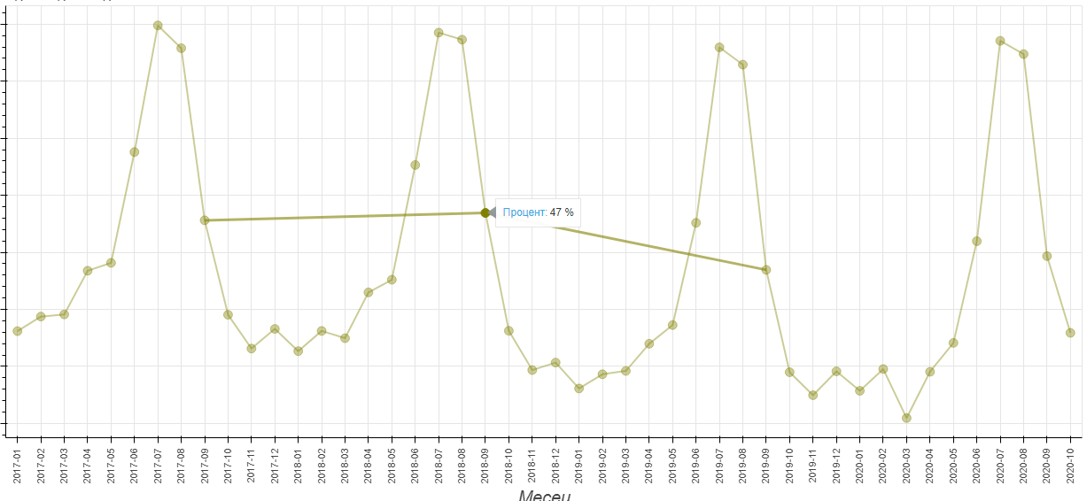
Currently, I have a line chart that shows lines related to datapoints when hovering:
Which I’ve managed to achieve with the following code:
code = """
const links = %s
const data = {'x0': [], 'y0': [], 'x1': [], 'y1': []}
const indices = cb_data.index.indices
for (var i = 0; i < indices.length; i++) {
    const start = indices[i]
    for (var j = 0; j < links[start].length; j++) {
        const end = links[start][j]
        data['x0'].push(circle.data.x[start])
        data['y0'].push(circle.data.y[start])
        data['x1'].push(circle.data.x[end])
        data['y1'].push(circle.data.y[end])
    }
}
segment.data = data
""" % links

callback = CustomJS(args={'circle': circle1.data_source, 'segment': sr1.data_source, 'line': line1.data_source}, code=code)
fig1.add_tools(HoverTool(tooltips=[
    ('Процент', '$y{0 %}'),
], callback=callback, renderers=[circle1]))
links is a dic which store the links between the points.
Do you know how I can just hilight the datapoints and show their values, not connecting them with line?
carolyn
November 30, 2020, 4:30pm
2
Hi @KAM ,
Is it required that you do this with a HoverTool (rather than a TapTool)? Working with a TapTool might make it more straightforward to highlight the selected rows in the source data.
KAM
December 7, 2020, 9:18am
3
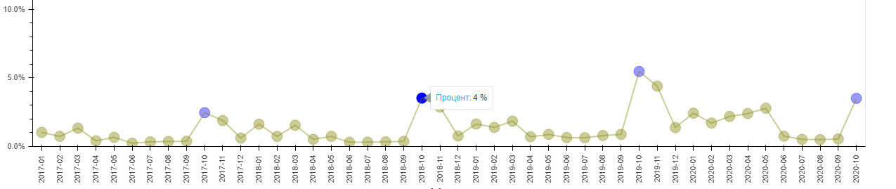
Hello, I’ve managed to achieve the desired output like this:
    ipc_array = df['split_month'].values.astype(str)
colorsRange = range(lengthArr)
colors_array = []
for color in colorsRange:
    colors_array.append('olive')

source = ColumnDataSource(data=dict(
    x=x,
    y=watched_21_days,
    ipc_class=ipc_array,
    color=colors_array
))

fig5 = figure(x_range=x, y_range=[0, 0.25], plot_width=1500, plot_height=600, tools ='wheel_zoom,reset,pan', title='21+ дни гледали цели видеа')
fig5.grid.visible = False
circle5 = fig5.circle('x', 'y', source=source, size=15, alpha=0.4, color='color', hover_alpha=1.0)

fig5.xaxis.axis_label = 'Месец'
fig5.xaxis.major_label_orientation = math.pi/2
fig5.xaxis.axis_label_text_font_size = "20px"
fig5.yaxis.axis_label_text_font_size = "20px"
fig5.yaxis.axis_label = 'Процент'
fig5.yaxis[0].formatter = NumeralTickFormatter(format="0.0%")
legend5 = Legend(items=[
    ("0 дни гледали цели видеа", [circle5])
], location="top_right", label_text_font='akrobat')
fig5.add_layout(legend5, 'right')
legend5.title = "Тип потребители"
legend5.title_text_font_size = "20px"
legend5.title_text_font_style = "bold"
legend5.label_text_font_size = "15px"

###################################
code5 = '''
for (let i in cb_data.renderer.data_source.data['color'])
    cb_data.renderer.data_source.data['color'][i] = colors[i];

if (cb_data.index.indices != null) {
    const hovered_index = cb_data.index.indices[0];
    const hovered_ipc_class = cb_data.renderer.data_source.data['ipc_class'][hovered_index];
    for (let i = 0; i < cb_data.renderer.data_source.data['ipc_class'].length; i++) {
        if (cb_data.renderer.data_source.data['ipc_class'][i] == hovered_ipc_class)
            cb_data.renderer.data_source.data['color'][i] = 'blue';
    }
}
cb_data.renderer.data_source.change.emit();
'''

TOOLTIPS = [
    ('Процент', '$y{0 %}')
]
callback5 = CustomJS(args=dict(ipc_array=ipc_array, colors=colors_array, source=source), code=code5)
hover5 = HoverTool(tooltips=TOOLTIPS, callback=callback5)
fig5.add_tools(hover5)
Now I have got a new challenge - to make the tooltip works for all highlighted points:
KAM
December 7, 2020, 9:19am
4
Thank you for the response, Carolyn.