I am trying to draw a single horizontal line on fig with X axis as datetime. I have tried many components without success. The closest i can get is ray.
            timestamp    open    high     low   close                date    clr_drk  clr_lgt
0 2020-04-29 15:25:00  284.15  284.15  283.95  283.95 2020-04-29 15:25:00  firebrick  #fce5bd
i am also animating everything
curdoc().add_periodic_callback(update_ohlc, 9000)
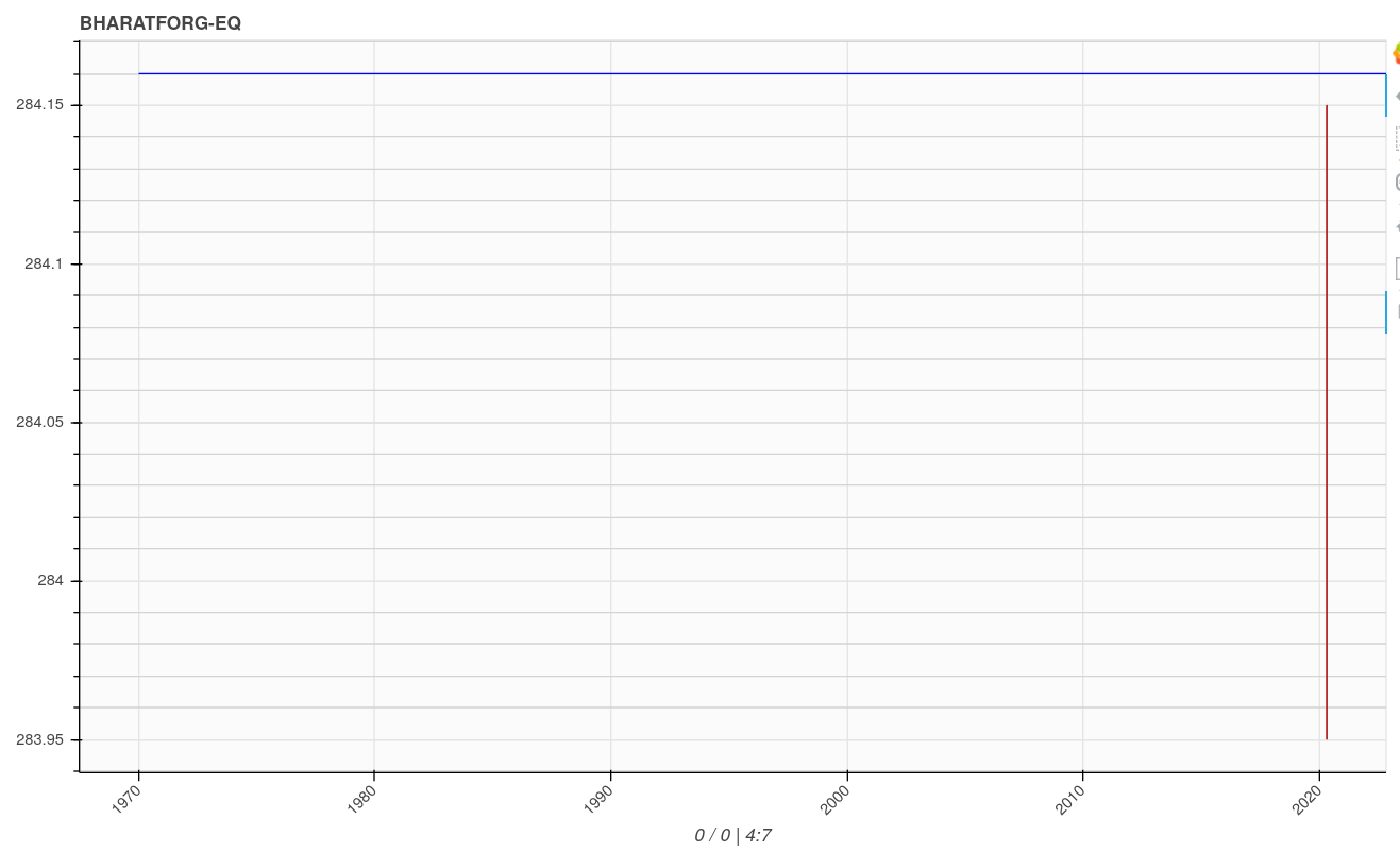
the problem is the ray is originating from the year 1970 which is not existing the data (both in the ray source and main source). as a result the main figure is pushed to the right and compressed (a day’s data is compressed as a yearly data)
Its not entirely clear from the data provided what you want to show as the horizontal line given that your dataframe (orders) only has a single entry.
Regarding the 1970 point appearing on the x-axis, this is because the plot axes are dynamically scaling to render all of the data provided to it.
Your use of the ray method specifies the close variable as both the x coordinate and y coordinate. In the example data, close has a value of 284.16, which is being interpreted as a “seconds since the Epoch”. The Epoch time or Unix time is the number of seconds elapsed since 00:00:00 UTC on 1 January 1970. This means the x-coordinate of data you’re sending to ray is 284.16 seconds after 12am on 01 January 1970.
Did you mean to use the date column (or index) of your dataframe as the x-coordinate of what you’re trying to visualize?
here 284.16 is price and i want a horizontal line to be placed on that price alone. actually the image above correctly produces the result i want. only thing is the date 1970 is messing up.
thanks for explaining the 1970 point appearing issue. i thought i can get away without specifying date by simply plotting x and y as price. i now understand what causes 1970 to appear. its the price (close) is interpreted by x as Epoch time.
Actually it does not matter from where the horizontal line starts and ends. it could start from the left most datetime on the x and span till the right most datetime. However from what i understand there cannot be addition to the figure that is independent of the x axis, which is of datetime format as mentioned above.
i just want a horizontal line with or without involving the datetime of x axis. any solution is acceptable. even it is a line, Segment, Span etc. i want to add many such horizontal lines from many orders dataframe rows later, to represent the y axis close price.
If the x-axis range of figure p is defined at the point when you render the close-price, you could do the following as a minimal change to your ray approach
Here, the close-price ray starts at the minimum value of the (datetime) x-axis and spans the length of the x-axis (b/c the length is explicitly prescribed as the delta between the end and start values). As you’re using the current values of the x-axis to render the ray, it should not do anything to modify the axes limits.
NB: If you’re axes ranges are dynamically changing because you’re incrementally adding new data, you’ll have to do something more sophisticated if you want the horizontal lines to continue to span the width of the plot as it updates.
one problem, i faced was the starting point of the ray keep shifting to the left. this is easily solved by fixating the starting point and subtracting it with the current time in milliseconds to get the length.