Hello,
I have a dataframe that looks like this:
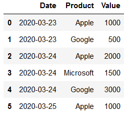
I would like to plot a simple bar chart where every bar represents the sum of the transaction for each day, basically using df.groupby(["Date"]).sum() as ColumnDataSource.
However, I would like to go one layer deeper in the the hover, showing the “details” (product and value) of each transaction, basically using df.groupby(["Date", "Product"]).sum() as source for the hover.
One workaround would be to create a “TransactionDetails” column in panda, add it to the first groupby and visualize that in the hover, but I wonder if there isn’t a better solution to have summary data in the gliph and details data in the hover?