having trouble to mix up everythin;
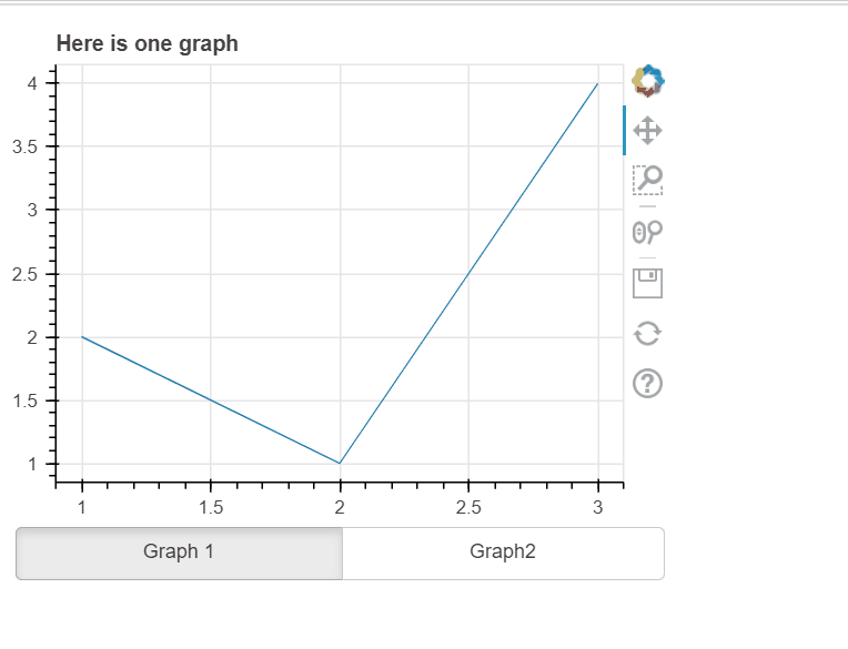
I have two graphs
the fist one is this one:
''' A crossfilter plot map that uses the `Auto MPG dataset`_. This example
demonstrates the relationship of datasets together. A hover tooltip displays
information on each dot.
.. note::
    This example needs the Pandas package to run.
.. _Auto MPG dataset: https://archive.ics.uci.edu/ml/datasets/auto+mpg
'''
import pandas as pd

from bokeh.layouts import column, row
from bokeh.models import Select
from bokeh.palettes import Spectral5
from bokeh.plotting import curdoc, figure
from bokeh.sampledata.autompg import autompg_clean as df

df = df.copy()

SIZES = list(range(6, 22, 3))
COLORS = Spectral5
N_SIZES = len(SIZES)
N_COLORS = len(COLORS)

# data cleanup
df.cyl = df.cyl.astype(str)
df.yr = df.yr.astype(str)
del df['name']

columns = sorted(df.columns)
discrete = [x for x in columns if df[x].dtype == object]
continuous = [x for x in columns if x not in discrete]

def create_figure():
    xs = df[x.value].values
    ys = df[y.value].values
    x_title = x.value.title()
    y_title = y.value.title()

    kw = dict()
    if x.value in discrete:
        kw['x_range'] = sorted(set(xs))
    if y.value in discrete:
        kw['y_range'] = sorted(set(ys))
    kw['title'] = "%s vs %s" % (x_title, y_title)

    p = figure(height=600, width=800, tools='pan,box_zoom,hover,reset', **kw)
    p.xaxis.axis_label = x_title
    p.yaxis.axis_label = y_title

    if x.value in discrete:
        p.xaxis.major_label_orientation = pd.np.pi / 4

    sz = 9
    if size.value != 'None':
        if len(set(df[size.value])) > N_SIZES:
            groups = pd.qcut(df[size.value].values, N_SIZES, duplicates='drop')
        else:
            groups = pd.Categorical(df[size.value])
        sz = [SIZES[xx] for xx in groups.codes]

    c = "#31AADE"
    if color.value != 'None':
        if len(set(df[color.value])) > N_COLORS:
            groups = pd.qcut(df[color.value].values, N_COLORS, duplicates='drop')
        else:
            groups = pd.Categorical(df[color.value])
        c = [COLORS[xx] for xx in groups.codes]

    p.circle(x=xs, y=ys, color=c, size=sz, line_color="white", alpha=0.6, hover_color='white', hover_alpha=0.5)

    return p


def update(attr, old, new):
    layout.children[1] = create_figure()


x = Select(title='X-Axis', value='mpg', options=columns)
x.on_change('value', update)

y = Select(title='Y-Axis', value='hp', options=columns)
y.on_change('value', update)

size = Select(title='Size', value='None', options=['None'] + continuous)
size.on_change('value', update)

color = Select(title='Color', value='None', options=['None'] + continuous)
color.on_change('value', update)

controls = column(x, y, color, size, width=200)
layout = row(controls, create_figure())

curdoc().add_root(layout)
curdoc().title = "Crossfilter"
and the second one is this one:
import numpy as np
import scipy.special

from bokeh.layouts import gridplot
from bokeh.plotting import figure, show


def make_plot(title, hist, edges, x, pdf, cdf):
    p = figure(title=title, tools='', background_fill_color="#fafafa")
    p.quad(top=hist, bottom=0, left=edges[:-1], right=edges[1:],
           fill_color="navy", line_color="white", alpha=0.5)
    p.line(x, pdf, line_color="#ff8888", line_width=4, alpha=0.7, legend_label="PDF")
    p.line(x, cdf, line_color="orange", line_width=2, alpha=0.7, legend_label="CDF")

    p.y_range.start = 0
    p.legend.location = "center_right"
    p.legend.background_fill_color = "#fefefe"
    p.xaxis.axis_label = 'x'
    p.yaxis.axis_label = 'Pr(x)'
    p.grid.grid_line_color="white"
    return p

# Normal Distribution

mu, sigma = 0, 0.5

measured = np.random.normal(mu, sigma, 1000)
hist, edges = np.histogram(measured, density=True, bins=50)

x = np.linspace(-2, 2, 1000)
pdf = 1/(sigma * np.sqrt(2*np.pi)) * np.exp(-(x-mu)**2 / (2*sigma**2))
cdf = (1+scipy.special.erf((x-mu)/np.sqrt(2*sigma**2)))/2

p1 = make_plot("Normal Distribution (μ=0, σ=0.5)", hist, edges, x, pdf, cdf)

# Log-Normal Distribution

mu, sigma = 0, 0.5

measured = np.random.lognormal(mu, sigma, 1000)
hist, edges = np.histogram(measured, density=True, bins=50)

x = np.linspace(0.0001, 8.0, 1000)
pdf = 1/(x* sigma * np.sqrt(2*np.pi)) * np.exp(-(np.log(x)-mu)**2 / (2*sigma**2))
cdf = (1+scipy.special.erf((np.log(x)-mu)/(np.sqrt(2)*sigma)))/2

p2 = make_plot("Log Normal Distribution (μ=0, σ=0.5)", hist, edges, x, pdf, cdf)

# Gamma Distribution

k, theta = 7.5, 1.0

measured = np.random.gamma(k, theta, 1000)
hist, edges = np.histogram(measured, density=True, bins=50)

x = np.linspace(0.0001, 20.0, 1000)
pdf = x**(k-1) * np.exp(-x/theta) / (theta**k * scipy.special.gamma(k))
cdf = scipy.special.gammainc(k, x/theta)

p3 = make_plot("Gamma Distribution (k=7.5, θ=1)", hist, edges, x, pdf, cdf)

# Weibull Distribution

lam, k = 1, 1.25
measured = lam*(-np.log(np.random.uniform(0, 1, 1000)))**(1/k)
hist, edges = np.histogram(measured, density=True, bins=50)

x = np.linspace(0.0001, 8, 1000)
pdf = (k/lam)*(x/lam)**(k-1) * np.exp(-(x/lam)**k)
cdf = 1 - np.exp(-(x/lam)**k)

p4 = make_plot("Weibull Distribution (λ=1, k=1.25)", hist, edges, x, pdf, cdf)

show(gridplot([p1,p2,p3,p4], ncols=2, width=400, height=400, toolbar_location=None))
I need both to be seen choosing with a button or radiobutton … dont mind if the transition to one or the other isnt ok or width si different. (whn one is done … I can add more graphs) … but dont really know how to do this.
also … it would be amazing to not press in the terminal bokeh server … any ideas?