I’m back to using Bokeh from another plotting platform and I’m completely lost. I have a very simple example that should bin plotting bins as histograms, but I can’t seem to be able to get the bokeh API to work.
import pandas as pd
import numpy as np

def construct_labels(start, end):
    labels = []
    for index, x in enumerate(start):
        y = end[index]
        labels.append('({}, {}]'.format(x, y))
    return labels


values = {'Length': np.random.uniform(0, 4, 10)}
df = pd.DataFrame(values, columns=['Length'])

bin_step_size = 0.5

# List of bin points.
p_bins = np.arange(0, (df['Length'].max() + bin_step_size), bin_step_size)

# Reduce the tail to create the left side bounds.
p_left_limits = p_bins[:-1].copy()

# Cut the head to create the right side bounds.
p_right_limits = np.delete(p_bins, 0)

# Create the bins.
p_range_bins = pd.IntervalIndex.from_arrays(p_left_limits, p_right_limits)

# Create labels.
p_range_labels = construct_labels(p_left_limits, p_right_limits)

p_ranges_binned = pd.cut(
    df['Length'],
    p_range_bins,
    labels=p_range_labels,
    precision=0,
    include_lowest=True)

counts = p_ranges_binned.value_counts(sort=False)
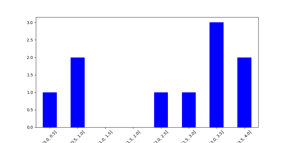
… and from here I’m pretty much lost. I can plot the above in matplotlib now, and it looks like this. But I just can’t figure out what was the Bokeh way
If you actually want histogram (which has a continuous axis) is there a reason you are implementing it with bar chart (which has a categorical axis)? That is bound to make things more complicated than necessary.
Just to be clear, the fundamental difference is not how the bin are built (e.g. np.histrogram or somethign else, it doesn’t matter). But whether you pass a list of string (categorical) labels as the range, instead of just using the bar edge coordinates.
Ideally, I will need to have percentages on the left (y-scale), is there a built in way, or should I rework that myself? I would like to show, like %5 instead of the count. Indicating that %5 of the values are in bin (0.5, 1.5]