Thx for helping me out guys.
At the end what was not working is that I thought that x = ;y = ; c = was equivalent to x = y = c = 
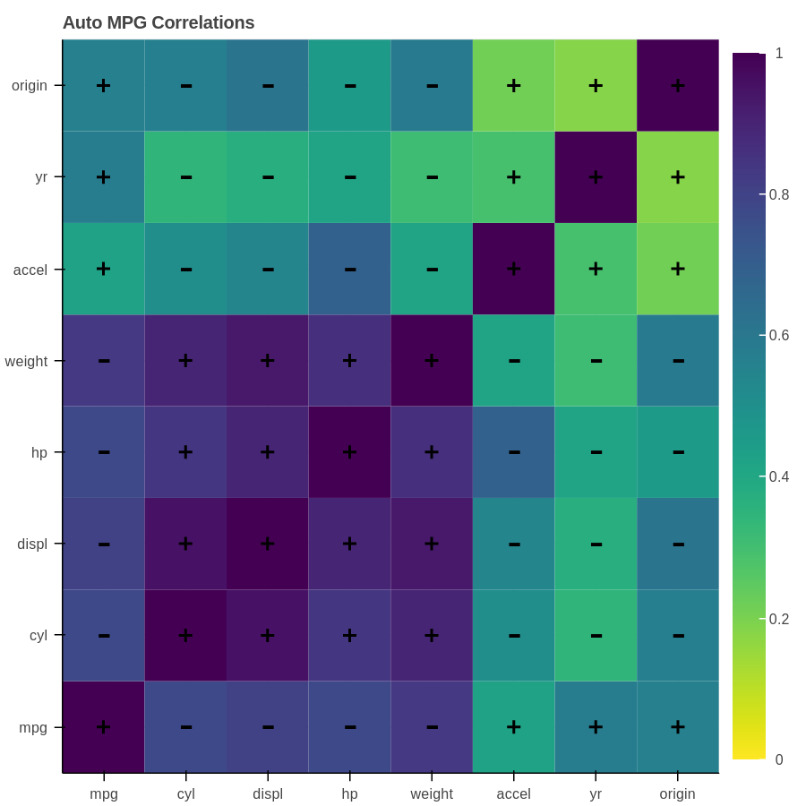
Now it’s working nicely ! And below is the full code with the plot and the html file for Hover interactivity at the end:
import numpy as np
import pandas as pd
from bokeh.plotting import figure, show, output_notebook
  from bokeh.palettes import Viridis256
from bokeh.models import ColumnDataSource, ColorBar, LinearColorMapper, HoverTool
from bokeh.sampledata.autompg import autompg
cols = list( autompg.corr().columns)
corr_matrix = np.asmatrix( autompg.corr())
N = len( cols)
x = ; y = ; c = ; c_abs =
minus = [ ‘-’] * N ** 2
size = [ ‘25pt’] * N ** 2
for i in range(N):
for j in range(N):
x.append( cols[ j])
y.append( cols[ i])
c.append( corr_matrix[ i, j])
c_abs.append( abs( corr_matrix[ i, j]))
data = pd.DataFrame({ ‘x’: x, ‘y’: y, ‘c’:c, ‘c_abs’: c_abs, ‘minus’: minus, ‘size’: size})
mapper = LinearColorMapper( palette=Viridis256[ :: -1], low=0, high=1)
colors= { ‘field’: ‘c_abs’, ‘transform’: mapper}
color_bar = ColorBar( color_mapper=mapper, location=( 0, 0))
p = figure( toolbar_location=‘above’, tools=‘hover’, x_range=cols, y_range=cols, title=“Auto MPG Correlations”)
source = ColumnDataSource( data)
p.rect( ‘x’, ‘y’, source= data, fill_color=colors, line_color=None, width=1, height=1)
add a plus or a minus to indicate positive or negative correlation - colors are absolute values
p.cross( ‘x’, ‘y’, source= data.query( “c > 0”), size=10, color=‘black’, line_width=2)
p.text( ‘x’, ‘y’, text=‘minus’, source= data.query( “c < 0”),
color=‘black’, text_font_size=‘size’, y_offset=16, x_offset=-5)
p.add_layout( color_bar, ‘right’)
p.select_one( HoverTool).tooltips = [( 'correlation: ', ‘@c’),]
output_notebook()
show( p)
Have a nice day,
alEx
AutoMPGHeatMap.html (282 KB)
···
On Thu, May 4, 2017 at 12:20 PM Marcus Donnelly [email protected] wrote:
Hi alEx,
Is the following the sort of thing you’re after? I’m not sure if colour mappers work with rectangle glyphs in the way you’re trying, but they do work with images which is what I use for this kind of plot…
from bokeh.plotting import figure, show
from bokeh.palettes import Viridis256
from bokeh.models import ColorBar, LinearColorMapper
``
from bokeh.sampledata.autompg import autompg
corr = autompg.corr()
cols = list(corr.columns)
``
x = y =
``
for i in cols:
for j in cols:
x.append(j)
y.append(i)
``
c = abs(autompg.corr().values)
mapper = LinearColorMapper(palette=Viridis256, low=0, high=1)
color_bar = ColorBar(color_mapper=mapper, location=(0,0))
p = figure(toolbar_location=None, tools=‘’, x_range=cols, y_range=cols)
p.image([c], x=.5, y=.5, dw=len(cols), dh=len(cols), color_mapper=mapper)
p.add_layout(color_bar, ‘right’)
show
``
–
You received this message because you are subscribed to the Google Groups “Bokeh Discussion - Public” group.
To unsubscribe from this group and stop receiving emails from it, send an email to [email protected].
To post to this group, send email to [email protected].
To view this discussion on the web visit https://groups.google.com/a/continuum.io/d/msgid/bokeh/0979b398-5274-4b71-b220-b8b35f72b94c%40continuum.io.
For more options, visit https://groups.google.com/a/continuum.io/d/optout.