Below is the code I am using and for some reason when I run it the ETH chart shows the right x axis, but when I select anything else it shows MS.
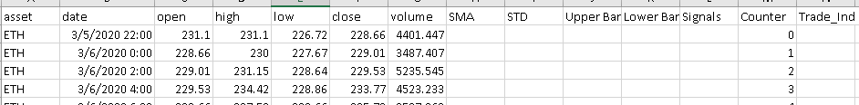
Below is a snippet of what the data looks like. The rest of the assets have the same date format.
def get_dataset(src, name):
        df = src[src.asset == name].copy()
        xaxis_dt_format = "%Y-%m-%d %H:%M"
        time_dict = {
            i: date.strftime(xaxis_dt_format)
            for i, date in enumerate(pd.to_datetime(df["date"]))
        }
        time_df = pd.DataFrame.from_dict(time_dict, orient = "index", columns = ["date"])

        time_source = ColumnDataSource(data = time_df)

        inc = df.close > df.open
        dec = ~inc
        inc_source = ColumnDataSource(
        data=dict(
            x1=df.index[inc],
            top1=df.open[inc],
            bottom1=df.close[inc],
            high1=df.high[inc],
            low1=df.low[inc],
            Date1=df.date[inc],
            )
        )

        dec_source = ColumnDataSource(
        data=dict(
            x2=df.index[dec],
            top2=df.open[dec],
            bottom2=df.close[dec],
            high2=df.high[dec],
            low2=df.low[dec],
            Date2=df.date[dec],
            )
        )

        bb_source = ColumnDataSource(
        data=dict(
            sma =  df["SMA"],
            upper_band = df["Upper Band"],
            lower_band = df["Lower Band"],
            color1 = df["Trade_Ind"],
            signals = df["Signals"],
            Date3=df.index,
            )
        )

        return inc_source, dec_source, bb_source, time_source

    def make_plot(source1, source2, source3, source4, title_name):
        # Select the datetime format for the x axis depending on the timeframe
        xaxis_dt_format = "%Y-%m-%d %H:%M"
        time_df = source4.to_df()
        time_df = time_df.rename(columns = {time_df.columns[0]:"Count", "date": "Date"})
        time_df.pop("Count")

        #time_dict = time_df.to_dict()
        fig = figure(
            sizing_mode="stretch_both",
            tools="xpan,xwheel_zoom,reset,save",
            active_drag="xpan",
            active_scroll="xwheel_zoom",
            x_axis_type="datetime",
            #x_range=Range1d(df.index[0], df.index[-1], bounds="auto"),
            title=title_name,
        )
        fig.yaxis[0].formatter = NumeralTickFormatter(format="$5.3f")

        # Colour scheme for increasing and descending candles
        INCREASING_COLOR = "#17BECF"
        DECREASING_COLOR = "#7F7F7F"

        width = 0.5

        # Plot candles
        # High and low
        fig.segment(
            x0="x1", y0="high1", x1="x1", y1="low1", source=source1, color="black"
        )
        fig.segment(
            x0="x2", y0="high2", x1="x2", y1="low2", source=source2, color="black"
        )

        # Open and close
        r1 = fig.vbar(
            x="x1",
            width=width,
            top="top1",
            bottom="bottom1",
            source=source1,
            fill_color=INCREASING_COLOR,
            line_color="black",
        )
        r2 = fig.vbar(
            x="x2",
            width=width,
            top="top2",
            bottom="bottom2",
            source=source2,
            fill_color=DECREASING_COLOR,
            line_color="black",
        )

        # Add on extra lines (e.g. moving averages) here
        fig.line(x = "Date3", y = "sma", source = source3, line_color = "firebrick")
        fig.varea(x = "Date3", y1 = "sma", y2 = "upper_band", source = source3, fill_alpha = 0.25)
        fig.line(x = "Date3", y = "sma", source = source3)
        fig.varea(x = "Date3", y1 = "sma", y2 = "lower_band", source = source3, fill_alpha = 0.25)
        fig.line(x = "Date3", y = "sma", source = source3)
        fig.circle(x = "Date3", y = "signals", color="color1", source = source3, size=15)
        #fig.xaxis[0].formatter=DatetimeTickFormatter(hourmin = ['%H:%M'])

        fig.xaxis.major_label_overrides = {
            i: date.strftime(xaxis_dt_format)
            for i, date in enumerate(pd.to_datetime(time_df["Date"]))
        }
        fig.xaxis.formatter=DatetimeTickFormatter(days = ['%m/%d'])
        # Set up the hover tooltip to display some useful data
        fig.add_tools(
            HoverTool(
                renderers=[r1],
                tooltips=[
                    ("Open", "$@top1"),
                    ("High", "$@high1"),
                    ("Low", "$@low1"),
                    ("Close", "$@bottom1"),
                    ("Date", "@Date1{" + xaxis_dt_format + "}"),
                ],
                formatters={"Date1": "datetime"},
            )
        )

        fig.add_tools(
            HoverTool(
                renderers=[r2],
                tooltips=[
                    ("Open", "$@top2"),
                    ("High", "$@high2"),
                    ("Low", "$@low2"),
                    ("Close", "$@bottom2"),
                    ("Date", "@Date2{" + xaxis_dt_format + "}"),
                ],
                formatters={"Date2": "datetime"},
            )
        )

        return fig

    def update_plot(attrname, old, new):
        currency = currency_select.value
        plot.title.text = "2 HR Results for " + currencies[currency]['title']

        src1, src2, src3, src4 = get_dataset(df, currencies[currency]['asset'])
        source1.data.update(src1.data)
        source2.data.update(src2.data)
        source3.data.update(src3.data)
        source4.data.update(src4.data)

    currency = 'ETH'

    currencies = {
        'XBT': {
            'asset': 'XBT',
            'title': 'XBT 2 Hour',
        },
        'ETH': {
            'asset': 'ETH',
            'title': 'ETH 2 Hour',
        },
        'LTC': {
            'asset': 'LTC',
            'title': 'LTC 2 Hour',
        },
        'XRP':{
            'asset': 'XRP',
            'title': 'XRP 2 Hour',
        }
    }

    currency_select = Select(value=currency, title='Asset', options=sorted(currencies.keys()))

    df = pd.read_csv( "E:\\Python36\\Scripts\\_Algorithms\\BokehTest.csv")

    source1, source2, source3, source4 = get_dataset(df, currencies[currency]['asset'])

    plot = make_plot(source1, source2, source3, source4, "2 HR Results for " + currencies[currency]['title'])

    currency_select.on_change('value', update_plot)
    controls = column(currency_select)

    curdoc().add_root(row(plot, controls))
    curdoc().title = "2 HR Results"