Hi,
this must be a simple one, but I can’t figure it out.
I have a Crossfilter dashboard running here http://www.logeeka.com/cruises/average_ratings_configurable.html.
It is powered by this dataframe
Line 8760 non-null object
Ship 8760 non-null object
Month 8760 non-null object
Year 8760 non-null object
Rating 8760 non-null int64
Count 8760 non-null int64
and it works perfectly if I want to see, for instance the average rating by year, or line.
I would like to see the percentage distribution of ratings, what % of ratings are 1 star, 2 star, eccetera,be able to see how this distribution changes in different years, or different cruise lines. This is a problem I have very often across my dashboard, where often I show, for instance, marketshare, that I need to see recalculated at the country, market, or category level.
I assume I need to do something with the dataframe I pass to the bokeh app, but have been totally insuccessfull. This might be a Pandas question more than a Bokeh question, but cannot make it work here.
Thanks so much
Fabio
It seems like your data is already somewhat in a summarized state. Unless I’m misinterpreting it, you shouldn’t need a count column. A count is a type of aggregation, which the crossfilter does with the bar chart. So, for a distribution of ratings, you’d get something similar by adding a count aggregation type, then doing a bar chart of it.
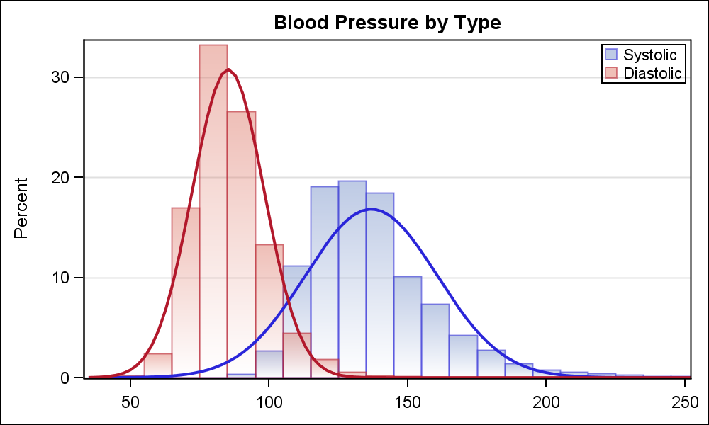
However, to display a true distribution, there would really need to be a new chart type added. A histogram. You’d want to be grouping by the the years or cruise lines, and doing the histogram of on the ratings of each group. Each group would then be plotted separately. You could do this as a grouped bar chart, or you could plot the bars on top of each other with transparency, or you could create continuous lines for each group and not use bars at all. I’ve used lines when doing this kind of plot so that you can support plotting more groups without things getting out of hand.
This plot shows both approaches on top of each other:
http://blogs.sas.com/content/graphicallyspeaking/files/2014/08/Grouped_Histogram_2.png
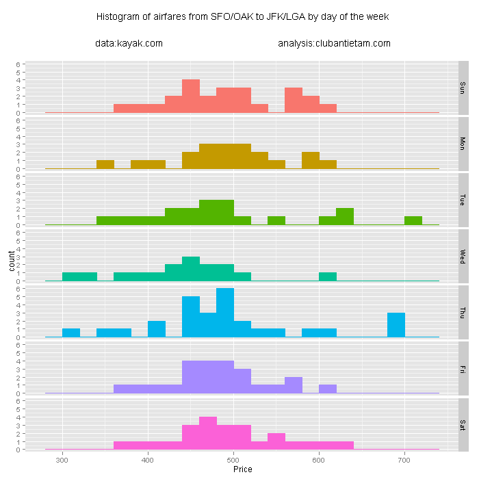
However, you can also facet by the things you want to compare (faceting is a type of grouping operation), to do something like this:
http://www.clubantietam.com/wp-content/uploads/2011/06/kayak_flights_hist_00.png
Again, the main thing that needs to be added is a new aggregation type to get this functionality you want with the existing bar chart. Ideally, there would be a new plot type that focuses on distributions.
···
On Mon, Mar 23, 2015 at 9:07 AM, Fabio Annovazzi [email protected] wrote:
Hi,
this must be a simple one, but I can’t figure it out.
I have a Crossfilter dashboard running here http://www.logeeka.com/cruises/average_ratings_configurable.html.
It is powered by this dataframe
Line 8760 non-null object
Ship 8760 non-null object
Month 8760 non-null object
Year 8760 non-null object
Rating 8760 non-null int64
Count 8760 non-null int64
and it works perfectly if I want to see, for instance the average rating by year, or line.
I would like to see the percentage distribution of ratings, what % of ratings are 1 star, 2 star, eccetera,be able to see how this distribution changes in different years, or different cruise lines. This is a problem I have very often across my dashboard, where often I show, for instance, marketshare, that I need to see recalculated at the country, market, or category level.
I assume I need to do something with the dataframe I pass to the bokeh app, but have been totally insuccessfull. This might be a Pandas question more than a Bokeh question, but cannot make it work here.
Thanks so much
Fabio
–
You received this message because you are subscribed to the Google Groups “Bokeh Discussion - Public” group.
To unsubscribe from this group and stop receiving emails from it, send an email to [email protected].
To post to this group, send email to [email protected].
To view this discussion on the web visit https://groups.google.com/a/continuum.io/d/msgid/bokeh/2661b3bc-63fe-48a1-8f3e-fd183fb83114%40continuum.io.
For more options, visit https://groups.google.com/a/continuum.io/d/optout.
I agree I do not need the count field to calculate for instance average rating per line. I put it in hoping it would help to calculate the distribution of ratings but did not manage to use it. I was trying to have a field with value 1/number of rows and then sum over that but it did not work for me.
Is it something that cannot be done at present with the bokeh crossfilter tool but that will be possible in the future with the addition of the histogram chart?
Thanks and best regards
Fabio
···
On Mon, Mar 23, 2015 at 9:07 AM, Fabio Annovazzi [email protected] wrote:
Hi,
this must be a simple one, but I can’t figure it out.
I have a Crossfilter dashboard running here http://www.logeeka.com/cruises/average_ratings_configurable.html.
It is powered by this dataframe
Line 8760 non-null object
Ship 8760 non-null object
Month 8760 non-null object
Year 8760 non-null object
Rating 8760 non-null int64
Count 8760 non-null int64
and it works perfectly if I want to see, for instance the average rating by year, or line.
I would like to see the percentage distribution of ratings, what % of ratings are 1 star, 2 star, eccetera,be able to see how this distribution changes in different years, or different cruise lines. This is a problem I have very often across my dashboard, where often I show, for instance, marketshare, that I need to see recalculated at the country, market, or category level.
I assume I need to do something with the dataframe I pass to the bokeh app, but have been totally insuccessfull. This might be a Pandas question more than a Bokeh question, but cannot make it work here.
Thanks so much
Fabio
–
You received this message because you are subscribed to the Google Groups “Bokeh Discussion - Public” group.
To unsubscribe from this group and stop receiving emails from it, send an email to [email protected].
To post to this group, send email to [email protected].
To view this discussion on the web visit https://groups.google.com/a/continuum.io/d/msgid/bokeh/2661b3bc-63fe-48a1-8f3e-fd183fb83114%40continuum.io.
For more options, visit https://groups.google.com/a/continuum.io/d/optout.
Here is where the bar chart is generating the grouped data set, given the aggregation type:
https://github.com/bokeh/bokeh/blob/master/bokeh/crossfilter/plugins.py#L174
Here is how you can calculate the percentage of groups with the pandas groupby, which is what is used for the other aggregations:
http://stackoverflow.com/questions/23377108/pandas-percentage-of-total-with-groupby
Since the percentage aggregation type isn’t built in, you’d have to handle it as a special case. So the UI would need to have it added here:
https://github.com/bokeh/bokeh/blob/master/bokeh/crossfilter/models.py#L230
Then you’d look for the new aggregation type (which is just a string) in the bar plot plugin. When you see it, you’d just need to calculate the percentages as described in stack overflow, and produce a column data source that represents the percentage bars.
Yeah, it definitely could be added in the future, but at the moment, I’m having to focus on non-fun stuff for work. This would be a fairly easy addition.
···
On Mon, Mar 23, 2015 at 10:36 AM, Fabio Annovazzi [email protected] wrote:
I agree I do not need the count field to calculate for instance average rating per line. I put it in hoping it would help to calculate the distribution of ratings but did not manage to use it. I was trying to have a field with value 1/number of rows and then sum over that but it did not work for me.
Is it something that cannot be done at present with the bokeh crossfilter tool but that will be possible in the future with the addition of the histogram chart?
Thanks and best regards
Fabio
On Mar 23, 2015 4:17 PM, “Nick Roth” [email protected] wrote:
It seems like your data is already somewhat in a summarized state. Unless I’m misinterpreting it, you shouldn’t need a count column. A count is a type of aggregation, which the crossfilter does with the bar chart. So, for a distribution of ratings, you’d get something similar by adding a count aggregation type, then doing a bar chart of it.
However, to display a true distribution, there would really need to be a new chart type added. A histogram. You’d want to be grouping by the the years or cruise lines, and doing the histogram of on the ratings of each group. Each group would then be plotted separately. You could do this as a grouped bar chart, or you could plot the bars on top of each other with transparency, or you could create continuous lines for each group and not use bars at all. I’ve used lines when doing this kind of plot so that you can support plotting more groups without things getting out of hand.
This plot shows both approaches on top of each other:
http://blogs.sas.com/content/graphicallyspeaking/files/2014/08/Grouped_Histogram_2.png
However, you can also facet by the things you want to compare (faceting is a type of grouping operation), to do something like this:
http://www.clubantietam.com/wp-content/uploads/2011/06/kayak_flights_hist_00.png
Again, the main thing that needs to be added is a new aggregation type to get this functionality you want with the existing bar chart. Ideally, there would be a new plot type that focuses on distributions.
–
You received this message because you are subscribed to the Google Groups “Bokeh Discussion - Public” group.
To unsubscribe from this group and stop receiving emails from it, send an email to [email protected].
To post to this group, send email to [email protected].
To view this discussion on the web visit https://groups.google.com/a/continuum.io/d/msgid/bokeh/CACqhitRmOc_bWpmGj0kJrwX%2B2Qna5NzLKOoUgOHGQpenkZqr%3DA%40mail.gmail.com.
For more options, visit https://groups.google.com/a/continuum.io/d/optout.
–
You received this message because you are subscribed to the Google Groups “Bokeh Discussion - Public” group.
To unsubscribe from this group and stop receiving emails from it, send an email to [email protected].
To post to this group, send email to [email protected].
To view this discussion on the web visit https://groups.google.com/a/continuum.io/d/msgid/bokeh/CACWJ9eJ6LgHJLDH2zeitQ9_gj30W-5C7UFGfv5bCsuaq8%2BKZ5w%40mail.gmail.com.
For more options, visit https://groups.google.com/a/continuum.io/d/optout.
On Mon, Mar 23, 2015 at 9:07 AM, Fabio Annovazzi [email protected] wrote:
Hi,
this must be a simple one, but I can’t figure it out.
I have a Crossfilter dashboard running here http://www.logeeka.com/cruises/average_ratings_configurable.html.
It is powered by this dataframe
Line 8760 non-null object
Ship 8760 non-null object
Month 8760 non-null object
Year 8760 non-null object
Rating 8760 non-null int64
Count 8760 non-null int64
and it works perfectly if I want to see, for instance the average rating by year, or line.
I would like to see the percentage distribution of ratings, what % of ratings are 1 star, 2 star, eccetera,be able to see how this distribution changes in different years, or different cruise lines. This is a problem I have very often across my dashboard, where often I show, for instance, marketshare, that I need to see recalculated at the country, market, or category level.
I assume I need to do something with the dataframe I pass to the bokeh app, but have been totally insuccessfull. This might be a Pandas question more than a Bokeh question, but cannot make it work here.
Thanks so much
Fabio
–
You received this message because you are subscribed to the Google Groups “Bokeh Discussion - Public” group.
To unsubscribe from this group and stop receiving emails from it, send an email to [email protected].
To post to this group, send email to [email protected].
To view this discussion on the web visit https://groups.google.com/a/continuum.io/d/msgid/bokeh/2661b3bc-63fe-48a1-8f3e-fd183fb83114%40continuum.io.
For more options, visit https://groups.google.com/a/continuum.io/d/optout.