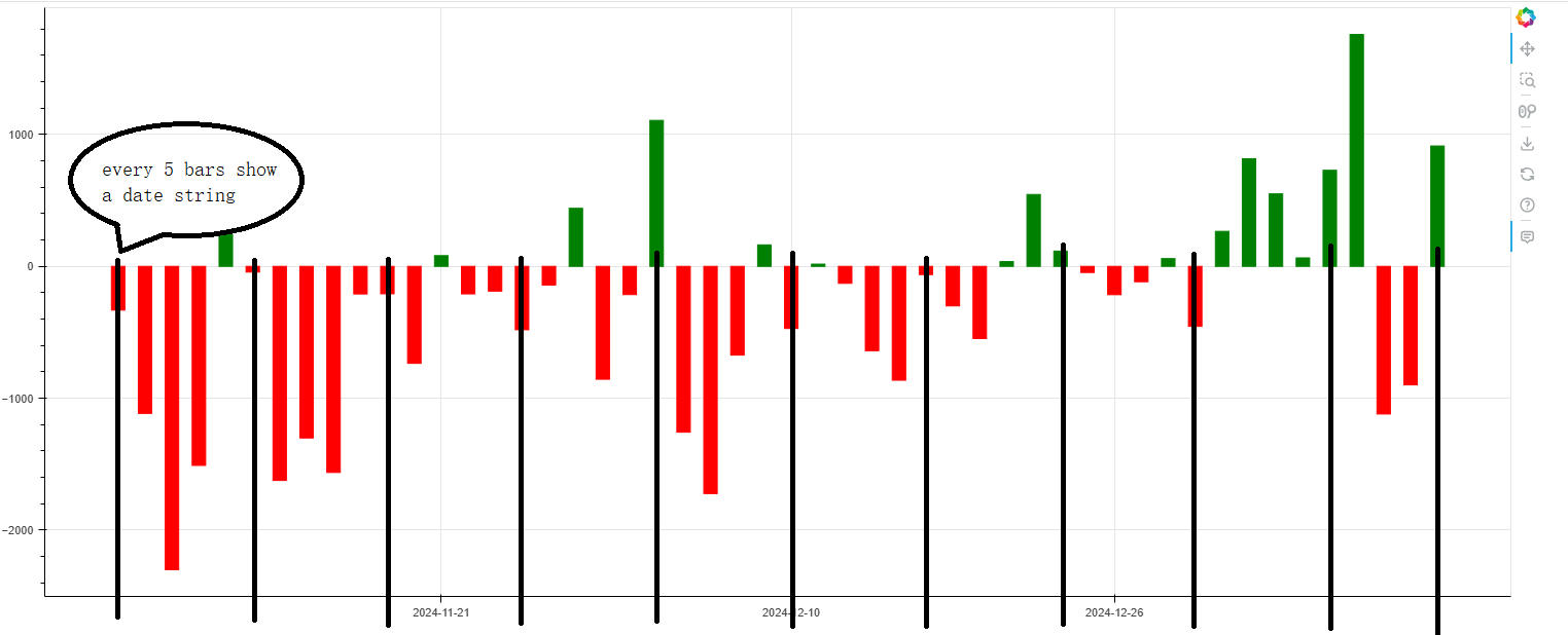
The code below is Bryan’s solution for missing dates on a bar chart. But it just show 3 date strings on the x-axis, if I want to add more date strings on the x-axis, given there’s enough space, maybe every 5 bars show a date string, can that be done?
just like that in this example bokeh.sampledata.stocks
from bokeh.plotting import figure, show
from bokeh.models import HoverTool, Range1d, ColumnDataSource, CustomJSTicker, CustomJSTickFormatter
from bokeh.models import DatetimeTickFormatter, NumeralTickFormatter

date = ["2024-11-05", "2024-11-06", "2024-11-07", "2024-11-08", "2024-11-11", "2024-11-12", "2024-11-13", "2024-11-14", "2024-11-15", "2024-11-18", "2024-11-19", "2024-11-20", "2024-11-21", "2024-11-22", "2024-11-25", "2024-11-26", "2024-11-27", "2024-11-28", "2024-11-29", "2024-12-02", "2024-12-03", "2024-12-04", "2024-12-05", "2024-12-06", "2024-12-09", "2024-12-10", "2024-12-11", "2024-12-12", "2024-12-13", "2024-12-16", "2024-12-17", "2024-12-18", "2024-12-19", "2024-12-20", "2024-12-23", "2024-12-24", "2024-12-25", "2024-12-26", "2024-12-27", "2024-12-30", "2024-12-31", "2025-01-02", "2025-01-03", "2025-01-06", "2025-01-07", "2025-01-08", "2025-01-09", "2025-01-10", "2025-01-13", "2025-01-14"]
x = list(range(len(date)))
y = [-331.6, -1114.8, -2299.9, -1509.2, 240.7, -43.2, -1623.2, -1301.2, -1562.6, -209.4, -208.1, -735.4, 81.4, -208.8, -187.7, -480.7, -141.4, 440.2, -855.7, -214.1, 1106.9, -1257.4, -1722.7, -672.9, 163.0, -471.0, 17.1, -128.7, -639.5, -863.1, -62.2, -299.9, -547.3, 36.3, 545.1, 116.0, -46.5, -214.8, -116.6, 58.9, -454.9, 265.5, 816.5, 549.9, 64.3, 728.6, 1758.3, -1119.4, -898.7, 912.9]
color = ["green" if a >= 0 else "red" for a in y]

source = ColumnDataSource(data=dict(x=x, y=y, date=date, color=color))

p = figure(width=1500)

p.vbar(x="x", top="y", color="color", width=0.5, bottom=0, source=source)

hover = HoverTool(tooltips=[("date", "@date"),( "value", "@y{"f"0.0""}")])
p.add_tools(hover)
# p.x_range = Range1d(x[-31], x[-1], bounds=(x[0]-1, x[-1]-0.25))
# p.y_range = Range1d(1.5 * min(y[-30:]), 1.5 * max(y[-30:]))
# p.xaxis[0].formatter = DatetimeTickFormatter(months="%b %Y")


# always three equally spaced ticks
p.xaxis.ticker = CustomJSTicker(
    args=dict(source=source),
    major_code="""
        const start = Math.max(cb_data.range.start, 0)
        const end = Math.min(cb_data.range.end, source.data.x.length-1)
        const d = (end-start) / 4
        return [Math.round(start+d), Math.round(start+2*d), Math.round(start+3*d)]
    """)

# use the tick (i.e index) to look up the date string
p.xaxis.formatter = CustomJSTickFormatter(
    args=dict(source=source),
    code="return source.data.date[tick] "
)

show(p)