Hi,
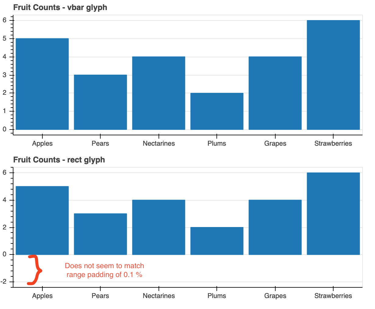
I have tried to use the rect glyph to make bar plot where the x-axis is Factorrange and the y-axis is normal DataRange1d. It works OK except I observe a lot of padding below the bars. On the screenshot I have a comparison of vbar (top) and rect using the same data. Both got range_padding of 0.1 and range_padding_unit of % and automatic scaling. Adjusting the value of range_padding does not help since it seems the padding is offset from the center of the highest bar.
It is possible to have the same kind of range padding as vbar and keeping the automatic scaling? Or is there a something I need to specify for the rectglyph that I am missing?
I use bokeh ver 2.2.3, python 3.8.1
from bokeh.io import output_file, show, save
from bokeh.plotting import figure
from bokeh.layouts import column

output_file("bars_vbar_vs_rect.html")

fruits = ['Apples', 'Pears', 'Nectarines', 'Plums', 'Grapes', 'Strawberries']
counts = [5, 3, 4, 2, 4, 6]
count_mid = [item*0.5 for item in counts]

def fig(title):
	p = figure(
		x_range = fruits,
		plot_height = 250,
		title = title,
		toolbar_location = None,
		tools = ""
	)
	p.xgrid.grid_line_color = None

	return p

def rng_info(rng):
	print(rng)
	print(rng.bounds)
	print(rng.range_padding)
	print(rng.range_padding_units)


p1 = fig("Fruit Counts - vbar glyph")
p1.vbar(x = fruits, top = counts, width = 0.9)

rng_info(p1.y_range)

p2 = fig("Fruit Counts - rect glyph")
p2.rect(x = fruits, y = count_mid, width = 0.9,	height = counts)

rng_info(p2.y_range)

save(column(p1, p2))