import pandas as pd
from bokeh.models import HoverTool
from bokeh.plotting import figure, show, output_file
from bokeh.models import Range1d

y= [-53.1, 290.2, 503.4, 545.4, 379.7, -515.9, -53.9, 17.0, -59.5, -381.1, 127.4, -121.6, -552.9, -329.2,
    -57.6, 52.3, 183.4, 42.8, -196.5, -17.2, 687.4, -50.3, -320.3, -323.7, -185.7, 56.0, -331.2, -366.6,
    -94.2, 90.9, -26.9, 40.7, -154.8, -130.5, -100.7, -303.1, -100.9, 6.9, -9.7, 130.9, -100.7, -105.6,
    13.1, 21.3, -59.3, -112.9, -172.3, -36.6, -92.4, 13.1, -29.6, 17.1, 1.2, -29.5, 24.7, 33.9, 159.7,
    77.9, 31.5, -158.7]

dates = ['2024-10-29', '2024-10-30', '2024-10-31', '2024-11-01', '2024-11-04', '2024-11-05', '2024-11-06',
         '2024-11-07', '2024-11-08', '2024-11-11', '2024-11-12', '2024-11-13', '2024-11-14', '2024-11-15',
         '2024-11-18', '2024-11-19', '2024-11-20', '2024-11-21', '2024-11-22', '2024-11-25', '2024-11-26',
         '2024-11-27', '2024-11-28', '2024-11-29', '2024-12-02', '2024-12-03', '2024-12-04', '2024-12-05',
         '2024-12-06', '2024-12-09', '2024-12-10', '2024-12-11', '2024-12-12', '2024-12-13', '2024-12-16',
         '2024-12-17', '2024-12-18', '2024-12-19', '2024-12-20', '2024-12-23', '2024-12-24', '2024-12-25',
         '2024-12-26', '2024-12-27', '2024-12-30', '2024-12-31', '2025-01-02', '2025-01-03', '2025-01-06',
         '2025-01-07', '2025-01-08', '2025-01-09', '2025-01-10', '2025-01-13', '2025-01-14', '2025-01-15',
         '2025-01-16', '2025-01-17', '2025-01-20', '2025-01-21']

x = []
fill_color = []
date_dic = {}
for i in range(60):
    x.append(i+1)
    if y[i] >= 0:
        fill_color.append('green')
    else:
        fill_color.append('red')
    date_dic[i+1] = dates[i][-5:]

p = figure(width=1500, height=400)

p.vbar(x=x, width=0.45, bottom=0, top=y, color = fill_color)
p.xaxis.ticker = x
p.xaxis.major_label_overrides = date_dic
hover = HoverTool(tooltips=[("date", "@x{w[x]}"),( "value", "@top{"f"0.0""}"),], )
p.add_tools(hover)
p.x_range = Range1d(x[-30]-0.75, x[-1]+1, bounds=(x[0]-1, x[60-1]+0.75))
p.y_range = Range1d(1.5 * min(y[-30:]), 1.5 * max(y[-30:]))
show(p)
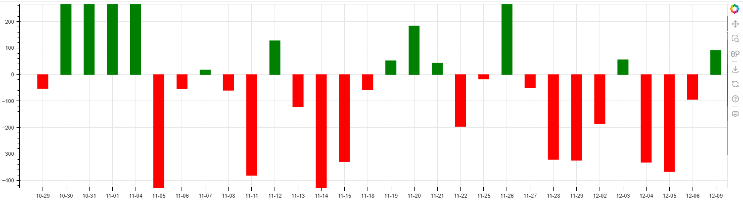
I have this bar chart using the recent 30 days’ max and min value for setting the Y axis’s range, but when I want to view previous records, the bar could sometimes has out of bounds problem. Could there be a way of changing Y axis’s range base on the data on the graph?