Another version with improved tooltips:
import numpy as np
import pandas as pd
from bokeh.io import show
from bokeh.plotting import figure
from bokeh.models import ColumnDataSource, HoverTool
from datetime import datetime
df = pd.DataFrame(data = np.random.rand(10, 3),
columns = (‘Argentina’, ‘Turkey’ , ‘Mexico’),
index = pd.DatetimeIndex(start = ‘31-01-2018’, periods = 10, freq = ‘m’))
source = ColumnDataSource({‘date’: [df.index.values] * len(df.columns),
‘countries’: [‘Argentina’, ‘Turkey’ , ‘Mexico’],
‘data’: [df[name].values for name in df],
‘colors’: [‘red’, ‘green’, ‘blue’] * len(df.columns)})
p = figure(plot_width = 1000, x_axis_type = “datetime”, tools = ‘hover’)
multilines = p.multi_line(xs = ‘date’, ys = ‘data’, color = ‘colors’, source = source)
circles1 = p.circle(df.index.values, df[‘Argentina’].values, legend = ‘Argentina’, color = ‘red’, size = 8)
circles2 = p.circle(df.index.values, df[‘Turkey’].values, legend = ‘Turkey’, color = ‘green’, size = 8)
circles3 = p.circle(df.index.values, df[‘Mexico’].values, legend = ‘Mexico’, color = ‘blue’, size = 8)
hover = p.select(dict(type = HoverTool))
hover.renderers = [circles1, circles2, circles3]
hover.tooltips = [(‘Date’, ‘@x{%F}’), (‘Value’, ‘@y’)]
hover.formatters = {‘x’: ‘datetime’, ‘y’: ‘printf’}
show(p)
``
···
On Friday, November 23, 2018 at 10:16:17 PM UTC+1, tony halik wrote:
import numpy as np
import pandas as pd
from bokeh.io import show
from bokeh.plotting import figure
from bokeh.models import ColumnDataSource, HoverTool
df = pd.DataFrame(data = np.random.rand(10, 3),
columns = (‘Argentina’, ‘Turkey’ , ‘Mexico’),
index = pd.DatetimeIndex(start = ‘31-01-2018’, periods = 10, freq = ‘m’))
source = ColumnDataSource({‘date’: [df.index.values] * len(df.columns),
‘countries’: [‘Argentina’, ‘Turkey’ , ‘Mexico’],
‘data’: [df[name].values for name in df],
‘colors’: [‘red’, ‘green’, ‘blue’] * len(df.columns)})
p = figure(plot_width = 1000, x_axis_type = “datetime”, tools = ‘hover’)
p.multi_line(xs = ‘date’, ys = ‘data’, color = ‘colors’, source = source)
p.add_tools(HoverTool(tooltips = [(‘Country’, ‘@countries’), (‘Dates’, ‘@date’), (‘Values’, ‘@data’)]))
show(p)
``
On Friday, November 23, 2018 at 6:11:35 AM UTC+1, Scott Pritchard wrote:
Thanks Tony, but that would seem to work for only one country (in your example, Argentina).
On Friday, November 23, 2018 at 1:50:19 AM UTC+2, tony halik wrote:
I didn’t have time to figure out the exact solution but maybe this simplified code can help you on your way:
import pandas as pd
import numpy as np
from bokeh.plotting import figure
from bokeh.models import ColumnDataSource, HoverTool
from bokeh.io import show
columns = [‘Argentina’, ‘Turkey’, ‘Mexico’]
dates = [‘2018-01-31’, ‘2018-02-28’, ‘2018-03-31’]
dates = [pd.to_datetime(x) for x in dates]
dates = [dates for x in range (10)]
np.random.seed(123)
data = np.random.rand(10, 3)
data = [[x, x, x] for x in data]
df = pd.DataFrame(columns = columns, data = data)
df[‘Date’] = dates
print df.to_string()
p = figure(plot_height = 400)
multilines = p.multi_line(xs = ‘Date’, ys = ‘Argentina’, color = [‘red’, ‘green’], source = ColumnDataSource(df))
p.add_tools(HoverTool(tooltips = [(‘Country’, ‘@Argentina’), (‘Date’, ‘@Date’)]))
show(p)
``
On Thursday, November 22, 2018 at 9:36:04 PM UTC+1, Scott Pritchard wrote:
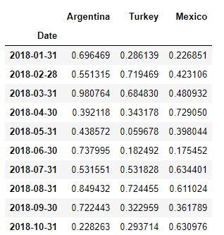
From a Pandas dataframe like the one below/attached, I’m simply trying to create a multi_line plot plus HoverTool; however, I can’t find any examples similar to my specific case. Here is my sample code:
import pandas as pd
import numpy as np
# Dataframe (just toy data, this will be an import of a much larger dataset)
index = ['2018-01-31', '2018-02-28', '2018-03-31', '2018-04-30', '2018-05-31',
         '2018-06-30', '2018-07-31', '2018-08-31', '2018-09-30', '2018-10-31']

columns = ['Argentina', 'Turkey', 'Mexico']

np.random.seed(123)
data = np.random.rand(10, 3)

df = pd.DataFrame(index=index, columns=columns, data=data)
df.index = pd.to_datetime(df.index)
df.index.name = 'Date'

# Attempt at plot (obviously doesn't work)
from bokeh.plotting import figure
from bokeh.models import ColumnDataSource, HoverTool
from bokeh.io import output_notebook, show
output_notebook()

source = ColumnDataSource(df)

p = figure(plot_height=400)
p.multi_line(xs='Date', ys=columns, source=source)

p.add_tools(HoverTool(tooltips=[('Country', '@???'),
                                ('Date', '@Date'),
                                ('Value', '@???')]))

show(p)