How to highlight a selected area in the graph and finding max-min values with using Bokeh?

I plotted a line graphs with using bokeh on Python. I want to highlight and take the values (Max-Min values) of the selected areas with “Box Select tool” like shown below. when I choose a certain section on the graph with “box select tool” the color of the selected part does not change. How to solve this problem?

import numpy as np
import pandas as pd
from bokeh.plotting import figure,show,output_file
from bokeh.models import ColumnDataSource


output_file("PlottingTest.html")

dataset     = pd.read_csv("data.csv")
    
data        = dataset.iloc[:,3]
time        = np.linspace(1, 500, num = 500)

TOOLS       ="pan,wheel_zoom,reset,hover,poly_select,xbox_select,lasso_select"
s1          = ColumnDataSource(data=dict(x=time, y=data))
p           = figure(title = 'Test',x_axis_label = 'time', y_axis_label='csv Data',plot_width=1000, plot_height=500,tools=TOOLS)
p.line      ('date', 't1', source=s1, selection_color="orange")

   
p.line(time, data, legend_label="Current", line_width=1)


p.toolbar.autohide = True
show(p)

There are a number of ways to do this, but see my take on it here. I think your initial framework was good (e.g. having two sources, one for an orange selected line and another for the main blue line etc.). What was missing was the CustomJS component to execute what you want (i.e. update the source driving the selected line and also extract the min/max value of the selection). What was also missing was a little trick in creating a scatter renderer with 0 alpha running off the same main source as the main blue line. That way the selection tool can grab specifically the indices you selected.

Read the comments etc in the code to see the logic.

“”"

import numpy as np
import pandas as pd
from bokeh.plotting import figure,show,output_file
from bokeh.models import ColumnDataSource,CustomJS


output_file("PlottingTest.html")

#making random data
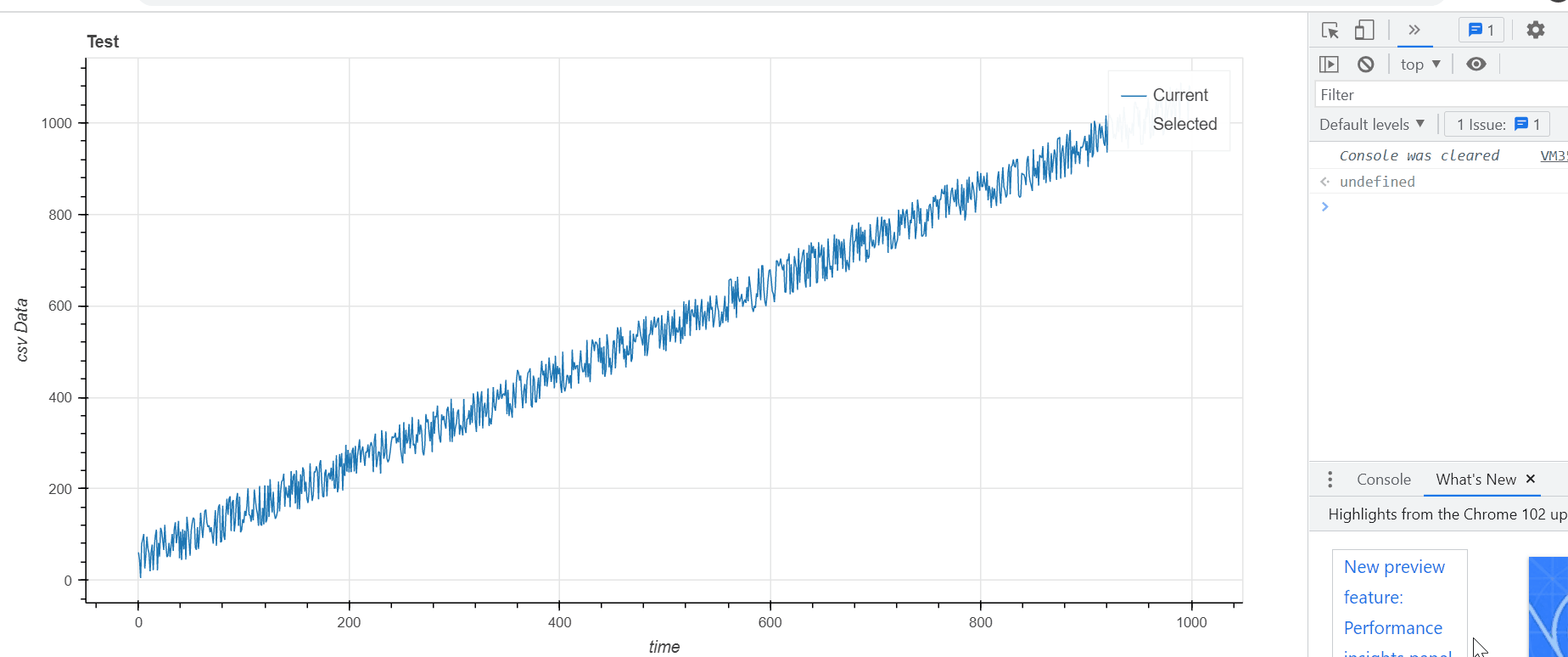
dataset     = pd.DataFrame(data={'time':range(1000),'data':np.random.random(1000)*100+np.arange(1000)})
    

TOOLS       ="pan,wheel_zoom,reset,hover,poly_select,xbox_select,lasso_select"
s1          = ColumnDataSource(data=dataset) 
p           = figure(title = 'Test',x_axis_label = 'time'
                     , y_axis_label='csv Data',plot_width=1000, plot_height=500,tools=TOOLS)

#create a line renderer of all data, pointing to s1 as the source
line_rend = p.line('time', 'data', legend_label="Current", line_width=1,source=s1)
#next step is to make the selection/nonselection glyphs of this line renderer identical to the "normal" line renderer
line_rend.selection_glyph = line_rend.glyph
line_rend.nonselection_glyph = line_rend.glyph

#now make a scatter renderer with zero alpha driving off the same ColumnDataSource
scatter_rend = p.scatter('time','data',fill_alpha=0,source=s1,line_alpha=0)
#do the the exact same thing as about with the selection glyphs and non selection glyphs
scatter_rend.selection_glyph = scatter_rend.glyph
scatter_rend.nonselection_glyph = scatter_rend.glyph

#now create a "selection source" (you had something like this already)
#initialize with no data
sel_src = ColumnDataSource(data={'time':[],'data':[]})
#make a renderer running off this source, orange line
sel_line_render = p.line('time','data',legend_label='Selected',line_color='orange',source=sel_src)

#now the JS component
#basically the alpha 0 scatter glyph will allow the selection tool to grab selected indices from s1
#we use those selected indices to collect the corresponding values from s1 for the time and data fields
#and push those values into arrays ("sel_time" and "sel_data")
#use Math.min etc to get the min/max values from that array... (not sure what you want to do with it but I have it logging in the console)
#then use the sel arrays to populate the sel_src, which your orange line is running off of... so it'll do what you want
cb=CustomJS(args=dict(s1=s1,sel_src=sel_src)
            ,code='''
            var sel_inds = s1.selected.indices
            var sel_time = []
            var sel_data = []
            for (var i=0;i<s1.selected.indices.length;i++){
                    sel_time.push(s1.data['time'][sel_inds[i]])
                    sel_data.push(s1.data['data'][sel_inds[i]])}
            console.log('Min of selection:')
            console.log(Math.min(...sel_data))
            sel_src.data['time']= sel_time
            sel_src.data['data'] = sel_data
            sel_src.change.emit()
            ''')
#tell this callback to happen whenever the selected indices of s1 change
s1.selected.js_on_change('indices',cb)

p.toolbar.autohide = True
show(p)

sel_line

2 Likes

Thank you so much with your help and explanations you wrote on the code, it helped me a lot to understand the concept but I got one more question. If we want to add more lines with the same properties to the graph, do we have to repeat all these steps for each data we want to plot or is there any shorter way?

Well there are a few ways to shortcut it:

Simplest would be to just to functionize this routine on the python side (basically just write a generalized def for the above), then you call it everytime you need to make a line that has this feature.

Another option would be a 3 CDS, MultiLine–>Scatter–>MultiLine approach for an arbitrary number of lines. In theory you could:

  1. Assemble your multiple lines into a CDS for a MultiLine glyph (takes an array of arrays for coords), and include a “LineID” field in the CDS as well.

  2. Then make a second source, of an “exploded” (i.e. flat/ see pandas.DataFrame.explode — pandas 1.4.2 documentation) version of the MultiLine source. Make a scatter glyph from it.

  3. Then instantiate another MultiLine glyph with another CDS that contains a full list of all your unique lineIDs, and empty arrays for xs and ys (i.e. initializing having no selection)

  4. Then for the callback collect each selected item from the scatter source, and assemble the corresponding array of arrays for 3)'s xs and ys (i.e. collect the selected xs’s and ys’s for each lineID (and get the aggregation like min/max along the way too).

A lot more involved but might be rewarding to try and implement.

1 Like

I followed your instructions but When I functionize the code and run it, it opens graphs in the different tabs. I want to see “Value1”, “Value2” and “Value 3” in the same graph against time at same tab

Just ensure you are passing the same figure instance to the function. It should be something like

def add_minmax_line(figure,df,x_field,y_field):
    src = ColumnDataSource(df)
    sel_src = ...
    line_rend = figure.line(x=x_field,y=y_field, source=src)
    #and so on with the equiv scatter and the callback

#make the "main figure"

f = figure()
#.... do the formatting of the figure, adding tools etc.
dataset1 = pd.Dataframe({'bananas':[0,1,2],'oranges':[10,8,3])
#pass the instance of the figure to your function
add_minmax_line(figure=f, df=dataset, x_field='bananas', y_field='oranges')

The CDS property itself (and thus the parameter to the CDS initializer) is always data. The value of data is a dict (e.g. which may have its own "data1" key inside).

2 Likes

This topic was automatically closed 90 days after the last reply. New replies are no longer allowed.