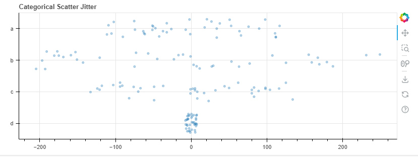
Based on the example plot (the link I mentioned previously), I want to make the column name (a,b,c,d) to be the y-axis on the left side as category and the y variable to be the x axis of the plot.
@Mxzero_mxzero I don’t really understand what you are after. The description and data above don’t match up in a clear way to the scatter jitter example to me, and the fact that everything is just random series makes the question too abstract to try speculate.
All I can really do is to suggest looking at the data from the example itself for inspiration:
In [1]: from bokeh.sampledata.commits import data

In [2]: data
Out[2]:
                           day      time
datetime
2017-04-22 15:11:58-05:00  Sat  15:11:58
2017-04-21 14:20:57-05:00  Fri  14:20:57
2017-04-20 14:35:08-05:00  Thu  14:35:08
2017-04-20 10:34:29-05:00  Thu  10:34:29
2017-04-20 09:17:23-05:00  Thu  09:17:23
...                        ...       ...
2013-01-24 17:08:57-06:00  Thu  17:08:57
2013-01-21 16:22:39-06:00  Mon  16:22:39
2013-01-03 16:28:49-06:00  Thu  16:28:49
2013-01-02 17:46:43-06:00  Wed  17:46:43
2012-12-29 11:57:50-06:00  Sat  11:57:50
There is just one dataframe, with all the data. It has the y-coordinate (the day name) in one column "day", and the corresponding x-coordinate (a time of day) in another column "time". The there is just one line to plot everything:
Note that the jitter is applied automatically on the JavaScript side by including the jitter function. There is never any random jitter computed or manually applied in Python.
I manage to achieve (somehow) what I want just now, by transforming (melt) my sample data into something similar in the given example like what you mentioned.
However, I am curious is there a way to pull this off without transforming the dataset? Because it makes my dataset longer.
Once again, sorry for the ambiguity since this is my curiosity on learning bokeh.
Thank you!
Not really in any useful way in this case. Data points have to be jittered individually so you have to actually have a real y coordinate to jitter for every x value. You can’t get away with, say, calling p.scatter four times, each with a single y value.
Using the same dataset from above, what if there are another column, lets say “LOC” which is an integer value column consist of how many line of code committed at that time.
The dataset will look something like this:
from bokeh.sampledata.commits import data
data['loc'] = np.random.randint(20, 301, size=len(data))

# the data will be transformed like this
datetime                    day time        loc
2017-04-22 15:11:58-05:00	Sat	15:11:58	75
2017-04-21 14:20:57-05:00	Fri	14:20:57	189
2017-04-20 14:35:08-05:00	Thu	14:35:08	129
2017-04-20 10:34:29-05:00	Thu	10:34:29	269
2017-04-20 09:17:23-05:00	Thu	09:17:23	73
...
How can I change the color of each scatterplot in each category (day) to something like grey-green where as the grey indicates a lower amount of LOC committed that day, and the green indicates higher amount?
(The min value and max value should be should be relative to the min or max of LOC that day)
I already did some digging and linear color map seems to do that, but I don’t know how to apply different color map for each category.
That’s kinda more a pandas-related question → You’re right that linear_cmap (which is just a transform application of LinearColorMapper) is the route. The nuance of your question is that you want the color to be scaled based on the min/max of each particular category (i.e. the day).
My pandas-side solution is to just pre calculate the percentile of each loc using pandas’ groupby-agg. Instead of pointing linear_cmap to the loc field, you pre-calculated each loc’s relative value based on the min/max of the day it belongs to, then pass that to the linear cmap instead:
from bokeh.models import ColumnDataSource
from bokeh.plotting import figure, show
from bokeh.sampledata.commits import data
from bokeh.transform import jitter
import numpy as np
from bokeh.transform import linear_cmap
from bokeh.palettes import Greens

DAYS = ['Sun', 'Sat', 'Fri', 'Thu', 'Wed', 'Tue', 'Mon']

data['loc'] = np.random.randint(20, 301, size=len(data))


#scale loc based on it's percentile per day
gb = data.groupby('day').agg({'loc':['min','max']}) #get min and max for each day
#pandas reindexing stuff
gb.columns = ['min','max']
gb = gb.reset_index()
#merge back to data
data = data.merge(gb,how='inner',on='day')
#calculate percentile
data['p'] = (data['loc']-data['min'])/(data['max']-data['min'])

source = ColumnDataSource(data)

p = figure(width=800, height=300, y_range=DAYS, x_axis_type='datetime',
           title="Commits by Time of Day (US/Central) 2012-2016")
#creates a transform that will transform field_name p into a hex color using the Greens palette
cmap = linear_cmap(field_name='p',low=0,high=1,palette=Greens[9])

p.scatter(x='time', y=jitter('day', width=0.6, range=p.y_range)
          , fill_color=cmap #assign the transform to the fill_color
          ,source=source, alpha=0.3)

p.xaxis.formatter.days = ['%Hh']
p.x_range.range_padding = 0
p.ygrid.grid_line_color = None

show(p)
There are definitely means of doing this on the JS-side using a CustomJSTransform but would be considerably more involved.
CategoricalColorMappercould also be an option here, but you’d need to convert the numerical data into some (string) factor for each point, e.g. “low” for points under the threshold, etc. There is an open issue to allow integers factors in addition to string values, but for now only string values are supported. There are come examples to refer to here.
Another possibility might be CustomJSExpr but I’ve never personally tried using it with non-numeric values (e.g. colors) so I don’t know if there are any pitfalls.
That would probably be an option. To be completely honest, I don’t clearly recall the distinction between expressions and transforms. AFAICT transforms always act on a CDS column and expression can just generate data on the fly however it wants (which could include referring to a CDS column, if desired).