So I’m trying to create a plot with BokehJS. This plot needs 3 axes (left, right, bottom):
The plot looks like this
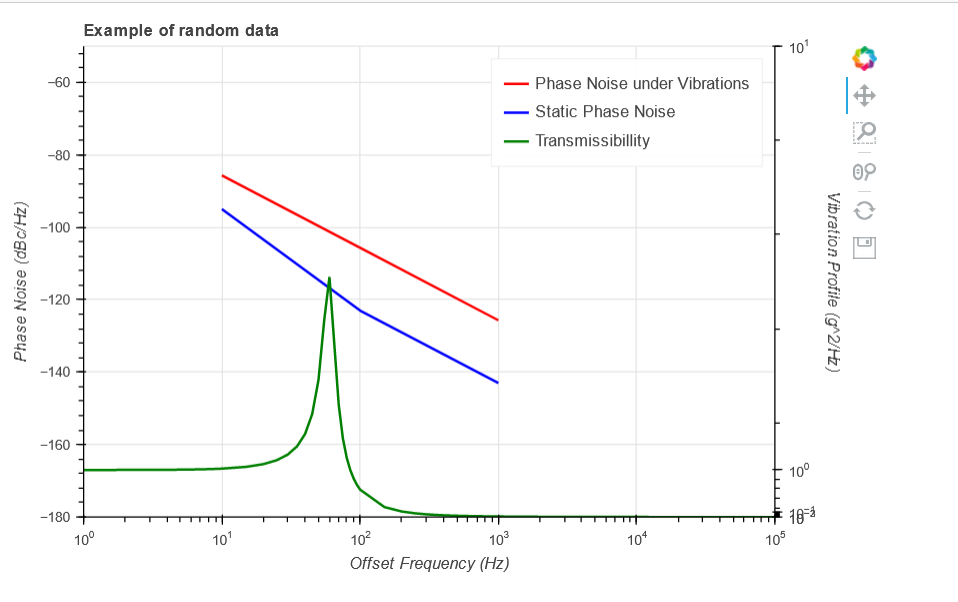
As you can see, the right y-axis is pretty ugly, you can’t read any data from towards the bottom as the tickers are bunched up.
How can I make the tickers equidistant from each other while keeping it as a log scale?
This is how im creating my plot and lines
const plot = Bokeh.Plotting.figure({
                    title: 'Example of random data',
                    tools: "pan,wheel_zoom,box_zoom,reset,save",
                    toolbar_location: "right",
                    toolbar_sticky: false,
                    height: 450,
                    width: 700,
                    outerWidth: 800,
                    legend_location: "top_left",
                    x_range: xdr,
                    y_range: ydr,
                    x_axis_type:"log",
                    x_axis_label: "Offset Frequency (Hz)",
                    y_axis_type: "linear",
                    y_axis_label: "Phase Noise (dBc/Hz)",
                    extra_y_ranges: {y2_range}
                });
//Add the second y axis on the right
const second_y_axis = new Bokeh.LogAxis({y_range_name:"y2_range", axis_label:'Vibration Profile (g^2/Hz)', x_range: xdr});


plot.add_layout(second_y_axis, "right");

// add line for vibraiton phase noise
plot.line({ field: "x" }, { field: "y" }, {
    source: source,
    line_width: 2,
    line_color: "red",
    legend_label: "Phase Noise under Vibrations"
    });

//add line for static phase noise
plot.line({ field: "x" }, { field: "y" }, {
    source: source1,
    line_width: 2,
    line_color: "blue",
    legend_label: "Static Phase Noise"
    });

plot.line({ field: "x" }, { field: "y" }, {
    source: source2,
    line_width: 2,
    line_color: "green",
    y_range_name:"y2_range",
    legend_label: "Transmissibillity"
    });
My question is, how would I be able to make it so that the right y-axis displays better? Preferably I want each tick to be the same distance from each other (ie. space between 10^0 and 10^1 is the same as space between 10^1 and 10^2)
This post was also posted on StackOverflow: Here
Thanks