I am trying to analyze flow cytometry data with PyDev in Eclipse and the plotting aspect is driving me crazy.
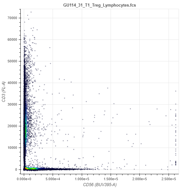
This was done with p = sample.plot_scatter(‘BUV395-A’, ‘FL-A’, source=‘raw’)
I need the X and y axis both on log scale but trying
p = figure(y_axis_type=“log” ,x_axis_type=“log”, x_range=(0,270000), y_range=(0,270000))
or any similar thing produces a validation check missing renderers error.
I changed it fro 0 to 1 now get a blank plot with log scale axes instead of nothing, but still have this error:
WARNING:bokeh.core.validation.check:W-1000 (MISSING_RENDERERS): Plot has no renderers:
I am using the webgl backend.
Could that be a problem?
They means you haven’t actually added any glyphs e.g. circle. Usually that’s a mistake so we we print a warning, but if you intend to have an empty plot with no glyphs you can just ignore if.
My goal is not to have an empty plot, but rather to have the data shown in my original post plotted on log scale.
This syntax came from FlowKit, and was used to generate the plot I showed:
p = sample.plot_scatter(‘BUV395-A’, ‘FL-A’, source=‘raw’)
It uses bokeh and works fine.
You can see the functionality where it colored the points according to density of data at that location, so it is not just circles of a single color.
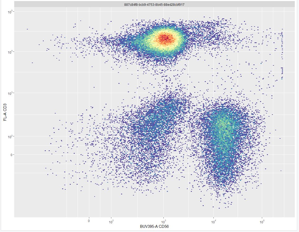
This is what it should look like and was plotted using R:
Your question is really unclear. Are you saying you used something called plot_scatter to generate Bokeh output? If so, plot_scatter is not a Bokeh API (e.g. I don’t know anything about it out what it is or is supposed to do). If it is part of some other package or tool, you would need to ask for help from the developers of that package, it’s not on-topic for this forum.
it is not just circles of a single color.
Bokeh can plot circles of any different sizes or colors but the Bokeh API for that is .circle (or .scatter) If you need help using .circle or .scatter that is something that is on-topic for this forum. But the first information you need to provide is the code for what you’ve already tried. There are lots of options and examples of scatters with varying colors in the docs and example repo.
Hello Bryan.
Thank you for taking the time to help me.
My apologies for being unclear, but I am completely new to this and got confused by the many levels of packaging.
I understand now that sample.plot_scatter a composite function that is calling bokeh and does not support axis rescaling, so let me rephrase the question in a way that you hopefully can answer by explaining what I am trying to do.
The flow cytometer simultaneously measures fluorescence in multiple channels and generates an array with the channels as columns and values for each data point as rows. The R plot above shows the data of 2 chanels plotted against each other on a logarithmic scale.
I want to do that in python with bokeh, so the question amounts to:
“How to I make a 2D scatter plot from a matrix or data frame where the axes are on a log scale”.
The coloring by density is not really mandatory, but would be nice.