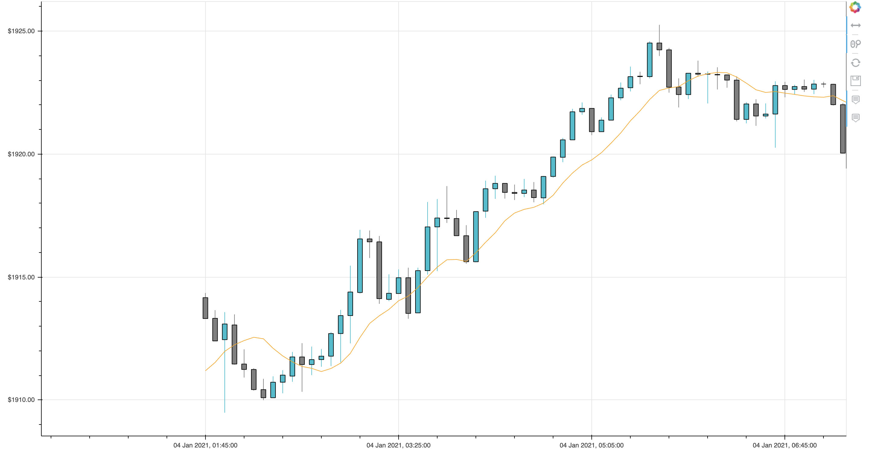
yes i have entry_price , entry_time , exit_price and exist time.
so my xaxis is time and yaxis is price.
import pandas as pd
from bokeh.io import output_file, show
from bokeh.plotting import figure
from bokeh.models import CustomJS, ColumnDataSource, HoverTool, NumeralTickFormatter , Span , Circle
from bokeh.transform import factor_cmap
import numpy as np

def candlestick_plot(df,df2, name):
    # Select the datetime format for the x axis depending on the timeframe
    xaxis_dt_format = '%d %b %Y'
    if df['Date'][0].hour > 0:
        xaxis_dt_format = '%d %b %Y, %H:%M:%S'

    fig = figure(sizing_mode='stretch_both',
                 tools="xpan,xwheel_zoom,reset,save",
                 active_drag='xpan',
                 active_scroll='xwheel_zoom',
                 x_axis_type='linear',
                 # x_range=Range1d(df.index[0], df.index[-1], bounds="auto"),
                 title=name
                 )
    fig.yaxis[0].formatter = NumeralTickFormatter(format="$5.3f")
    inc = df.Close > df.Open
    dec = ~inc

    # Colour scheme for increasing and descending candles
    INCREASING_COLOR = '#17BECF'
    DECREASING_COLOR = '#7F7F7F'
    # cmap = factor_cmap('returns_positive', COLORS, ['0', '1'])


    width = 0.5
    inc_source = ColumnDataSource(data=dict(
        x1=df.index[inc],
        top1=df.Open[inc],
        bottom1=df.Close[inc],
        high1=df.High[inc],
        low1=df.Low[inc],
        Date1=df.Date[inc]
    ))

    dec_source = ColumnDataSource(data=dict(
        x2=df.index[dec],
        top2=df.Open[dec],
        bottom2=df.Close[dec],
        high2=df.High[dec],
        low2=df.Low[dec],
        Date2=df.Date[dec]
    ))


    # Plot candles
    # High and low
    fig.segment(x0='x1', y0='high1', x1='x1', y1='low1', source=inc_source, color=INCREASING_COLOR)
    fig.segment(x0='x2', y0='high2', x1='x2', y1='low2', source=dec_source, color=DECREASING_COLOR)

    # Open and close
    r1 = fig.vbar(x='x1', width=width, top='top1', bottom='bottom1', source=inc_source,
                    fill_color=INCREASING_COLOR, line_color="black")
    r2 = fig.vbar(x='x2', width=width, top='top2', bottom='bottom2', source=dec_source,
                    fill_color=DECREASING_COLOR, line_color="black")

    # Add on extra lines (e.g. moving averages) here
    fig.line(df.index, df['sma10'] ,color='orange')


    # Add on a vertical line to indicate a trading signal here


    # vline = Span(location=df2.index[0], dimension='height',
    #              line_color="green", line_width=2)


#     fig.scatter(x="entry_time",
#          y="entry_price",
#          size=15,
#          source=df2,
#          # fill_color="red",
#          fill_alpha=0.5,
#          line_color="red",
#         )

#     fig.renderers.extend([vline])


    # Add date labels to x axis
    fig.xaxis.major_label_overrides = {
        i: date.strftime(xaxis_dt_format) for i, date in enumerate(pd.to_datetime(df["Date"]))
    }

    # Set up the hover tooltip to display some useful data
    fig.add_tools(HoverTool(
        renderers=[r1],
        tooltips=[
            ("Open", "$@top1"),
            ("High", "$@high1"),
            ("Low", "$@low1"),
            ("Close", "$@bottom1"),
            ("Date", "@Date1{" + xaxis_dt_format + "}"),
        ],
        formatters={
            'Date1': 'datetime',
        }))

    fig.add_tools(HoverTool(
        renderers=[r2],
        tooltips=[
            ("Open", "$@top2"),
            ("High", "$@high2"),
            ("Low", "$@low2"),
            ("Close", "$@bottom2"),
            ("Date", "@Date2{" + xaxis_dt_format + "}")
        ],
        formatters={
            'Date2': 'datetime'
        }))

    # JavaScript callback function to automatically zoom the Y axis to
    # view the data properly
    source = ColumnDataSource({'Index': df.index, 'High': df.High, 'Low': df.Low})
    callback = CustomJS(args={'y_range': fig.y_range, 'source': source}, code='''
        clearTimeout(window._autoscale_timeout);

        var Index = source.data.Index,
            Low = source.data.Low,
            High = source.data.High,
            start = cb_obj.start,
            end = cb_obj.end,
            min = Infinity,
            max = -Infinity;

        for (var i=0; i < Index.length; ++i) {
            if (start <= Index[i] && Index[i] <= end) {
                max = Math.max(High[i], max);
                min = Math.min(Low[i], min);
            }
        }
        var pad = (max - min) * .06;

        window._autoscale_timeout = setTimeout(function() {
            y_range.start = min - pad;
            y_range.end = max + pad;
        });
    ''')

    # Finalise the figure
    fig.x_range.callback = callback
    show(fig)
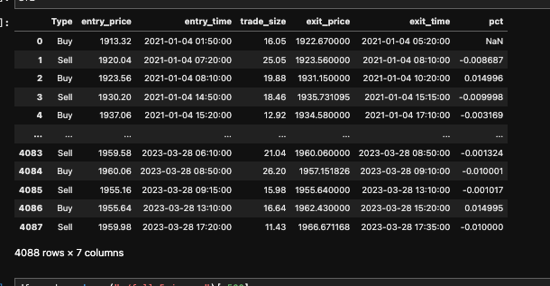
my trades df looks like this
so how can i plot this df ? on candlestick ?