How to plot data availability

I have 3 station names having the name ASD, AFD and CDF respectively(column-1). And each station has started recording the data from a day to another day(column 2 and 3)
.however in some days data recording has stopped because of power issue of the sensor, so there is gaps in the data (column 4 and 5)

I want to plot the data recording of each station from 2014-01-01 to 2019-01-01 and data gaps which is given below for each station input.csv

station    data_recording_start                       data_recording_end                        data_recording_stopped_from        data_recording_stopped_to
ASD        2014-01-01T00:12:00                    2019-01-01T00:12:00                           nan                                                             nan
ASD        2014-01-01T00:12:00                    2019-01-01T00:12:00                           2015-01-25T00:12:00                          2015-01-28T00:12:00
AFD        2015-01-01T13:12:00                    2019-01-01T00:12:00                           2015-01-25T00:12:00                          2015-01-28T00:12:00
CDF        2018-01-01T00:12:00                    2019-01-01T00:12:00                           2015-01-25T00:12:00                          2015-01-28T00:12:00

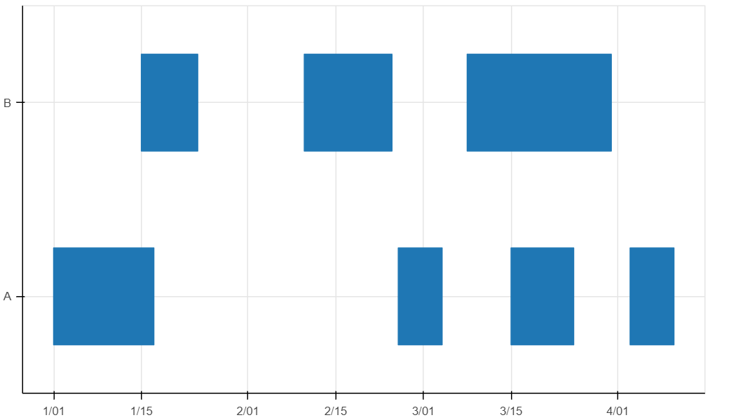
I want to plot a chart where the x -axis should contain the month and year and y -axis should contain the stations name. My plot should looks like this demo plot

I tried this script but it doesnot help me doing this work

import matplotlib.pylab as plt
import datetime
from matplotlib import dates as mdates
import pandas as pd 
import numpy as np

df = pd.read_csv('input.csv', header = 0,delimiter=r"\s+")
df.set_index('station').plot();

n = 3 # number of stations

df['Date'] = pd.to_datetime(df['station'])

After that i am unable to proceed as i am new to python and i didnot get any answer from pandas community and matplotlib, i hope experts may help me on this kind of plot.Thanks in advance.

Something like this perhaps? Read the comments and go through the components etc.

import pandas as pd
from bokeh.plotting import figure, save
from bokeh.models import ColumnDataSource

#make up some data similar to yours
df = pd.DataFrame(data={'Station':['A','A','A','A','B','B','B']
                        ,'DateStart':['1975-01-01','1975-02-25','1975-03-15','1975-04-03'
                                      ,'1975-01-15','1975-02-10','1975-03-08']
                        ,'DateEnd':['1975-01-17','1975-03-04','1975-03-25','1975-04-10'
                                      ,'1975-01-24','1975-02-24','1975-03-31']})
df['DateStart'] = pd.to_datetime(df['DateStart'])
df['DateEnd'] = pd.to_datetime(df['DateEnd'])

#using a quad glyph, which needs left, right, top and bottom fields to point to
#the "trick" is that when you assign a categorical y_range, the first category (i.e. Station 'A')
#will plot at y = 0.5, the second one (Station 'B') at y = 1.5, and so on
#so with that knowledge we can map top and bottom values
df['bot'] = df['Station'].map({'A':0.25,'B':1.25}) #you can adjust these to play with spacing/thickness etc
df['top'] = df['Station'].map({'A':0.75,'B':1.75})

#make a figure, with the key specs being x_axis_type datetime and y_range = a list of your unique stations IN THE CORRECT ORDER
f = figure(height=400,width=700
           ,x_axis_type='datetime',y_range=df['Station'].unique())
#make a datasource
src = ColumnDataSource(df)
#make the quad renderer/glyph on the figure, pointing to the respective fields, and the source to find them from
quad_rend = f.quad(left='DateStart',right='DateEnd',bottom='bot',top='top'
                   ,source=src)

save(f,'dataavail.html')

Makes a pretty ugly figure, but the core structure is there and the rest is just pretty formatting and labelling etc:

An hbar might be more ergonomic than a quad here, no need to futz with categorical coordinate offsets.

I looked at that, is there a way to make it “stack sideways” the way they want using that (i.e. with gaps etc)? I couldn’t figure it out offhand and resorted to lower level stuff as a result.

Dang, never mind, that was way easier/simpler:

import pandas as pd
from bokeh.plotting import figure, save
from bokeh.models import ColumnDataSource

#make up some data similar to yours
df = pd.DataFrame(data={'Station':['A','A','A','A','B','B','B']
                        ,'DateStart':['1975-01-01','1975-02-25','1975-03-15','1975-04-03'
                                      ,'1975-01-15','1975-02-10','1975-03-08']
                        ,'DateEnd':['1975-01-17','1975-03-04','1975-03-25','1975-04-10'
                                      ,'1975-01-24','1975-02-24','1975-03-31']})
df['DateStart'] = pd.to_datetime(df['DateStart'])
df['DateEnd'] = pd.to_datetime(df['DateEnd'])


#make a figure, with the key specs being x_axis_type datetime and y_range = a list of your unique stations IN THE CORRECT ORDER
f = figure(height=400,width=700
           ,x_axis_type='datetime',y_range=df['Station'].unique())
#make a datasource
src = ColumnDataSource(df)

hbr = f.hbar(left='DateStart',right='DateEnd',y='Station',height=0.25,source = src)

save(f,'dataavail.html')

No futzing this time.

1 Like

@seis statements like this require qualification. Do you mean that you just need the same genera presentation of horizontal bars on a standard datetime axis? If so then @gmerritt123 response above should have you covered. Or do you mean you need that same plot down to specifics like the unusual datetime axis on top? If so that’s possible but will probably take some effort.

Also, as an aside, the data format is somewhat confusing. I would expect a row for every interval with columns for station, start and stop times, plus a column to specify whether recording happened during that interval.

Thanks for the effort, however i need the months and year plot on the -axis and stations name on the y axis, moreover i need to show data availabble and data gaps in the period range by using the graph. I think it would be better if we draw a line from start date to end date and where the data gaps is there at that portion line will cut out.

@Bryan i need to plot the months and year as depicted in my demo figure

@gmerritt123 i need the year and months to be plotted on axis. Data gaps u have not plotted.

moreover i need to plot many years on x-axis not only one year, but our demo figure shows only single year data.

moreover i need to plot many years on x-axis not only one year, but our demo figure shows only single year data.

?

Your example plot has five years? Or do you mean the plot by @gmerritt123? If so that’s because he only happened to add one year of fake data for simplicity. If there were more actual data, it would show up just fine. Trying things out with your real data is something only you can do.

Data gaps u have not plotted.

Also confusing. The data gaps don’t need to be “plotted” they are are just the empty space between the bars. If that’s not what you want then you will need to explain your requirements in more detail. You could explicitly draw the gaps too, though, if you need a different color or something—but that is not what your example shows.

i need the year and months to be plotted on axis.

More clarification is still needed. If the plot by @gmerritt123 above had the same tick locations but every one had the corresponding year and month formatted, would that suffice? That would be simple to accomplish. Or do you need the “two-tiered” version with exactly 12 “ticks” that is visually exactly like the OP plot? If so, then you’d have to draw it “by hand” I think, and it would be some work. (It’s a specialized display and not a common need at all, so to be clear you should not expect it to be a simple few lines)

Edit: here are your simple options for axis:

  • Use a datetime axis. You can have two-tier with year on top but the axis is dynamic and will pick the tick locations for you, you won’t get one every single month at most zoom levels
  • Use a month-ticker to get ticks every month. You can’t get the “two-tiered” context this way but you can put the year on every tick (might need to rotate the ticks to avoid overlap)
  • Don’t use a built-in axis at all. You can draw that “axis” using Bokeh glyphs by hand.

yes i need two-tiered” version with exactly 12 like plot.

Data gaps are within the range of data, that i need to show: For example suppose i have data from 2014-01-01 to 2015-01-01 so at first i need to plot a continuous horizontal bar from 2014-01-01 to 2015-01-01. Then suppose data gaps is there from 2014-05-02 to 2014-06-01 so on the continuous horizontal bar this data gap portion should be blank.

Ok then your only option is to draw everything manually I am afraid.

2014-01-01 to 2015-01-01 so at first i need to plot a continuous horizontal bar from 2014-01-01 to 2015-01-01. Then suppose data gaps is there from 2014-05-02 to 2014-06-01

This goes back to my comment above about the weird data format. You should probably pre-process your data to the format I described above:

Also, as an aside, the data format is somewhat confusing. I would expect a row for every interval with columns for station, start and stop times, plus a column to specify whether recording happened during that interval.

Then you can just plot the rows that correspond to “recording” and the gaps show up correctly automatically.

my data format is in year-month-dayThr:mn:sec, please help if possible for the given data sets.

@seis That’s not what I am talking about at all. I am saying the columns that are defined are not very useful for what you want to draw. You should extract individual start/end values for every continuous interval of recording, separately, then you can plot those intervals directly using hbar (and then any gaps in between are automatically the gaps in your data).

This topic was automatically closed 90 days after the last reply. New replies are no longer allowed.