The task is to automate the Visualization. The CSV file contains large nos of features (column names e:g. 32 nos it may increase in future). The task is to plot Interactive Visualization. All the examples I found are hardcoded for the dynamic features selection.
But the requirement is to make the stuff dynamic. How to make it dynamic? Please guide.
I have successfully plotted the graph dynamically, but could not connect the interactive part. The code is as follows:
import pandas as pd
from bokeh.plotting import figure
from bokeh.io import show
from bokeh.models import CustomJS,HoverTool,ColumnDataSource,Select
from bokeh.models.widgets import CheckboxGroup
from bokeh.models.annotations import Title, Legend
import itertools
from bokeh.palettes import inferno
from bokeh.layouts import row

def creat_plot(dataframe):
    data=dataframe
    #Converting the timestamp Column to Timestamp datatype so that it can be used for Plotting on X-axis
    data['timestamp'] = pd.to_datetime(data['timestamp'])

    #Segregating Date and Time from timestamp column. It will be used in Hover Tool
    date = lambda x: str(x)[:10]
    data['date'] = data[['timestamp']].applymap(date)
    time= lambda x: str(x)[11:]
    data['time'] = data[['timestamp']].applymap(time)

    #Converting whole dataframe ColumnDatasource for easy usage in hover tool
    source = ColumnDataSource(data)

    # List all the tools that you want in your plot separated by comas, all in one string.
    TOOLS="crosshair,pan,wheel_zoom,box_zoom,reset,hover"

    # New figure
    t = figure(x_axis_type = "datetime", width=1500, height=600,tools=TOOLS,title="Plot for Interactive Features")

    #X-axis Legend Formatter
    t.xaxis.formatter.days = '%d/%m/%Y'

    #Axis Labels
    t.yaxis.axis_label = 'Count'
    t.xaxis.axis_label = 'Date and Time Span'

    #Grid Line Formatter
    t.ygrid.minor_grid_line_color = 'navy'
    t.ygrid.minor_grid_line_alpha = 0.1
    t.xgrid.visible = True
    t.ygrid.visible= True

    #Hover Tool Usage
    t.select_one(HoverTool).tooltips = [('Date', '@date'),('Time', '@time')]

    #A color iterator creation
    colors = itertools.cycle(inferno(len(data.columns)))

    #A Line type iterator creation
    line_types= ['solid','dashed','dotted','dotdash','dashdot']
    lines= itertools.cycle(line_types)

    column_name=[]
    #Looping over the columns to plot the Data
    for m in data.columns[2:len(data.columns)-2]:
        column_name.append(m)
        a=t.line(data.columns[0], m ,color=next(colors),source=source,line_dash=next(lines), alpha= 1)

    #Adding Label Selection Check Box List
    column_name= list(column_name)
    checkboxes = CheckboxGroup(labels = column_name, active= [0,1,2])


    show(row(t,checkboxes))
**The above code is executed on the following requirements:
- Bokeh version: 2.2.3
- Panda Version: 1.1.3
I need to plot the graph based on the value selected with the checkbox(s) .
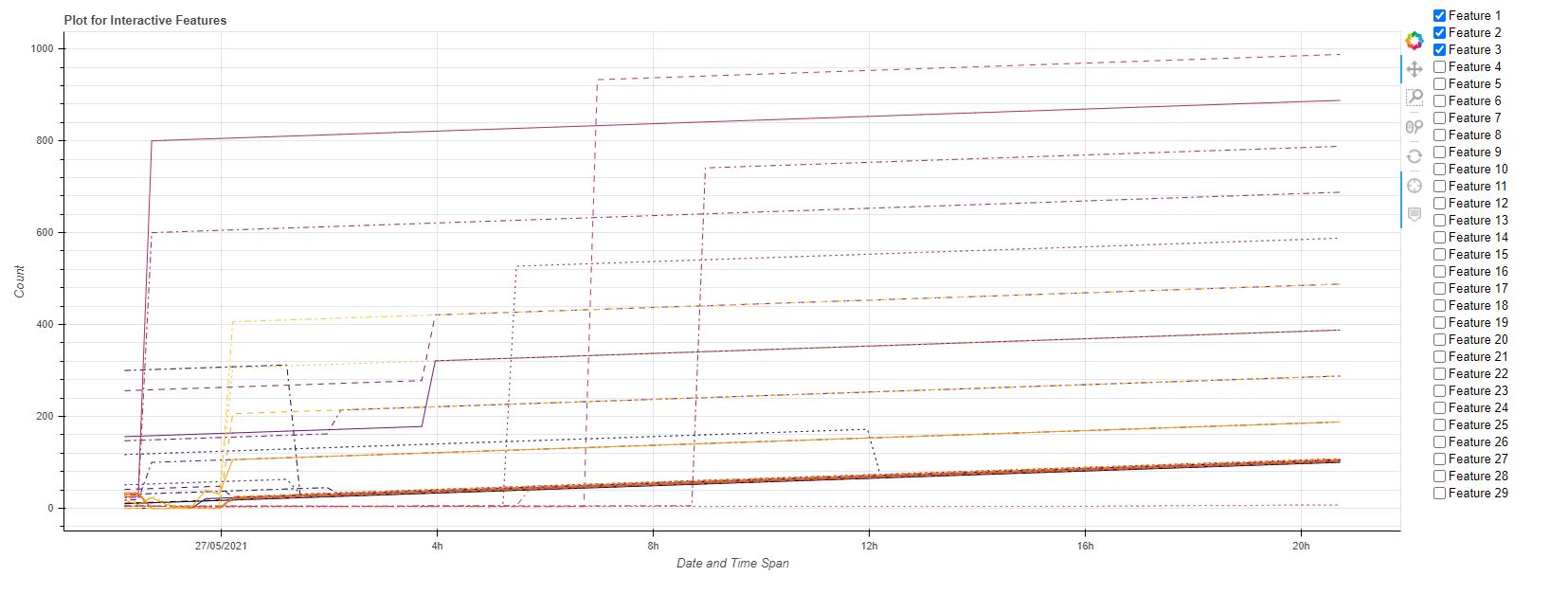
Figure attached.
For example: If the User will select Feature 1 Feature 2 and Feature 15 then the plot should showcase only the selected feature.
I stuck on this feature filteration. Please guide to accomplish this filtration of features.