Hello World,
I’m a bokeh beginner, and I’m stuck at creating a Bar chart the way I want.
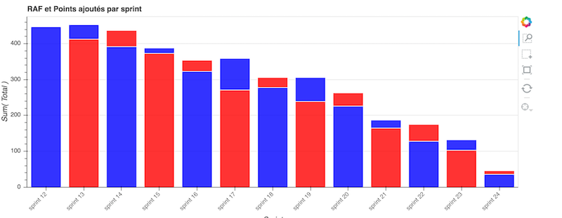
Here are my dataframe, named est :
···
±----±-----------±---------±-----±------+
> sprint | created | raf | cumul |
±----±-----------±---------±-----±------+
0 | sprint 12 | 0 | 447 | 447 |
1 | sprint 13 | 40 | 413 | 453 |
2 | sprint 14 | 45 | 392 | 437 |
3 | sprint 15 | 15 | 373 | 388 |
4 | sprint 16 | 31 | 323 | 354 |
5 | sprint 17 | 88 | 271 | 359 |
6 | sprint 18 | 28 | 278 | 306 |
7 | sprint 19 | 67 | 239 | 306 |
8 | sprint 20 | 37 | 226 | 263 |
9 | sprint 21 | 22 | 165 | 187 |
10 | sprint 22 | 47 | 128 | 175 |
11 | sprint 23 | 29 | 103 | 132 |
12 | sprint 24 | 10 | 36 | 46 |
±----±-----------±---------±-----±------+
It contains sprint datas of a developer team: created are the story points added to the backlog during the sprint, ‘raf’ means ToDo in french: this is the total of story points in the backlog to be done and cumul is simply the sum of the two.
I simply want to display a bar chart with, for each print, a bar with the RAF value and the created value on top of it. Here is what I do:
TOOLS = ‘box_zoom,box_select,crosshair,resize,reset’
bar = Bar(est,
values=blend(‘raf’,‘created’,name=‘total’,labels_name=‘bis’),
label=cat(‘sprint’, sort=False),
stack=cat(columns=(‘total’), sort=False),
color=color(columns=(‘total’),palette=[‘blue’, ‘red’], sort=False),
plot_width=950, plot_height=400, toolbar_location=‘right’, legend=None,tools=TOOLS,
title=“RAF et Points ajoutés par sprint”)
show(bar)
Sadly, the results is not OK. This is what I get: