Over the past year I’ve collected data such as average income and education level for all the municipalities in Flanders, and coupled this data to the federal election results from 2014 and 2019. The result is this website: wiestemtwat.be.
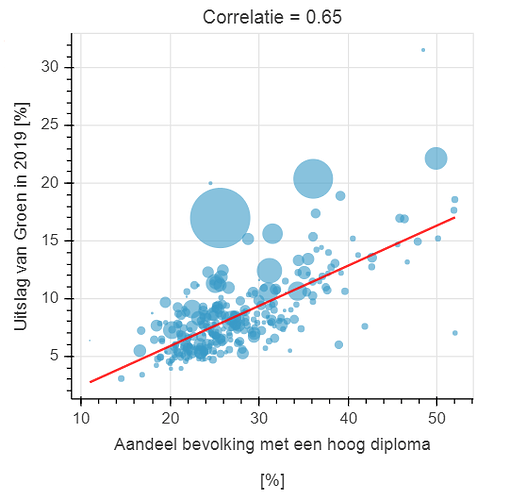
Users can select various factors and political parties, and create interesting plots such as themselves. As an example, this shows the correlation between the percentage of people in each municipality that has a higher education degree, and the results for the Green party:
Thanks to Bokeh, users can easily see which dot represents which municipality, a feature that was requested a lot! The main thing that I can share is that while line breaks in axis labels are not supported yet, I got around this by adding multiple titels to the plots. You can add titels below or to the side of plots, even multiple ones, so they can effectively function as labels!
Currently, the site is still only in Dutch, but I thought it might be interesting to showcase. Let me know if this is not suitable material.
