I finally found a way to make buttons work.
Now I just don’t know how to horizontally center buttons, does anyone knows how to do it? I tried with align=center for RadioButtonGroup but it does not work.
import numpy as np
from bokeh.layouts import column
from bokeh.models import ColumnDataSource, RangeTool, RadioButtonGroup, CustomJS
from bokeh.plotting import figure, show
from bokeh.sampledata.stocks import AAPL
dates = np.array(AAPL['date'], dtype=np.datetime64)
source = ColumnDataSource(data=dict(date=dates, close=AAPL['adj_close']))
p = figure(height=300, width=800, tools="xpan,xwheel_zoom,reset",
x_axis_type="datetime", x_axis_location="above", window_axis="x",
background_fill_color="#efefef", x_range=(dates[0], dates[-1]))
p.line('date', 'close', source=source)
p.yaxis.axis_label = 'Price'
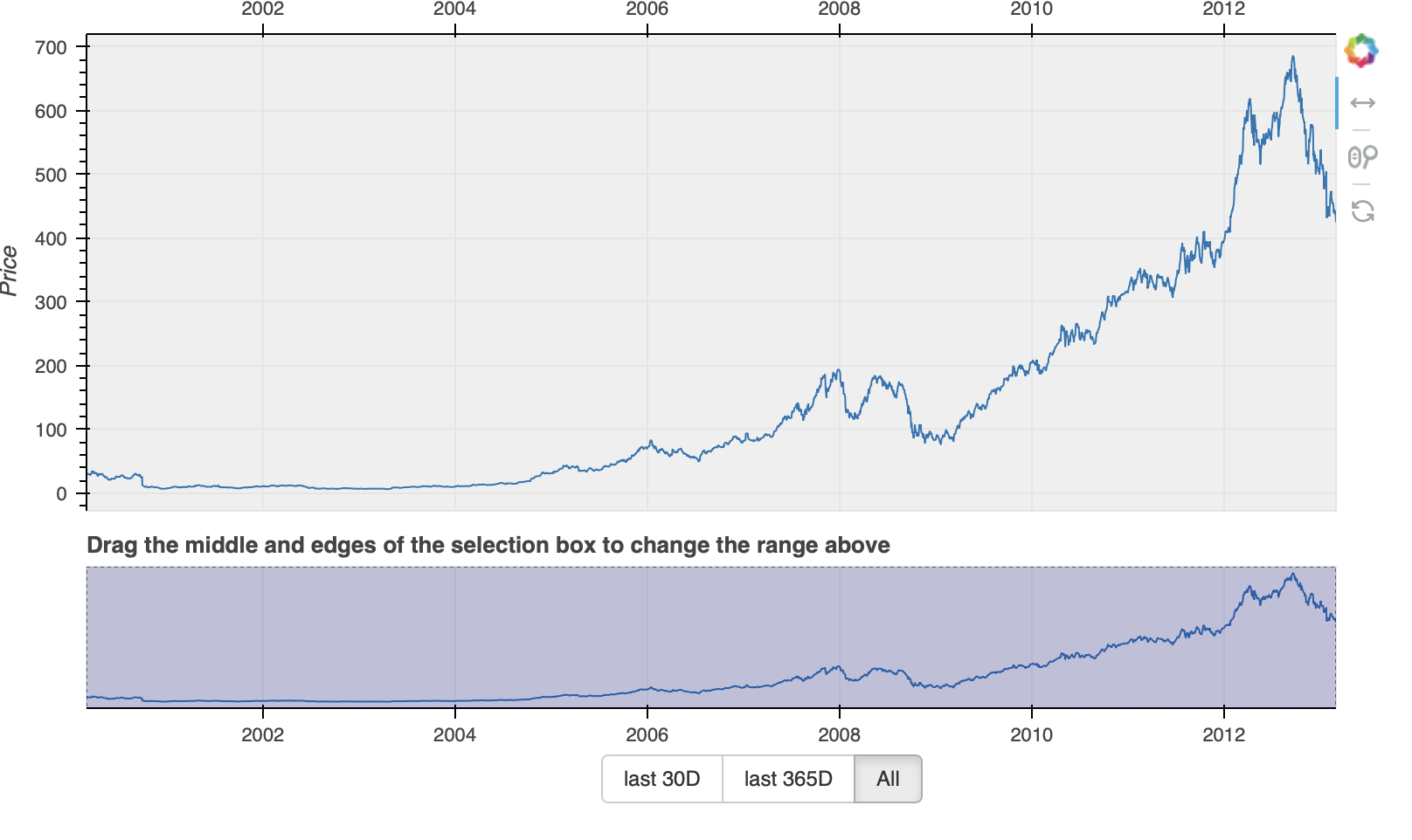
select = figure(title="Drag the middle and edges of the selection box to change the range above",
height=130, width=800,
x_axis_type="datetime", y_axis_type=None,
tools="", toolbar_location=None, background_fill_color="#efefef")
select.x_range.range_padding = 0
select.x_range.bounds = "auto"
range_tool = RangeTool(x_range=p.x_range, start_gesture="pan")
range_tool.overlay.fill_color = "navy"
range_tool.overlay.fill_alpha = 0.2
select.line('date', 'close', source=source)
select.ygrid.grid_line_color = None
select.add_tools(range_tool)
radio_button_group = RadioButtonGroup(labels=["last 30D", "last 365D", "All"], active=2, width=100, max_height=30)
radio_button_group.js_on_event(
"button_click",
CustomJS(
args=dict(source=source, p=p),
code="""
console.log('radio_button_group: active=' + this.origin.active, this.toString());
const data = source.data;
const last = new Date(data["date"][data["date"].length-1]);
console.log('last '+last);
const first = new Date(data["date"][0]);
console.log('first '+first);
const mid = new Date(last);
if(this.origin.active == 0) {
mid.setTime(mid.getTime() - (24*60*60*1000) * 30);
} else if (this.origin.active == 1) {
mid.setTime(mid.getTime() - (24*60*60*1000) * 365);
} else {
mid.setTime(first.getTime());
}
console.log('mid '+mid);
p.x_range.start = Date.parse(mid.toDateString());
p.x_range.end = Date.parse(last.toDateString());
p.x_range.change.emit();
"""
)
)
show(column(
children=[p, select, radio_button_group],
sizing_mode='stretch_both'))