import numpy as np
from scipy.stats import gaussian_kde
from bokeh.plotting import figure, show
from bokeh.models import LinearColorMapper, ColorBar, FixedTicker
from bokeh.io import output_notebook
from matplotlib import cm
from matplotlib.colors import to_hex
output_notebook() # Remove this line if running as .py script
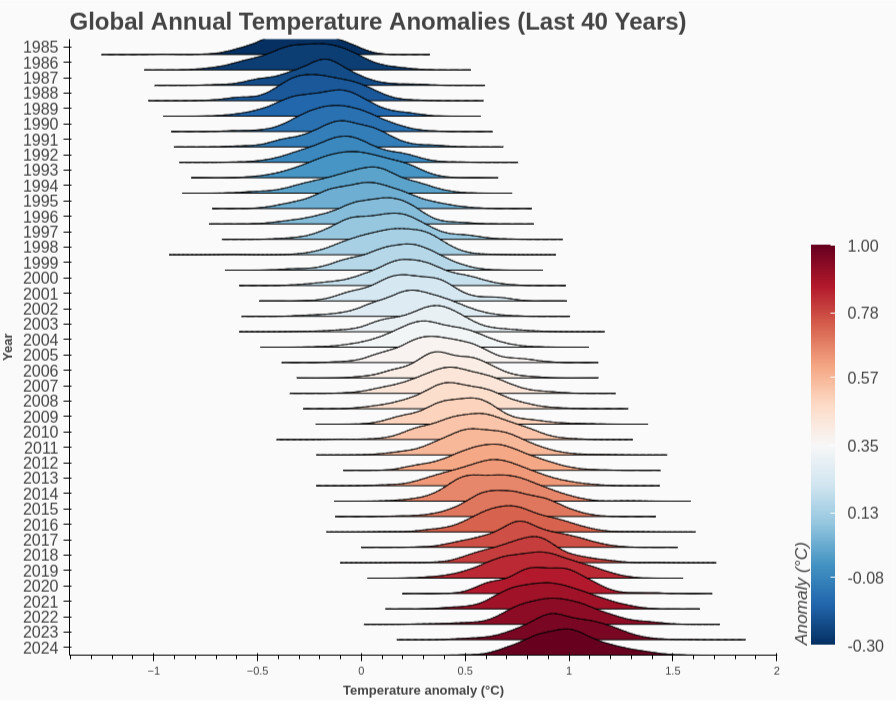
# --- 1. Setup years and simulate temperature anomaly data ---
N_YEARS = 40
years = np.arange(2024 - N_YEARS + 1, 2025) # 1985–2024
means = np.linspace(-0.3, 1.0, N_YEARS)[::-1] # Simulate increasing anomaly
data_per_year = [np.random.normal(loc=mu, scale=0.18, size=200) for mu in means]
# --- 2. Colormap setup ---
rdblue256 = [to_hex(cm.get_cmap('RdBu_r')(i/255)) for i in range(256)] # Blue (cold) to Red (warm)
min_anom, max_anom = float(min(means)), float(max(means))
color_mapper = LinearColorMapper(palette=rdblue256, low=min_anom, high=max_anom)
# --- 3. Bokeh figure setup ---
p = figure(
width=900,
height=700,
y_range=[str(y) for y in years[::-1]], # Newest year at top
x_axis_label="Temperature anomaly (°C)",
toolbar_location=None,
outline_line_color=None,
title="Global Annual Temperature Anomalies (Last 40 Years)"
)
# --- 4. Plot joyplots: LATEST year is on top ---
for i in reversed(range(len(years))):
year = years[i]
year_data = data_per_year[i]
mean_anom = means[i]
kde = gaussian_kde(year_data)
x = np.linspace(year_data.min() - 0.3, year_data.max() + 0.3, 300)
y = kde(x)
y_offset = i * 1.0
y_scaled = y / y.max() * 1.7
color = to_hex(cm.get_cmap('RdBu_r')((mean_anom - min_anom) / (max_anom - min_anom)))
p.patch(x, y_offset + y_scaled, color=color, alpha=1, line_color="black", line_width=1.0)
# --- 5. Style ---
p.yaxis.axis_label = "Year"
p.yaxis.major_label_text_font_size = "12pt"
p.xgrid.visible = False
p.ygrid.visible = False
p.background_fill_color = "#fafafa"
p.title.text_font_size = "18pt"
p.xaxis.axis_label_text_font_style = "bold"
p.yaxis.axis_label_text_font_style = "bold"
p.outline_line_alpha = 0
p.border_fill_color = '#fafafa'
# --- 6. Colorbar for anomaly color coding ---
color_bar = ColorBar(
color_mapper=color_mapper,
location=(0, 0),
width=24,
height=400,
title='Anomaly (°C)',
title_text_font_size="13pt",
major_label_text_font_size="12pt",
label_standoff=12,
ticker=FixedTicker(ticks=np.round(np.linspace(min_anom, max_anom, 7), 2)),
major_label_overrides={float(f"{v:.2f}"): f"{v:.2f}" for v in np.round(np.linspace(min_anom, max_anom, 7), 2)},
background_fill_color='#fafafa'
)
p.add_layout(color_bar, 'right')
show(p)
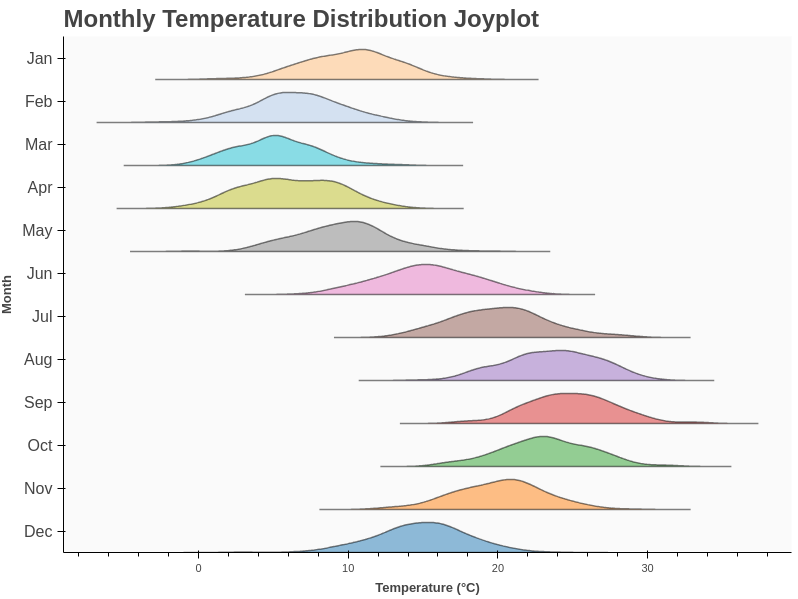
import numpy as np
from scipy.stats import gaussian_kde
from bokeh.plotting import figure, show
from bokeh.io import output_notebook

output_notebook()  # Remove if running as script

months = ["Jan", "Feb", "Mar", "Apr", "May", "Jun",
          "Jul", "Aug", "Sep", "Oct", "Nov", "Dec"]

# Use your favorite 12 colors
colors = [
    "#1f77b4", "#ff7f0e", "#2ca02c", "#d62728",
    "#9467bd", "#8c564b", "#e377c2", "#7f7f7f",
    "#bcbd22", "#17becf", "#aec7e8", "#ffbb78"
]

p = figure(
    width=800,
    height=600,
    y_range=months[::-1],
    x_axis_label="Temperature (°C)",
    toolbar_location=None,
    outline_line_color=None
)

for i, month in enumerate(months):
    # Simulate data for each month
    mean = 5 + 10 * np.sin((i / 12) * 2 * np.pi) + 10
    temps = np.random.normal(mean, 3, 200)
    # KDE for smooth curve
    kde = gaussian_kde(temps)
    x = np.linspace(temps.min()-4, temps.max()+4, 300)
    y = kde(x)
    # Offset
    y_offset = i * 1.0
    y_scaled = y / y.max() * 0.7
    p.patch(x, y_offset + y_scaled, color=colors[i], alpha=0.5, line_color="black", line_width=1.5)

# Style
p.yaxis.axis_label = "Month"
p.yaxis.major_label_text_font_size = "12pt"
p.xgrid.visible = False
p.ygrid.visible = False
p.background_fill_color = "#fafafa"
p.legend.visible = False
p.title.text = "Monthly Temperature Distribution Joyplot"
p.title.text_font_size = "18pt"
p.xaxis.axis_label_text_font_style = "bold"
p.yaxis.axis_label_text_font_style = "bold"
p.outline_line_alpha = 0

show(p)