Hi every one, I’am trying to show this:

This image represent how much satellites are in a point (longitude-latitude) through the day. Axis X is a whole day in minutes and Axis Y is quantity of satellites in that moment.
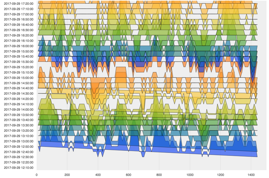
So I want to do this chart (just for GPS, I mean the blue one) in differents days. I was thinking represent this with a Joyplot. Using the code that attach I get the next figure.
Something I am wrong… It supposed each category is a day (same day, but different time) but seems is all are in the same category.

my code is:
from numpy import linspace
import bokeh
from scipy.stats.kde import gaussian_kde
from bokeh.io import output_file, show
from bokeh.models import ColumnDataSource, FixedTicker, PrintfTickFormatter
from bokeh.plotting import figure
#from bokeh.sampledata.perceptions import probly
bokeh.BOKEH_RESOURCES=‘inline’
import colorcet as cc
output_file(“joyplot.html”)
cats = g #ListOfTime # list(reversed(probly.keys())) #list([‘Pos_1’,‘Pos_2’]) #
print len(cats),’ lengh of times’
palette = [cc.rainbow[i*15] for i in range(16)]
palette += palette
print len(palette),‘lengh palette’
x = X # linspace(-20,110, 500) #Test.X #
print len(x),’ lengh X’
source = ColumnDataSource(data=dict(x=x))
p = figure(y_range=cats, plot_width=900, x_range=(0, 1500), toolbar_location=None)
for i, cat in enumerate(reversed(cats)):
y = EveryTest[i].GPS #joy(cat, pdf(x))
#print i,cat
source.add(y,cat)
p.patch(‘x’, cat, color=palette[i], alpha=0.6, line_color=“black”, source=source)
#break
#print source
p.outline_line_color = None
p.background_fill_color = “#efefef”
p.ygrid.grid_line_color = None
p.xgrid.grid_line_color = “#dddddd”
#p.xgrid.ticker = p.xaxis[0].ticker
p.axis.minor_tick_line_color = None
p.axis.major_tick_line_color = None
p.axis.axis_line_color = None
show(p)
``