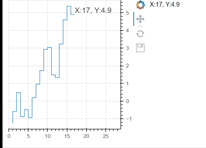
Hopefully this works for you. As mentioned above, you can’t overlay anything on an axis outside the plot area. I’ve presented two options below:
- use a div outside the plot, PRO: it’s outside the plot CON: it doesn’t move up/down etc
- use a label inside the plot, PRO: it moves up/down etc, CON: it’s inside the plot
For both, the real trick is to access the last value of the x/y arrays and update the label/glyph with that value.
from bokeh.layouts import column,row
from bokeh.plotting import figure, curdoc
from bokeh.models import ColumnDataSource, Plot,Div,Label, Range1d

import numpy as np

current_x = 0
current_y = 0
def generate_point():
	global current_x, current_y
	current_x += 1
	current_y += np.random.normal()
	return dict(x=[current_x], y=[current_y])

def stream_point():
    source.stream(generate_point())
    #update the div text outside the plot
    div.text = 'X:'+ str(source.data['x'][-1])+', Y:'+str(np.round(source.data['y'][-1],2))
    #update the label x-y coords
    lbl.x = source.data['x'][-1]
    lbl.y = source.data['y'][-1]
    # update the label text
    lbl.text = 'X:'+ str(source.data['x'][-1])+', Y:'+str(np.round(source.data['y'][-1],2))
    #expand the x_range so the label fits
    p.x_range.end= source.data['x'][-1]*1.7

p = figure(width=300, height=300, tools="pan,reset,save", y_axis_location="right")
#make the x_range follow a specific range, not a datasource (because we need to pad it on the right to fit the label)
p.x_range = Range1d(start=0,end=1)
source = ColumnDataSource(data=generate_point())
p.step(source=source)
#make the div and the label, add them to the layout and the figure respectively
div=Div(text='')
lbl=Label(x=current_x,y=current_y,text='X: '+str(current_x)+', Y: '+str(current_y))
p.add_layout(lbl)
doc = curdoc()
doc.add_periodic_callback(stream_point, 100)
doc.add_root(row(p,div))
Another kinda hacky idea (and I could flesh this out for you too if interested) would be to stick this info into a makeshift legend, which would put the value inside the plot located in the upper right or something like that…
Finally my last idea would be some kind of manipulation of the axis tick labels… @Bryan I’m wondering if you can splice in one “special” tick label for the current y value (in addition to the normally calculated tick labels) on the LinearAxis model attached to the figure’s y axis? and if you could even conditionally format that one “special” tick label (like make it bold or red or something. Probably not easily as I’m pretty sure it’s the JS side that decides what tick labels to use, but just another idea…