Hello everyone,
I’ve been stuck on this problems for days and I hope someone can suggest me a way to get out of this.
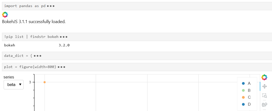
I need to create a minimal dashboard to show the distribution of data coming from different series, in order to do this I’m using a Select dropdown with a CustomJS callback that updates a figure. To show extra information, different colors are used to distinguish the points according to the values of a column and these values are displayed in a Legend.
Unfortunately, not all the series contain all the possible values for that column and this seems to create trouble to the Legend because, when updating the plot, it always shows all the possible values, but with a random color associated to the values that are missing for a specific series.
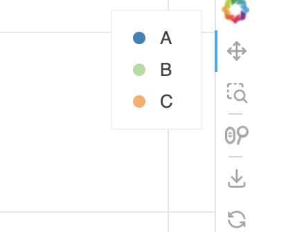
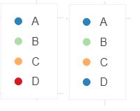
I’ll try to show an example hoping to be more clear. On the left you can see a Legend for a series that contains all the values (A, B, C, D) and it’s displayed correctly; on the right the Legend for a series that contains only A, B, C: as you can see it still shows the D value associated to a repeated color
I’m leaving a minimal working example to reproduce this issue
MWE
from bokeh.io import output_notebook, show
from bokeh.layouts import row
from bokeh.models import CategoricalColorMapper, ColumnDataSource, CustomJS, Select
from bokeh.palettes import Spectral4
from bokeh.plotting import figure

output_notebook()

data_dict = {
    'alpha': {
        'x': [2, 1, 4, 3],
        'y': [1, 2, 3, 4],
        'c': ['A', 'B', 'C', 'D']
    },
    'beta': {
        'x': [3, 2, 1],
        'y': [1, 2, 3],
        'c': ['A', 'B', 'C']
    }
}

df = pd.DataFrame(data=data_dict['alpha'])
source = ColumnDataSource(data=df)

plot = figure(width=800)

color_map = CategoricalColorMapper(factors=df['c'].unique(), palette=Spectral4)

o = plot.circle(x='x', y='y', source=source, size=6, legend_field='c', color={'field': 'c', 'transform': color_map})

select_series = Select(value='alpha', title='series', options=['alpha', 'beta'])

cb = CustomJS(args=dict(select_series=select_series, source=source, data_dict=data_dict), code="""
    const series = select_series.value

    const x = Array.from(data_dict[series]['x'])
    const y = Array.from(data_dict[series]['y'])
    const c = Array.from(data_dict[series]['c'])

    source.data = {x, y, c}
    source.change.emit()
""")

select_series.js_on_change('value', cb)

show(row(select_series, plot))
I’m fine with having either a “fixed” Legend that displays (correctly) all the values even if some of them are missing for the current plot or adding/removing items from it according to the data that it’s being currently displayed.
I remain at your disposal in case I haven’t been clear enough.
Thank you in advance!