Hello,
This is my first vizualisation made with bokeh.
I wanted to represent each country’s path to net zero in 2050 following their signature of the Paris agreement.
The goal was to use a simple interactive graph where users can choose which country they want to see the data representation of.
I thus coded this with Bokeh and some javascript and I am pretty happy with the result. It is simple yet contains all the functionality that it needs.
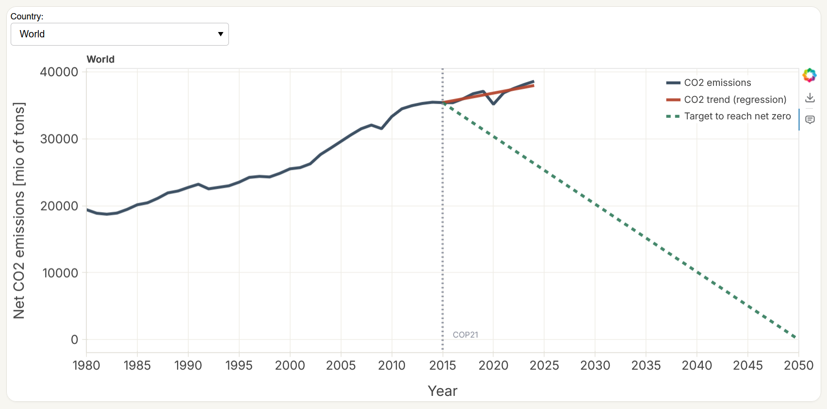
The graph can be interacted with on the project website: Objective net-zero 2050
Related Github page where you can find the code: GitHub - lucabron/netzero: Data visualization of each country's efforts toward net zero emission using Python · GitHub