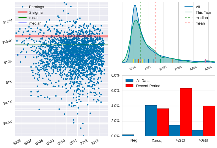
I am trying to plot some financial data using a logarithmic scale. I can transform the data in numpy easily enough, but I can’t seem to figure out how to change the tick labels to something more user friendly. I really don’t want to show 10^0 - 10^6 but would much rather format the displayed text as $1.00 - $1.0M etc.
Also, The data is coming from a pandas datetime series, and I have had to extract the year and month and create a decimal representation (2012.2 for march 2012) to get a reasonable axis for the plot. Can anyone suggest a more direct route? I see pandas data sources/plots objects in the source and time series related properties in the axis classes but I can’t find any demos or docs that would help me figure out how to use them.
Ideally, I would like to create a scatter plot like the one in the attached image.
Log-scaled axes are slated either for the upcoming release (0.4.3/0.5) or failing that, the immediate next. It should also support custom formatting of axes labels in log-scaled units, so the scatter plot example you attached will be fully reproducible!
As for the datetime axis: although the documentation has not been properly updated to explain the new format (it is still undergoing development), an example has been posted here. Please also note that according to Issue 470 on our GH tracker, you might have to take an extra step to coerce the pandas DatetimeIndex into a numpy array of dtype datetime64[ms]. As Hugo has pointed out, this should be addressed once #477 is merged.
Hope this helps!
Karan
···
On Wed, Apr 2, 2014 at 8:48 AM, Mark Benedict [email protected] wrote:
I am trying to plot some financial data using a logarithmic scale. I can transform the data in numpy easily enough, but I can’t seem to figure out how to change the tick labels to something more user friendly. I really don’t want to show 10^0 - 10^6 but would much rather format the displayed text as $1.00 - $1.0M etc.
Also, The data is coming from a pandas datetime series, and I have had to extract the year and month and create a decimal representation (2012.2 for march 2012) to get a reasonable axis for the plot. Can anyone suggest a more direct route? I see pandas data sources/plots objects in the source and time series related properties in the axis classes but I can’t find any demos or docs that would help me figure out how to use them.
Ideally, I would like to create a scatter plot like the one in the attached image.
Thanks.
Mark Benedict
–
You received this message because you are subscribed to the Google Groups “Bokeh Discussion - Public” group.
To unsubscribe from this group and stop receiving emails from it, send an email to [email protected].
Thanks for the information. I look forward to further Bokeh releases. While I am still more comfortable plotting in matplotlib, for many tasks I am starting to enjoy working with Bokeh.
Looks like the date time issue is a pretty simple fix.
Thanks again,
Mark Benedict
···
On Friday, April 4, 2014 12:07:52 PM UTC-5, Karan Dodia wrote:
Hello Mark,
Log-scaled axes are slated either for the upcoming release (0.4.3/0.5) or failing that, the immediate next. It should also support custom formatting of axes labels in log-scaled units, so the scatter plot example you attached will be fully reproducible!
As for the datetime axis: although the documentation has not been properly updated to explain the new format (it is still undergoing development), an example has been posted here. Please also note that according to Issue 470 on our GH tracker, you might have to take an extra step to coerce the pandas DatetimeIndex into a numpy array of dtype datetime64[ms]. As Hugo has pointed out, this should be addressed once #477 is merged.
Hope this helps!
Karan
On Wed, Apr 2, 2014 at 8:48 AM, Mark Benedict [email protected] wrote:
I am trying to plot some financial data using a logarithmic scale. I can transform the data in numpy easily enough, but I can’t seem to figure out how to change the tick labels to something more user friendly. I really don’t want to show 10^0 - 10^6 but would much rather format the displayed text as $1.00 - $1.0M etc.
Also, The data is coming from a pandas datetime series, and I have had to extract the year and month and create a decimal representation (2012.2 for march 2012) to get a reasonable axis for the plot. Can anyone suggest a more direct route? I see pandas data sources/plots objects in the source and time series related properties in the axis classes but I can’t find any demos or docs that would help me figure out how to use them.
Ideally, I would like to create a scatter plot like the one in the attached image.
Thanks.
Mark Benedict
–
You received this message because you are subscribed to the Google Groups “Bokeh Discussion - Public” group.
To unsubscribe from this group and stop receiving emails from it, send an email to [email protected].
OK that's pretty interesting! I am not sure it will make it in a first cut but it definitely seems worth implementing. Question, does MPL use a default value of 'linthreshx' for 'symlog'? Alternatively, what happens around zero if a user *doesn't* supply `linthreshx'? It does not seem to say in the docs.
Bryan
···
On Apr 4, 2014, at 8:04 PM, Chris Stoughton <[email protected]> wrote:
A small suggestion for logarithmic plots is to also implement symmetric logarithmic scaling.
The matplolib implementation is documented here: http://matplotlib.org/api/pyplot_api.html
‘symlog’
basex/basey:
The base of the logarithm
linthreshx/linthreshy:
The range (-x, x) within which the plot is linear (to avoid having the plot go to infinity around zero).
subsx/subsy:
Where to place the subticks between each major tick. Should be a sequence of integers. For example, in a log10 scale: [2, 3, 4, 5,6, 7, 8, 9]
will place 8 logarithmically spaced minor ticks between each major tick.
linscalex/linscaley:
This allows the linear range (-linthresh to linthresh) to be stretched relative to the logarithmic range. Its value is the number of decades to use for each half of the linear range. For example, when linscale== 1.0 (the default), the space used for the positive and negative halves of the linear range will be equal to one decade in the logarithmic range.
On Wed, Apr 2, 2014 at 8:48 AM, Mark Benedict <[email protected]> wrote:
I am trying to plot some financial data using a logarithmic scale. I can transform the data in numpy easily enough, but I can't seem to figure out how to change the tick labels to something more user friendly. I really don't want to show 10^0 - 10^6 but would much rather format the displayed text as $1.00 - $1.0M etc.
Also, The data is coming from a pandas datetime series, and I have had to extract the year and month and create a decimal representation (2012.2 for march 2012) to get a reasonable axis for the plot. Can anyone suggest a more direct route? I see pandas data sources/plots objects in the source and time series related properties in the axis classes but I can't find any demos or docs that would help me figure out how to use them.
Ideally, I would like to create a scatter plot like the one in the attached image.
You need to have a value for linthreshx, and matplotlib’s default is 1.0.
I use this to the zero value shows up on plots, or when there are positive and negative values to plot and you want to use a logarithmic scale.
···
On Sat, Apr 5, 2014 at 7:44 AM, Bryan Van de Ven [email protected] wrote:
OK that’s pretty interesting! I am not sure it will make it in a first cut but it definitely seems worth implementing. Question, does MPL use a default value of ‘linthreshx’ for ‘symlog’? Alternatively, what happens around zero if a user doesn’t supply `linthreshx’? It does not seem to say in the docs.
Bryan
On Apr 4, 2014, at 8:04 PM, Chris Stoughton [email protected] wrote:
A small suggestion for logarithmic plots is to also implement symmetric logarithmic scaling.
The range (-x, x) within which the plot is linear (to avoid having the plot go to infinity around zero).
subsx/subsy:
Where to place the subticks between each major tick. Should be a sequence of integers. For example, in a log10 scale: [2, 3, 4, 5,6, 7, 8, 9]
will place 8 logarithmically spaced minor ticks between each major tick.
linscalex/linscaley:
This allows the linear range (-linthresh to linthresh) to be stretched relative to the logarithmic range. Its value is the number of decades to use for each half of the linear range. For example, when linscale== 1.0 (the default), the space used for the positive and negative halves of the linear range will be equal to one decade in the logarithmic range.
On Wed, Apr 2, 2014 at 8:48 AM, Mark Benedict [email protected] wrote:
I am trying to plot some financial data using a logarithmic scale. I can transform the data in numpy easily enough, but I can’t seem to figure out how to change the tick labels to something more user friendly. I really don’t want to show 10^0 - 10^6 but would much rather format the displayed text as $1.00 - $1.0M etc.
Also, The data is coming from a pandas datetime series, and I have had to extract the year and month and create a decimal representation (2012.2 for march 2012) to get a reasonable axis for the plot. Can anyone suggest a more direct route? I see pandas data sources/plots objects in the source and time series related properties in the axis classes but I can’t find any demos or docs that would help me figure out how to use them.
Ideally, I would like to create a scatter plot like the one in the attached image.
Thanks.
Mark Benedict
–
You received this message because you are subscribed to the Google Groups “Bokeh Discussion - Public” group.
To unsubscribe from this group and stop receiving emails from it, send an email to [email protected].