Hi,
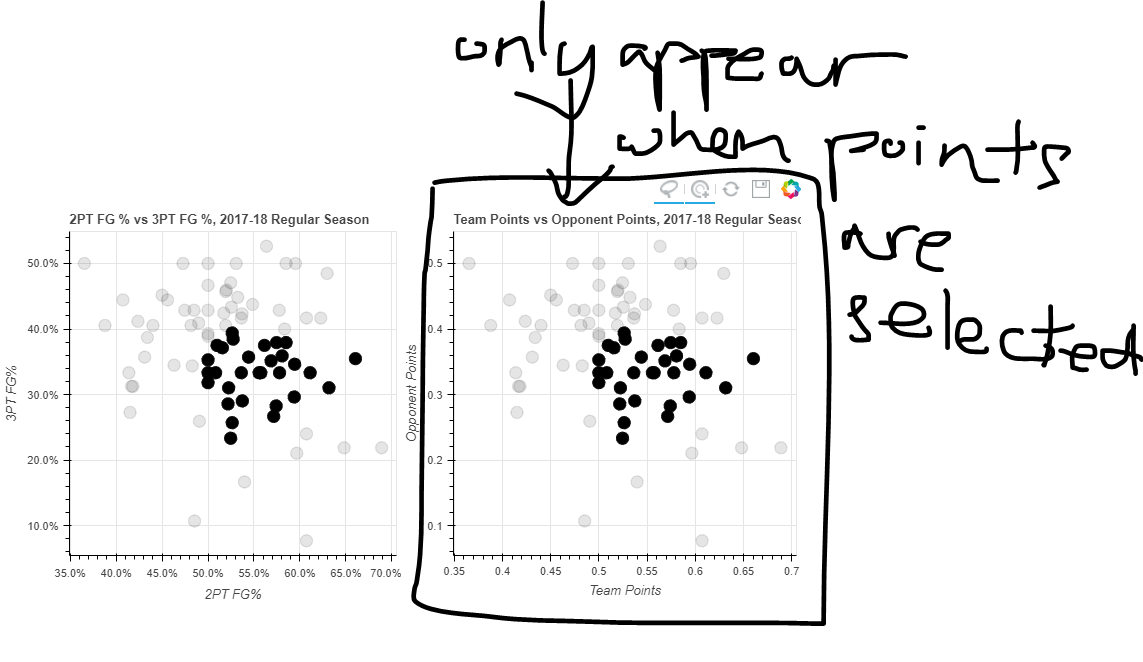
I have a question whether the following is possible: Having two plots (A main and sub), the subplot is not visible by standard, and only when points in the main plot are selected the subplot will appear.
Lets take this code for example:
# Bokeh Libraries
from bokeh.plotting import figure, show
from bokeh.io import output_file
from bokeh.models import ColumnDataSource, CategoricalColorMapper, NumeralTickFormatter
from bokeh.layouts import gridplot
import pandas as pd

team_stats = pd.read_csv('2017-18_teamBoxScore.csv', parse_dates=['gmDate'])
phi_gm_stats_2 = (team_stats[(team_stats['teamAbbr'] == 'PHI') &
                             (team_stats['seasTyp'] == 'Regular')]
                  .loc[:, ['gmDate',
                           'team2P%',
                           'team3P%',
                           'teamPTS',
                           'opptPTS']]
                  .sort_values('gmDate'))

# Output inline in the notebook
output_file('phi-gm-linked-selections.html',
            title='76ers Percentages vs. Win-Loss')

# Store the data in a ColumnDataSource
gm_stats_cds = ColumnDataSource(phi_gm_stats_2)

# Create a CategoricalColorMapper that assigns specific colors to wins and losses
win_loss_mapper = CategoricalColorMapper(factors = ['W', 'L'], palette=['Green', 'Red'])

# Specify the tools
toolList = ['lasso_select', 'tap', 'reset', 'save']

# Create a figure relating the percentages
pctFig = figure(title='2PT FG % vs 3PT FG %, 2017-18 Regular Season',
                plot_height=400, plot_width=400, tools=toolList,
                x_axis_label='2PT FG%', y_axis_label='3PT FG%')

# Draw with circle markers
pctFig.circle(x='team2P%', y='team3P%', source=gm_stats_cds,
              size=12, color='black')

# Format the y-axis tick labels as percenages
pctFig.xaxis[0].formatter = NumeralTickFormatter(format='00.0%')
pctFig.yaxis[0].formatter = NumeralTickFormatter(format='00.0%')

# Create a figure relating the totals
totFig = figure(title='Team Points vs Opponent Points, 2017-18 Regular Season',
                plot_height=400, plot_width=400, tools=toolList,
                x_axis_label='Team Points', y_axis_label='Opponent Points')

# Draw with square markers
totFig.circle(x='team2P%', y='team3P%', source=gm_stats_cds,
              size=12, color='black')

# Create layout
grid = gridplot([[pctFig, totFig]])

# Visualize
show(grid)
As it is not possible to add csv files, you can download it here on Kaggle:
The result is in the image, and how it should look like.
Is this possible to do in Bokeh?