from bokeh.plotting import figure, show, output_file
from bokeh.models import ColumnDataSource, HoverTool, Legend, LegendItem
import numpy as np
from math import pi
def mini_pie(data, category_col, y_values_col, values_col,
title='Cycle Pie Plot',
width=900, height=400,
pie_radius=0.15,
slice_names=None,
slice_colors=None,
show_line=True):
"""
Create a mini-pie plot.
"""
# Convert to list of dicts if needed
if hasattr(data, 'to_dict'):
data = data.to_dict('records')
categories = [d[category_col] for d in data]
n_categories = len(categories)
# Calculate global y-range
y_values = [d[y_values_col] for d in data]
y_min, y_max = min(y_values), max(y_values)
y_range = y_max - y_min
y_padding = y_range * 0.2
# Create figure
p = figure(width=width, height=height, title=title,
x_range=(-0.5, n_categories - 0.5),
y_range=(y_min - y_padding - pie_radius, y_max + y_padding + pie_radius),
toolbar_location='above',
tools="pan,wheel_zoom,box_zoom,reset,save")
# Plot the main line and dots
x_positions = list(range(n_categories))
if show_line:
p.line(x_positions, y_values, line_width=2, color='navy', alpha=0.5, line_dash='dashed')
# p.scatter(x_positions, y_values, size=8, color='navy', alpha=0.7)
# Determine number of slices from first data point
n_slices = len(data[0][values_col]) if data else 0
# Set slice names if not provided
if slice_names is None:
slice_names = [f'Category {i+1}' for i in range(n_slices)]
# Set slice colors if not provided
if slice_colors is None:
from bokeh.palettes import Category10
slice_colors = Category10[n_slices] if n_slices <= 10 else Category10[10][:n_slices]
# Create separate data sources and renderers for each slice
all_renderers = []
for slice_idx in range(n_slices):
# Prepare data for this specific slice only
slice_data = {
'x_center': [],
'y_center': [],
'start_angle': [],
'end_angle': [],
'value': [],
'category': [],
'slice_name': [],
'percentage': []
}
# Collect data for this slice from all data points
for i, d in enumerate(data):
category = d[category_col]
y_center = d[y_values_col]
composition = d[values_col]
if not isinstance(composition, (list, tuple, np.ndarray)):
continue
total = sum(composition)
if total == 0 or slice_idx >= len(composition):
continue
# Scale composition if needed
scale_factor = y_center / total if total > 0 else 1
scaled_composition = [v * scale_factor for v in composition]
# Calculate cumulative angle up to this slice
cumulative_angle = 0
for j in range(slice_idx):
if j < len(scaled_composition):
value = scaled_composition[j]
angle = 2 * pi * (value / y_center) if y_center > 0 else 0
cumulative_angle += angle
# Calculate angle for this slice
value = scaled_composition[slice_idx]
angle = 2 * pi * (value / y_center) if y_center > 0 else 0
if angle > 0: # Only add if slice has non-zero value
slice_data['x_center'].append(i)
slice_data['y_center'].append(y_center)
slice_data['start_angle'].append(cumulative_angle)
slice_data['end_angle'].append(cumulative_angle + angle)
slice_data['value'].append(value)
slice_data['category'].append(category)
slice_data['slice_name'].append(slice_names[slice_idx])
slice_data['percentage'].append(value / y_center if y_center > 0 else 0)
# Create source and renderer for this slice
if slice_data['x_center']: # Only create if there's data
source = ColumnDataSource(slice_data)
# Create wedge renderer for this slice with its specific color
renderer = p.wedge(x='x_center', y='y_center', radius=pie_radius,
start_angle='start_angle', end_angle='end_angle',
line_color="white", line_width=0.5,
fill_color=slice_colors[slice_idx],
source=source)
all_renderers.append((slice_names[slice_idx], renderer))
# Add hover tool for this renderer
hover = HoverTool(
tooltips=[
("Category", "@category"),
("Component", "@slice_name"),
("Value", "@value{0.0}"),
("Percentage", "@percentage{0.0%}"),
],
renderers=[renderer]
)
p.add_tools(hover)
# Create legend with colored items
legend_items = []
for name, renderer in all_renderers:
legend_items.append(LegendItem(label=name, renderers=[renderer]))
# Add legend to the right of the plot
legend = Legend(items=legend_items,
location="center_right",
title="Components",
title_text_font_size="12pt",
label_text_font_size="10pt")
p.add_layout(legend, 'right')
# Set x-axis labels
p.xaxis.ticker = list(range(n_categories))
p.xaxis.major_label_overrides = {i: cat for i, cat in enumerate(categories)}
if n_categories > 8:
p.xaxis.major_label_orientation = pi/4
p.xgrid.grid_line_color = None
p.ygrid.grid_line_color = '#f0f0f0'
p.xaxis.axis_label = 'Category / Time'
p.yaxis.axis_label = 'Value'
p.title.text_font_size = '14pt'
return p
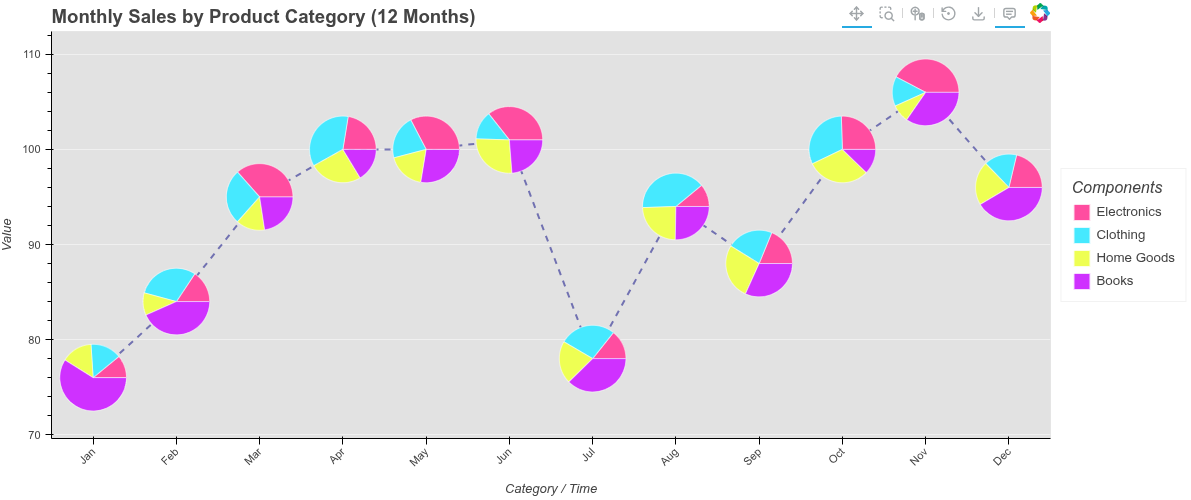
# Example 1: 12 months of the year with 4 product categories
print("Example 1: Monthly Sales for 12 Months")
np.random.seed(42)
monthly_data = []
months = ['Jan', 'Feb', 'Mar', 'Apr', 'May', 'Jun',
'Jul', 'Aug', 'Sep', 'Oct', 'Nov', 'Dec']
product_categories = ['Electronics', 'Clothing', 'Home Goods', 'Books']
for i, month in enumerate(months):
base_sales = 80 + 5 * (i % 6)
total_sales = base_sales + np.random.randint(-10, 10)
np.random.seed(i * 100)
composition = np.random.randint(10, 50, 4)
# Seasonal effects
if month in ['Nov', 'Dec']:
composition[0] *= 1.5
elif month in ['Jun', 'Jul', 'Aug']:
composition[1] *= 1.3
scale = total_sales / sum(composition)
composition = [int(v * scale) for v in composition]
monthly_data.append({
'month': month,
'total_sales': total_sales,
'breakdown': composition
})
output_file("12_months_pies_fixed.html")
p1 = mini_pie(
data=monthly_data,
category_col='month',
y_values_col='total_sales',
values_col='breakdown',
title='Monthly Sales by Product Category (12 Months)',
width=1200,
height=500,
pie_radius=0.4,
slice_names=product_categories,
slice_colors=['#ff4da0', '#46e9ff', '#eeff53', '#cf31ff'],
show_line=True
)
p1.background_fill_color = "#e2e2e2"
show(p1)
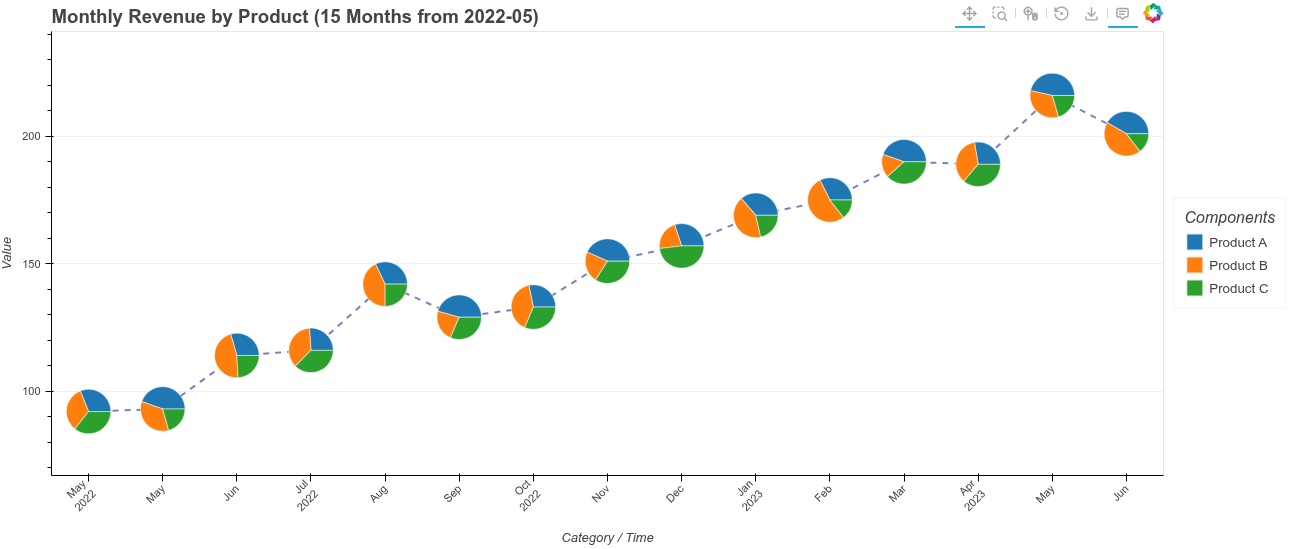
# Example 2: 15 monthly values from 2022-05-01
print("\nExample 2: 15 Monthly Values from 2022-05-01")
from datetime import datetime, timedelta
date_data = []
start_date = datetime(2022, 5, 1)
revenue_sources = ['Product A', 'Product B', 'Product C']
for i in range(15):
current_date = start_date + timedelta(days=30*i)
month_str = current_date.strftime('%b\n%Y') if i % 3 == 0 else current_date.strftime('%b')
base_revenue = 100 + i * 8
total_revenue = base_revenue + np.random.randint(-15, 15)
np.random.seed(i * 50)
composition = np.random.randint(20, 80, 3)
scale = total_revenue / sum(composition)
composition = [int(v * scale) for v in composition]
date_data.append({
'date': month_str,
'total_revenue': total_revenue,
'sources': composition
})
output_file("15_months_pies_fixed.html")
p2 = mini_pie(
data=date_data,
category_col='date',
y_values_col='total_revenue',
values_col='sources',
title='Monthly Revenue by Product (15 Months from 2022-05)',
width=1300,
height=550,
pie_radius=0.3,
slice_names=revenue_sources,
slice_colors=['#1f77b4', '#ff7f0e', '#2ca02c'],
show_line=True
)
show(p2)
# Example 3: Cost vs Profit with Red/Green colors
print("\nExample 3: Cost vs Profit Analysis")
profit_data = []
quarters = ['Q1 2023', 'Q2 2023', 'Q3 2023', 'Q4 2023']
for i, quarter in enumerate(quarters):
revenue = 1000 + i * 200
cost = 600 + i * 80
profit = revenue - cost
profit_data.append({
'quarter': quarter,
'revenue': revenue,
'cost_profit': [cost, profit]
})
output_file("cost_profit_pies_fixed.html")
p3 = mini_pie(
data=profit_data,
category_col='quarter',
y_values_col='revenue',
values_col='cost_profit',
title='Quarterly Revenue: Cost vs Profit',
width=900,
height=450,
pie_radius=0.15,
slice_names=['Cost', 'Profit'],
slice_colors=['#ff6b6b', '#4ecdc4'],
show_line=True
)
show(p3)
# Example 4: Simple test with 3 slices
print("\nExample 4: Simple Test with Colored Legend")
simple_data = [
{'category': 'A', 'total': 100, 'parts': [40, 35, 25]},
{'category': 'B', 'total': 120, 'parts': [50, 40, 30]},
{'category': 'C', 'total': 90, 'parts': [30, 30, 30]},
{'category': 'D', 'total': 110, 'parts': [40, 35, 35]},
]
output_file("simple_test_fixed.html")
p4 = mini_pie(
data=simple_data,
category_col='category',
y_values_col='total',
values_col='parts',
title='Test with 3 Components',
width=800,
height=400,
pie_radius=0.12,
slice_names=['Part 1', 'Part 2', 'Part 3'],
slice_colors=['#FF6B6B', '#4ECDC4', '#d8f84d'],
show_line=True
)
show(p4)
from bokeh.plotting import figure, show, output_file
from bokeh.models import HoverTool
from bokeh.layouts import gridplot
import numpy as np
def mini_line(data, category_col, values_col,
title='Cycle Plot',
line_color='#7cb342', average_color='#5e92f3',
width=900, height=400,
mini_chart_width=0.8, show_average=True):
"""
Create a cycle plot where each category has its own mini time-series.
Parameters:
-----------
data : list of dict or pandas DataFrame
Data where each row is a category with a list/array of values
category_col : str
Column name for categories (x-axis labels)
values_col : str
Column name containing lists/arrays of time-series values
title : str
Plot title
line_color : str
Color for the time-series lines
average_color : str
Color for the average line
width : int
Plot width in pixels
height : int
Plot height in pixels
mini_chart_width : float
Width of each mini chart relative to category spacing (0-1)
show_average : bool
Show horizontal average line for each mini chart
Returns:
--------
Bokeh figure object
"""
# Convert to list of dicts if needed
if hasattr(data, 'to_dict'):
data = data.to_dict('records')
categories = [d[category_col] for d in data]
n_categories = len(categories)
# Create main figure
p = figure(width=width, height=height, title=title,
x_range=(-0.5, n_categories - 0.5),
toolbar_location='above')
# Calculate global y-range for consistent scaling
all_values = []
for d in data:
vals = d[values_col]
if isinstance(vals, (list, tuple, np.ndarray)):
all_values.extend(vals)
y_min, y_max = min(all_values), max(all_values)
y_range = y_max - y_min
y_padding = y_range * 0.1
p.y_range.start = y_min - y_padding
p.y_range.end = y_max + y_padding
# Draw mini time-series for each category
for i, d in enumerate(data):
values = d[values_col]
if not isinstance(values, (list, tuple, np.ndarray)):
continue
n_points = len(values)
avg_value = np.mean(values)
# Create x-coordinates for mini chart centered at category position
half_width = mini_chart_width / 2
x_positions = np.linspace(i - half_width, i + half_width, n_points)
# Draw the time-series line
p.line(x_positions, values, line_width=2, color=line_color, alpha=0.8)
# Draw average line if enabled
if show_average:
p.line([i - half_width, i + half_width], [avg_value, avg_value],
line_width=2, color=average_color, alpha=0.7)
# Set x-axis labels
p.xaxis.ticker = list(range(n_categories))
p.xaxis.major_label_overrides = {i: cat for i, cat in enumerate(categories)}
p.xaxis.major_label_orientation = 0.8
p.xgrid.grid_line_color = None
p.xaxis.axis_label = 'Category'
p.yaxis.axis_label = 'Value'
return p
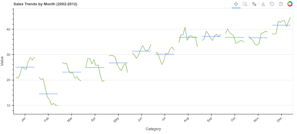
# Example 1: Monthly sales cycle plot (like the image)
print("Example 1: Sales Trends by Month - Line Version")
np.random.seed(42)
# Simulate sales data for each month over multiple years
monthly_data = []
months = ['Jan', 'Feb', 'Mar', 'Apr', 'May', 'Jun',
'Jul', 'Aug', 'Sep', 'Oct', 'Nov', 'Dec']
for i, month in enumerate(months):
# Create trend with some randomness
base = 20 + i * 2
trend = base + np.random.randn(10).cumsum() * 2
trend = np.clip(trend, 10, 100)
monthly_data.append({
'month': month,
'sales': trend.tolist()
})
output_file("mini_line_lines.html")
p1 = mini_line(
data=monthly_data,
category_col='month',
values_col='sales',
title='Sales Trends by Month (2002-2012)',
line_color='#7cb342',
average_color='#5e92f3',
width=1000,
height=450,
mini_chart_width=0.8,
show_average=True
)
show(p1)
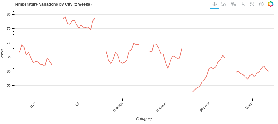
# Example 2: Temperature variations by city
print("\nExample 2: Temperature Variations by City")
city_data = []
cities = ['NYC', 'LA', 'Chicago', 'Houston', 'Phoenix', 'Miami']
for city in cities:
# Simulate daily temperatures
base_temp = np.random.randint(50, 80)
temps = base_temp + np.random.randn(15).cumsum() * 1.5
city_data.append({
'city': city,
'temperatures': temps.tolist()
})
output_file("mini_line_temps.html")
p2 = mini_line(
data=city_data,
category_col='city',
values_col='temperatures',
title='Temperature Variations by City (2 weeks)',
line_color='#e74c3c',
average_color='#3498db',
width=900,
height=400,
mini_chart_width=0.75,
show_average=False
)
show(p2)