Minor Gridlines for Log axes

I’m struggling a bit getting the right number of minor gridlines for my plots with log/log axes.

These plots are known correlations and have a set range of 1 - 1000 on the y-axis and 0.1 to 10 on the x-axis.

Here is the figure call

p22 = figure(title="SBTn - Jefferies", x_axis_label="Normalized Friction Ratio, Fr",
                 y_axis_label="Normalized Penetration Resistance, Qtn(1-Bq)+1",
                 plot_width=std_plot_height, plot_height=std_plot_height, x_axis_type="log", x_range=(0.1, 10),
                 y_axis_type="log", y_range=(1, 1000))

And here is how I’ve added the gridlines

#p22.xaxis.ticker = [0.1, 1, 10]
    #p22.yaxis.ticker = [1, 10, 100, 1000]
    p22.outline_line_width = 1.5
    p22.outline_line_color = 'black'
    p22.xaxis[0].formatter = PrintfTickFormatter(format="%d")
    p22.yaxis[0].formatter = PrintfTickFormatter(format="%d")
    p22.ygrid.minor_grid_line_color = 'black'
    p22.ygrid.minor_grid_line_alpha = 0.1
    p22.xgrid.minor_grid_line_color = 'black'
    p22.xgrid.minor_grid_line_alpha = 0.1

Here is the result, the y axis works out because it’s ok setting the major ticks to 1, 10, 100 and 1000, the x axis is a bit of a mess because it adds major ticks between 1 and 10. I’m not really sure how to get it to only give the major ticks at each order of magnitude:

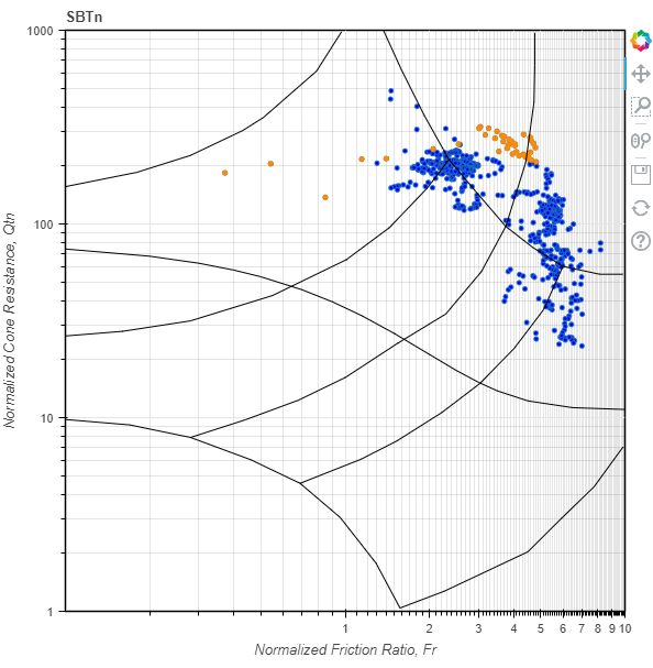
I thought that maybe I could use x_minor_ticks to control the number of ticks in between, but that didn’t seem to help.

If it’s not clear, what I want is for the x axis to have major ticks at 0.1, 1 and 10, with minor ticks at 0.2, 0.3… 2, 3…etc. The y axis is fine as is.

It’s not really clear what you are asking to have happen. There is only a single decade, so “only give the major ticks at each order of magnitude” technically means there would be no ticks on the x-axes except 1 and 10 at either extreme end of the axis. Is that actually what you want to happen?

Regardless, I don’t really think this behavior can be changed. Currently the log ticker special cases things whenever there are less than two decades, and picks the same ticks that a linear scale ticker would:

https://github.com/bokeh/bokeh/blob/branch-3.0/bokehjs/src/lib/models/tickers/log_ticker.ts#L41-L63

If it’s not clear, what I want is for the x axis to have major ticks at 0.1, 1 and 10, with minor ticks at 0.2, 0.3… 2, 3…etc. The y axis is fine as is.

Given that, and the code observation above, I think your best bet is to enlarge the range slightly so that it is larger than two decades.

What the x axis should look like is Major gridlines at 0.1, 1 and 10, minor gridlines at 0.2, 0.3, 0.4, 0.5, 0.6, 0.7, 0.8, 0.9, 2, 3, 4, 5, 6, 7, 8 & 9.

There is only a single decade, so “only give the major ticks at each order of magnitude” technically means there would be no ticks on the x-axes except 1 and 10 at either extreme end of the axis. Is that actually what you want to happen?

The figure is defined with an x_range of 0.1 to 10, so that would be two orders of magnitude?

Setting the x_range to (0.09,10) works.

Thanks!

1 Like

This topic was automatically closed 90 days after the last reply. New replies are no longer allowed.