I am really enjoying the grouped categorical axes in Bokeh. I find this feature very handy, but it is for some reason not common among the plotting libraries I have seen, so extra thanks for making it available in Bokeh!
One thing I have noticed is that the vertical grey bars marking the separation of the outer categories seems to not always line up correctly and sometimes it even overlaps with the axis labels for the inner categorical axis, which is confusing and makes it hard to read. I suspect that this is a bug and I can open an issue if you would like, but in the meantime, is there a workaround for either realigning or removing the grey bars?
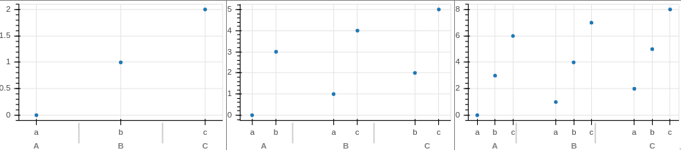
Sample where the grey bars are misaligned and start to overlap with the ‘c’ label.
from bokeh.io import output_notebook, show
from bokeh.models import ColumnDataSource, FactorRange
from bokeh.plotting import figure, gridplot
import pandas as pd

output_notebook()


num1 = 3
plot_row = []
for num2 in range(1, 4):
    cat1 = list('ABC')[:num1] * num2
    cat2 = ['a'] * num2 + ['b'] * num2 + ['c'] * num2

    df = pd.DataFrame({'cat1': cat1, 'cat2': cat2[:len(cat1)], 'value': range(num1*num2)})
    df['cat_combo'] = df[['cat1', 'cat2']].apply(tuple, axis=1)

    p = figure(
        width=300, height=200,
        x_range=FactorRange(*df['cat_combo'].unique().tolist()))
    p.circle('cat_combo', 'value', source=df)
    plot_row.append(p)
show(gridplot([plot_row]))
Version:
-----
bokeh       2.0.1
pandas      1.0.3
sinfo       0.3.1
-----
IPython             6.5.0
jupyter_client      5.2.3
jupyter_core        4.6.3
jupyterlab          2.1.0
notebook            5.6.0
-----
Python 3.7.6 | packaged by conda-forge | (default, Mar 23 2020, 23:03:20) [GCC 7.3.0]
Linux-5.6.15-arch1-1-x86_64-with-arch-Arch-Linux
4 logical CPU cores