Hi Bryan,
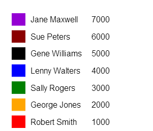
Thanks so much for the encouragement this morning, and for working on the weekend! I got as far as the code below and the image attached. Such as it is, it will still be a huge bonus for my project to have this legend. I ended up using a rectangle because I couldn't figure out how to make colored boxes (table background color) using df.to_html().
By the way, I added the xaxis and yaxis code to plotting.py, and was then able to hide the axes again. Thanks!
However, there were several things I wasn't able to figure out:
1. How to print column headers (or totals) or insert a line separator below them.
2. An easy way to format numbers (I couldn't get '{0:,}'.format() or the locale module to work).
3. How to concatenate df['a'] with df['b'] in order to avoid having to use multiple text() functions.
Also, how would I insert some HTML, like a table or image, directly under a Bokeh plot?
Thanks so much for your help! I'm still very new to Python and Bokeh so I'm sure the way I did things in the code below could be much improved.
Cheers!
Armen
import numpy as np
from numpy.random import randn
from pandas import *
from bokeh.plotting import *
'''
I had some trouble in the past in which newer plots would print on top
of older plots so this reset_output() command clears away old plots
from memory.
'''
reset_output()
# Set an output file.
output_file("C:/Users/Armen/Desktop/legend.html", title="Legend Example")
# Plotting all on the same plot.
hold()
# There will be another plot above this one so instantiate a new figure.
figure(
title = "",
tools = "" # Title and tools not needed for the legend.
)
# Make some series, including one to color the rectangles.
sx = Series([.5,.5,.5,.5,.5,.5,.5])
sy = Series([1,2,3,4,5,6,7])
sc = Series(['red','orange','green','blue','black','darkred','darkviolet'])
s1 = Series([
'Robert Smith',
'George Jones',
'Sally Rogers',
'Lenny Walters',
'Gene Williams',
'Sue Peters',
'Jane Maxwell'
])
s2 = Series(range(1000, 7001, 1000))
# Create a dict putting the series above together.
d = {
'x': sx,
'y': sy,
'color': sc,
'one': sy,
'two': s1,
'three': s2
}
# Create a pandas data frame from the dict.
df = DataFrame(d)
# Print the data frame in the Spyder console.
print(df)
# Create x and y axis ranges.
x_axis_range = [str(x) for x in sorted(set(df['x']))]
y_axis_range = [str(x) for x in sorted(set(df['y']))]
'''
The plot height should only be as tall as needed.
Get the max of the y axis for setting the height.
'''
max_y_axis_range = int(str(max(y_axis_range)))
# Print the rectangles
rect(
x = df['x'],
y = df['y'],
x_range = x_axis_range,
y_range = y_axis_range,
width = .1,
height = .7,
fill_color = df['color'],
line_color = df['color'],
plot_width = 600,
# Set the plot height based on how many rows there will be.
plot_height = max_y_axis_range * 45
)
# For all the text properties that should be the same.
text_props = {
"angle": 0,
"text_align": "left",
"text_baseline": "middle",
"text_font_size": "12pt",
}
# Print the name a little bit after the rectangles.
text(
df['x'] + .07,
df['y'],
text = df['two'],
**text_props
)
# Print the number a little after the name.
text(
df['x'] + .30,
df['y'],
text = df['three'],
**text_props
)
# Hide the grid lines inside the big rectangle box.
grid().grid_line_color = None
# Hide elements of the plot.
plot = curplot()
plot.outline_line_color = None
axis().axis_line_color = None
axis().major_label_text_color = None
axis().major_tick_line_color = None
# Show in browser.
show()
On Sunday, August 17, 2014 4:40:37 AM UTC-7, Bryan Van de ven wrote:
Hi Armen,
You could absolutely draw this sort of legend in Bokeh using the rect() or quad() glyph functions together with text() and line() functions (all in bokeh.plotting). However it would also be fairly simple to do with pure HTML. Whether it is worthwhile to do as a plot vs HTML probably depends upon more details of what you are doing. An advantage for doing it in Bokeh would be that if you set it up properly, it should update whenever the data updates. If your data is not updating once the plot is renderers, then it is probably simpler to go the HTML route.
Bryan
On Aug 15, 2014, at 7:44 PM, Armen Alexanian <[email protected]> wrote:
> To clarify, it wouldn't technically be the type of legend that is connected to a graph. It would be another separate graph below the first graph. Thanks!
>
> On Friday, August 15, 2014 5:35:55 PM UTC-7, Armen Alexanian wrote:
> Hi,
>
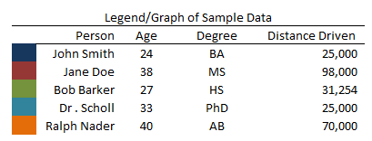
> I'm trying to experiment with plotting glyphs and text together to try to create a legend that looks like the picture attached. I need to create a legend which also functions as a mini report describing the associated graph with colors corresponding to data items (in this case, people).
>
> Would using a rect() be the best approach or is there another way (like an HTML table?) to create something like the attached image? The ability to do this would be really awesome because rich text and numeric data would perfectly compliment the graph and summarize key elements.
>
> Thanks very much!
> Armen
>
> --
> You received this message because you are subscribed to the Google Groups "Bokeh Discussion - Public" group.
> To unsubscribe from this group and stop receiving emails from it, send an email to bokeh+un...@continuum.io.
> To post to this group, send email to bo...@continuum.io.
> To view this discussion on the web visit https://groups.google.com/a/continuum.io/d/msgid/bokeh/169052b3-21cc-4190-911e-cb6e4b69a47a%40continuum.io\.
> For more options, visit https://groups.google.com/a/continuum.io/d/optout\.
--
You received this message because you are subscribed to the Google Groups "Bokeh Discussion - Public" group.
To unsubscribe from this group and stop receiving emails from it, send an email to [email protected].
To post to this group, send email to [email protected].
To view this discussion on the web visit https://groups.google.com/a/continuum.io/d/msgid/bokeh/bbdd36db-0e30-4c77-a10a-8314b06c7f36%40continuum.io\.
For more options, visit https://groups.google.com/a/continuum.io/d/optout\.
<Sample_Legend.PNG>