I am trying to draw two groups of scatterplots on one figure as in matplotlib two lines with scatter code. But the data is large and I need to view it interactively. I need to dynamically view some data properties using hover.
I am having trouble with this task. Here are the questions:
How do I correctly display two or more groups of data on the same fig?
How do I set specific colors for data for the user to recognize it? For example group 1 is red and group 2 is blue.
How to add hover with displaying properties from dataframe for all DISPLAYED data?
How to add the ability to turn off the display of selected dynamically groups?
I tried to implement orisovka taking “Multidimensional plots” as an example in the documentation Working with large data using datashader
However, this example was not clear to me. I’m not sure if I need to use some functions like NdOverlay or dynspread. Also, I cannot figure out how to set specific colors for specific data. Perhaps this is what I need to do, and if this is so, then please show me exactly where I need to pay attention.
This applied to questions 1 and 2.
Here is the code with sample data and my attempt to solve the problem.
import pandas as pd
import random
import numpy as np
import holoviews as hv
import datashader as ds

from holoviews import opts
from holoviews.operation.datashader import datashade, dynspread
hv.extension('bokeh')

#Data can contain much more data and features
#Here, for example, only two data groups and one feature
N=int(10e5)
df = pd.DataFrame(np.random.randint(0,100,size=(N, 4)), columns=list(('x1','y1','x2','y2')))
df['feature']=np.random.random(N)

#This is where questions begin about how to do it correctly or fix the existing code
Data_1 = hv.Points((df['x1'],df['y1']),label="Data_1")
Data_2 = hv.Points((df['x2'],df['y2']),label="Data_2")

data_i_want_to_plot={'Data_1':Data_1,'Data_2':Data_2 }

c = dynspread(datashade(hv.NdOverlay(data_i_want_to_plot, kdims='k'), aggregator=ds.by('k', ds.count())))
c.opts(width=800, height=800).relabel('System')
Regarding questions 3 and 4, I have no idea how to do this at all, so please tell me how to do this. In the example above, this possibility should already be taken into account in the future.
I think this question(s) may better belong in the holoviz discourse over here https://discourse.holoviz.org/ because holoviews is built on top of bokeh.
Not to leave you empty handed to get two data sets into one graph with holoviews you could do the following:
scatter_plot = Data_1*Data_2
colouring with datashade I’ve always found rather tricky and it may not be so easy to hide show data due to the way it works, but I’m sure you can at least the colouring part. You might consider holoviews decimate function if it works for you
from holoviews.operation import decimate
c = decimate(scatter_plot)
c
The hover tool at it’s simplest can be added like below, will need to read up on it how to get it to display the way you require. Also added a muted alpha option not clear if this is what your after but you will be able to hide show by clicking the legend. I hope this is of some help, and probably as mentioned above find more help with the features your trying to use at the holviz discourse.
import pandas as pd
import random
import numpy as np
import holoviews as hv
from holoviews.operation import decimate
#import datashader as ds

#Data can contain much more data and features
#Here, for example, only two data groups and one feature
N=int(10e5)
df = pd.DataFrame(np.random.randint(0,100,size=(N, 4)), columns=list(('x1','y1','x2','y2')))
df['feature']=np.random.random(N)

#This is where questions begin about how to do it correctly or fix the existing code
Data_1 = hv.Points((df['x1'],df['y1']),label="Data_1").opts(muted_alpha=0,tools=['hover'])
Data_2 = hv.Points((df['x2'],df['y2']),label="Data_2").opts(muted_alpha=0,tools=['hover'])

scatter_plot = Data_1*Data_2
decimated_scatter = decimate(scatter_plot)
decimated_scatter
Right, the HoloViz discourse is the place for this discussion, since the answers don’t depend on Bokeh. Still, since it’s here now:
Depends what you mean by “groups of data”. If it’s tidy data that’s distinguished by a categorical column (type A, B, C, etc.), then yes, you’d use the “Multidimensional plots” section of the large data HoloViews user guide, which shows you how to make a categorical datashader plot, with each pixel colored by the fraction of each category that’s in the pixel. This option will most accurately represent your dataset, with no overplotting, mathematically mixing the various categories to show you the true distribution of the data. To do this, you need tidy data, so you’d need to change your data from its current wide organization into a long format with a categorical variable having the value “Data_1” or “Data 2” for each data point, for which you can use e.g. pd.melt. But if you don’t need full color mixing and can handle having overplotting, e.g. if your datasets are spatially non-overlapping and you just want to look at them on the same axes, you can choose two different colormaps and simply overlay the separate plots using *.
Depends on your choice for item 1. For a categorical plot, you pass color_key=..., then provide a list or dictionary of colors, one per category. For an overlay, you can provide either a single color, which lets datashader use alpha (opacity) to show the counts per pixel in that color (e.g. datashade(hv.Points(df1), cmap='red') * datashade(hv.Points(df1), cmap='blue'), or you can use a full separate colormap per pixel (e.g. rasterize(hv.Points(df1)).opts(cmap=colorcet.kr) * rasterize(hv.Points(df1)).opts(cmap=colorcet.kb). (In the latter case I’m using rasterize rather than datashade, which doesn’t support datashader-specific coloration features but does support hover and legends…)
Depends what you mean by “properties” and all data. Unfortunately, once you use datashade() to render down to an RGB image, all information about the underlying data points is lost; Bokeh is only displaying pixels at that point. So if you use Datashader’s categorical mixing features (only available in datashade()), you lose hoverability, but that’s not avoidable, because Bokeh and other plotting packages don’t offer Datashader’s accurate categorical mixing support. If you use the overlay option with rasterize() rather than datashade(), Bokeh’s doing the colormapping and Bokeh can then provide hovering, revealing the counts per pixel in what you are hovering over. You can even cheat by overlaying a transparent (alpha=0) version overlay computed with rasterize() on top of your datashade() output if you want to support some hovering.
If you use an Overlay with * there should automatically be a legend where you can turn each category on or off by clicking on it. There’s nothing like that supported for the full categorical mixing, though.
Basically, Datashader is unique in offering fully accurate categorical mixing, where each pixel accurately represents the categories of points that land in that pixel. Bokeh or other plotting libraries could be extended to support that, which would be great, but until then, you have to give up on Bokeh features like hovering and interactive legends if you want proper color mixing.
Now I understand more …
Thank you very much for your advice. I will try to complete the example in the pinned post using your advice. Something tells me that there will be new questions or problems with old ones. But in any case, my problem will be clearer and possibly solved.
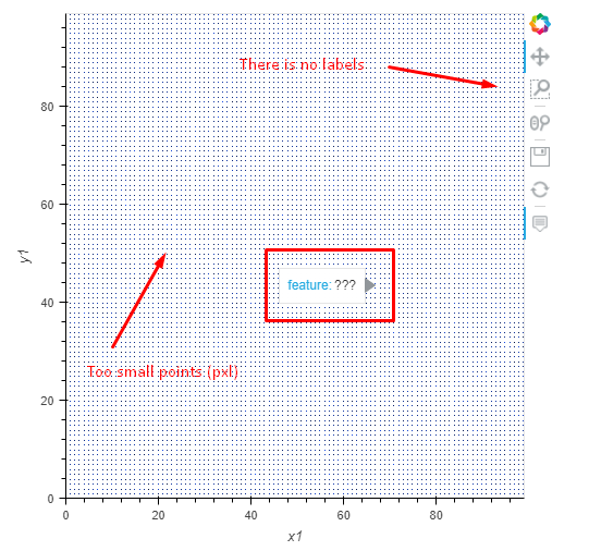
The new version of the code is above. The following questions arose.
Why are the final points (pixels) so small?
I read “Setting options” in the Working with large data using datashader, which said that this is solved using spread but I ran into the following error ```TypeError: Expected Image, got: `<class ‘xarray.core.dataarray.DataArray’>````
What’s wrong with the Hover? It doesn’t show anything.
There are no labels here. Although I enter them and use the * operator
In the course of work, it became interesting if, when choosing a point, it is possible to automatically read and write a predetermined header value into a buffer?
The idea is as follows. The user finds the required point or object and selects it. Next, a specific header is read from the selected point (it will be displayed in the hover). And after all this, the read value will be fed into another program - that is, you just need to read this property. In the example program above, this is actually the feature variable
 If you use the overlay option with