I am having difficulty grokking how to go from a melted datatable through a column data source to a nested bar chart. The below code does not work, and nets me “Expected x to reference fields in the supplied data source.” ( with some nice explanation btw, kudos ).
My desire is to produce something looking like this example: bar_nested_colormapped.py — Bokeh 2.4.2 Documentation
I will need to be able to dynamically change what is plotted in the bar chart using CustomJS, but to do that I will need to get a CDS approach working.
My initial non-working attempt to use CDS
df_input = load_data("sppt_measurement_archive.csv")
melted_df = pd.melt(df_input, id_vars=['SOC', 'Frequency'], value_vars=['Avg_Power'])
freqs = df_input['Frequency'].unique().tolist()
socs = df_input['SOC'].unique().tolist()
x = [(soc, freq) for soc in socs for freq in freqs]
p = figure(x_range=FactorRange(*x), plot_height=250, title="Power",
           toolbar_location=None, tools="")
p.xgrid.grid_line_color = None
p.y_range.start = 0

p.vbar(x=['Frequency', 'SOC'], top='value', width=0.9, source=source)
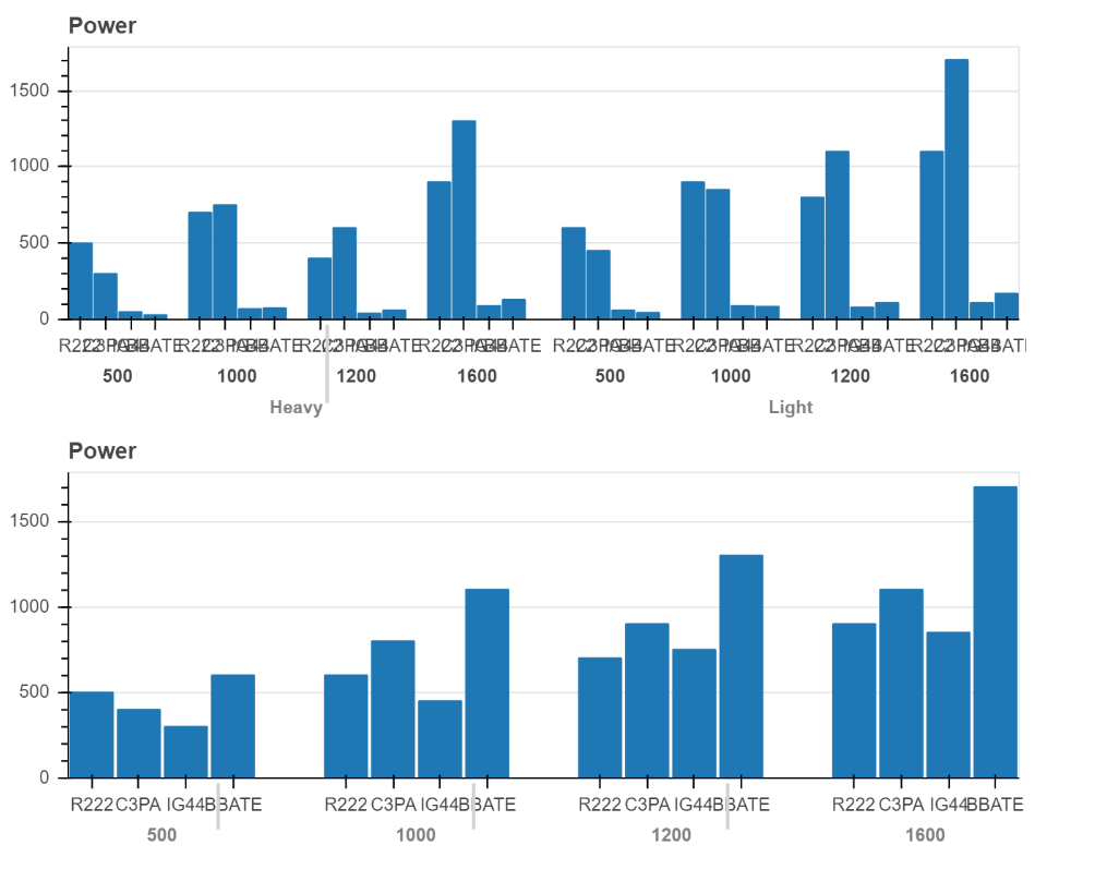
The following code does render, albeit with too much information to be legible.
df_input = load_data("sppt_measurement_archive.csv")
melted_df = pd.melt(df_input, id_vars=['SOC', 'Frequency', 'Workload'], value_vars=['Avg_Power'])

freqs = df_input['Frequency'].unique().tolist()
socs = df_input['SOC'].unique().tolist()

x = [(soc, freq) for soc in socs for freq in freqs]
y = melted_df['value'].tolist()

p = figure(x_range=FactorRange(*x), plot_height=250, title="Power",
           toolbar_location=None, tools="")
p.xgrid.grid_line_color = None
p.y_range.start = 0

p.vbar(x=x, top=y, width=0.9)
show(p)