Negative values are not showing with the circle function in extra_y_ranges
import pandas as pd
from bokeh.plotting import figure, output_file, show
# create a new plot with a datetime axis type
output_notebook()
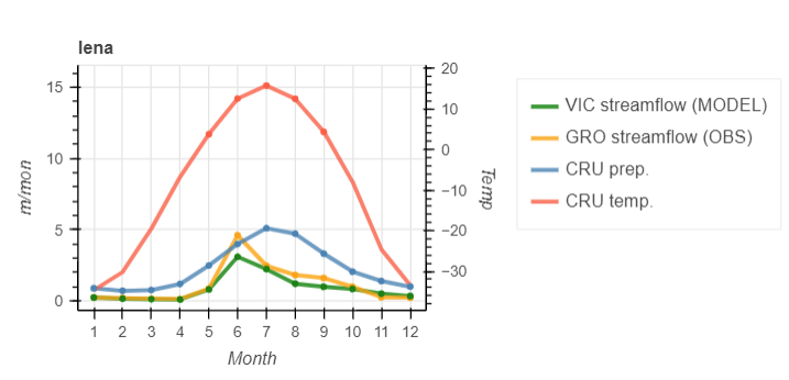
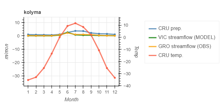
station = 'lena'
p = figure(width=600, height=250, y_axis_type="auto",x_axis_label = "Month", y_axis_label='m/mon')
# p.title.text = 'GRO Observation data vs. VIC River Routing Model data '
p.title.text = station
# p.line(cru_tmp_seasonality['mon'], cru_tmp_seasonality['yukon'], color='tomato', alpha=0.8,line_width=3,legend_label='temp.')
tmp_min = cru_tmp_seasonality[station].min()
tmp_max = cru_tmp_seasonality[station].max()
p.extra_y_ranges = {"Temp": Range1d(start=tmp_min-5, end=tmp_max+5)}
linaxis = LinearAxis(axis_label='Temp', y_range_name='Temp')
p.add_layout(linaxis, 'right')
p.line(vic_seasonality['mon'], vic_seasonality[station]*(155520000)/(2.45E+12), color='green', alpha=0.8, line_width=3,legend_label='VIC streamflow (MODEL)')
p.line(obs_seasonality['mon'], obs_seasonality[station]*(155520000)/(2.45E+12), color='orange', alpha=0.8, line_width=3,legend_label='GRO streamflow (OBS)')
p.line(cru_pre_seasonality['mon'], cru_pre_seasonality[station]/(10^4), color='steelblue', alpha=0.8, line_width=3,legend_label='CRU prep.')
p.line(cru_tmp_seasonality['mon'], cru_tmp_seasonality[station], color='tomato', alpha=0.8, line_width=3,legend_label='CRU temp.', y_range_name="Temp")
p.circle(cru_tmp_seasonality['mon'], cru_tmp_seasonality[station], color='tomato',alpha=1, y_range_name="Temp")
p.circle(cru_pre_seasonality['mon'], cru_pre_seasonality[station]/(10^4), color='steelblue',alpha=1,)
p.circle(obs_seasonality['mon'], obs_seasonality[station]*(155520000)/(2.45E+12), color='orange', alpha=1)
p.circle(vic_seasonality['mon'], vic_seasonality[station]*(155520000)/(2.45E+12), color='green', alpha=1,)
p.xaxis.ticker = obs_seasonality['mon']
p.add_layout(p.legend[0], 'right')
show(p)