Thanks for the reply Bryan.
I’ll try my best to understand what you’ve
referenced, but honestly, it’d be miles for me to reach
there, as I’m totally new to all of these.
OK, the situation is that positioning of things
with “categorical coordinates” is a little clunky
currently. Now, how about putting those values as
tooltips instead? As for the vertical dotted line, I can
surely live without it. “Getting the values out” is most
important to me.
If the answer is yes, could you show me the code to
put tooltips in the horizontal group bar charts please?
Once again, the code to generate the data is:
df = pd.DataFrame({‘A’: np.random.choice([‘foo’,
‘bar’], 100),
‘B’: np.random.choice([‘one’, ‘two’, ‘three’],
100),
‘C’: np.random.choice([‘I1’, ‘I2’, ‘I3’, ‘I4’],
100),
‘D’: np.random.randint(-10,11,100),
‘E’: np.random.randn(100)})
p
= pd.pivot_table(df, index=[‘A’,‘B’], columns=‘C’,
values=‘D’)
e
= pd.pivot_table(df, index=[‘A’,‘B’], columns=‘C’,
values=‘E’)
Thanks
On Fri, Mar 4, 2016 at 10:51 AM, Bryan Van de Ven
<>
wrote:
Bokeh can definitely re-create this plot.
Currently, positioning of things with “categorical
coordinates” is a little clunky, and we hope to make it
better soon, but it’s still quite possible. You can see
an example of positioning quads and test with categorial
coordinates here
There is also a Span annotation to add lines like
the vertical dotted one in your plot:
Thanks,
Bryan
On Mar 4, 2016, at 9:39 AM, Tong Sun <>
wrote:
Hi,
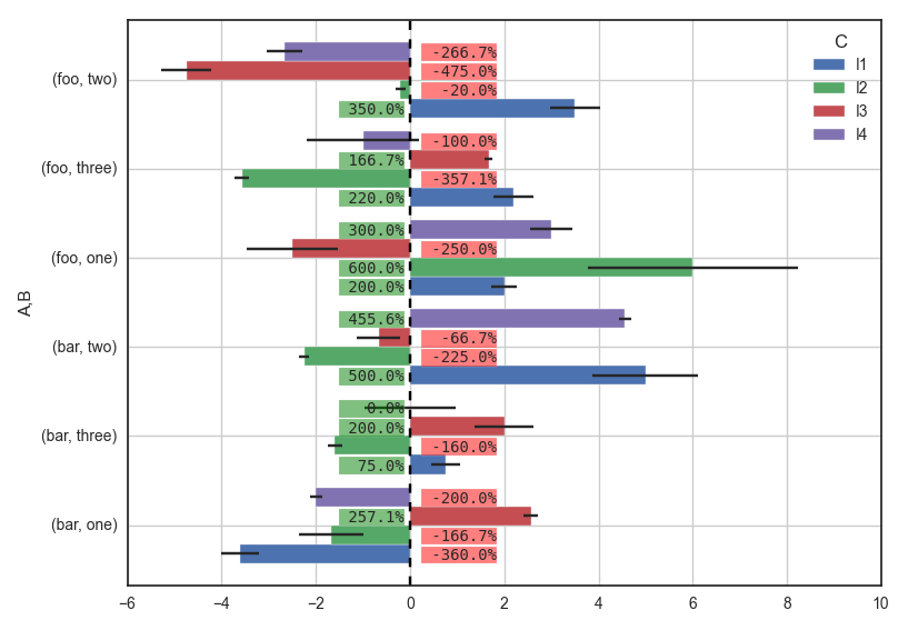
I’m new to Bokeh from matplotlib (actually I’m
totally new to matplotlib and Python as well), so I
understand that I need to do a lot of reading before I
can pick up the speed.
Meanwhile, I’m wondering if it is possible to
do this at all with Bokeh?
Full code at ,
re-posted below:
import numpy as
np
import matplotlib.pyplot as
plt
import pandas as
pd
import seaborn as
sns
sns
.set_style(“white”) #for aesthetic purpose
only
fake data
df
= pd.DataFrame({‘A’: np.random.choice([‘foo’,
‘bar’], 100),
‘B’: np.random.choice([‘one’, ‘two’, ‘three’],
100),
‘C’: np.random.choice([‘I1’, ‘I2’, ‘I3’,
‘I4’], 100),
‘D’: np.random.randint(-10,11,100),
‘E’: np.random.randn(100)})
p
= pd.pivot_table(df, index=[‘A’,‘B’],
columns=‘C’, values=‘D’)
e
= pd.pivot_table(df, index=[‘A’,‘B’],
columns=‘C’, values=‘E’)
ax
= p.plot(kind=‘barh’, xerr=e, width=0.85)
for r in ax.patches:
if r.get_x() < 0: # it it’s a negative bar
ax
.text(0.25, # set label on the opposite side
r
.get_y() + r.get_height()/5., # y
“{:” “>7.1f}%”.format(r.get_x()*100), #
text
bbox
={“facecolor”:“red”,
“alpha”:0.5,
“pad”:1},
fontsize
=10, family=“monospace”, zorder=10)
else:
ax
.text(-1.5, # set label on the opposite side
r
.get_y() + r.get_height()/5., # y
“{:” “>6.1f}%”.format(r.get_width()*100),
bbox
={“facecolor”:“green”,
“alpha”:0.5,
“pad”:1},
fontsize
=10, family=“monospace”, zorder=10)
plt
.tight_layout()
Thanks
–
You received this message because you are
subscribed to the Google Groups “Bokeh Discussion -
Public” group.
To unsubscribe from this group and stop
receiving emails from it, send an email to .
To post to this group, send email to .
To view this discussion on the web visit .
For more options, visit .
–
You received this message because you are
subscribed to a topic in the Google Groups “Bokeh
Discussion - Public” group.
To unsubscribe from this topic, visit .
To unsubscribe from this group and all its topics,
send an email to .
To post to this group, send email to .
To view this discussion on the web visit .
For more options, visit .
–
You received this message because you are
subscribed to the Google Groups “Bokeh Discussion -
Public” group.
To unsubscribe from this group and stop receiving
emails from it, send an email to .
To post to this group, send email to .