I pasted the code from First steps 1: Creating a line chart — Bokeh 2.4.2 Documentation and it worked as expected. I then changed the values to more closely resemble my data, (I have some NaNs that I still wanted to chart, SEE Missing points: “You can pass NaN values to line() and multi_line() glyphs. This produces disjointed lines with gaps for NaN values.”) but I can’t get the line to show up.
# beta1c.py

from bokeh.plotting import figure, show

nan = float('nan') <--change from example in docs

# prepare some data
x = [1, 2, 3, nan, 5] <--change from example in docs
y = [6, nan, 2, 4, 5] <--change from example in docs

# create a new plot with a title and axis labels
p = figure(title="Simple line example", x_axis_label="x", y_axis_label="y")

# add a line renderer with legend and line thickness
p.line(x, y, legend_label="Temp.", line_width=2)

# show the results
show(p)
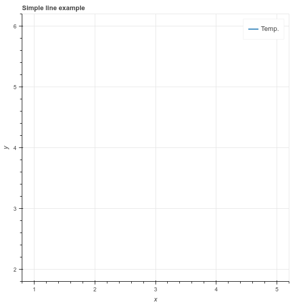
The only question I know to ask is: Why doesn’t this work? Thx.
update, like 20 minutes later:
I decided to try to jupyter notebook tutorlal. After the first exercise, which uses the same plot points as the tutorial I was using before, it suggested I play with the values. So I put in my nan…and it worked! That’s just not fair, and very discouraging.
# create a new plot with default tools, using figure
p = figure(plot_width=400, plot_height=400)
nan = float('nan')
# add a circle renderer with x and y coordinates, size, color, and alpha
p.circle([1, 2, 3, 4, 5], [6, nan, 2, 4, 5], size=15, line_color="navy", fill_color="orange", fill_alpha=0.5)

show(p) # show the results
update # 2
Because I am a masochist, I copied the code from binder and pasted into my editor (PyCharm) and it even worked there. It must be something tiny but totally necessary, but I’m too frustrated to keep looking and trying to figure it out. Your help appreciated.