I have a simple graph with a linear numerical (non-categorical) x-axis. I would like to use tick labels, which are not true x-values, but come from a different column in the data source. Can I do that with bokeh?
So I have a dataset with three columns: x:float, y:float, x_label:datetime. I plot y(x), but need to show x_label as tick labels instead of x.
In fact, x represents the number of events and x_label is the actual time point at which the event occurred. However, events do not arrive uniformly in time, but I would like the x-axis to be linear with respect to event numbers (not time).
Hi @mdimura
It seems like you should be able to do what you describe by treating your x_label column as if it were a categorical axis by using a formatted string representation of the datetime quantity.
Here’s a simple example based on my understanding from the description of the data. (If this doesn’t match your requirements, perhaps provide a representative data set even if it is contrived and a sketch of how you think the plot should look.)
In the example below, the logic to set up the x-axis deals with possibly non-unique datetime values. That’s the reason for the list(dict.fromkeys(ts)).
#!/usr/bin/env python3
# -*- coding: utf-8 -*-
"""
"""
import numpy as np
import pandas as pd

from bokeh.models import ColumnDataSource

from bokeh.plotting import figure
from bokeh.io import show

ts = [pd.to_datetime(1636805740 + 86400*i, unit='s').strftime('%Y-%m-%d') for i in (0,3,3,7,11,11,15,31)]
x = [10.0*np.random.random() for _ in range(len(ts))]
y = [_x**2 for _x in x]

data = {'x': x,
        'y': y,
        'x_label': ts}
source = ColumnDataSource(data=data)

p = figure(x_range=list(dict.fromkeys(ts)), width=800, height=300)
p.scatter(x='x_label', y='y', source=source)

show(p)
Hi, @_jm! Thank you very much for your reply!
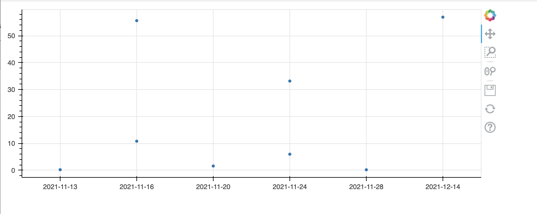
What I actually want to achieve is slightly different. I should have been more specific in the first place.
Here is my code and the plot, which I modified in paint, so the tick labels look the way I want them to look. And the zooming and corresponding tick adjustment is supposed to work too, so that the number of tick labels is approximately the same, independent of the zoom level.
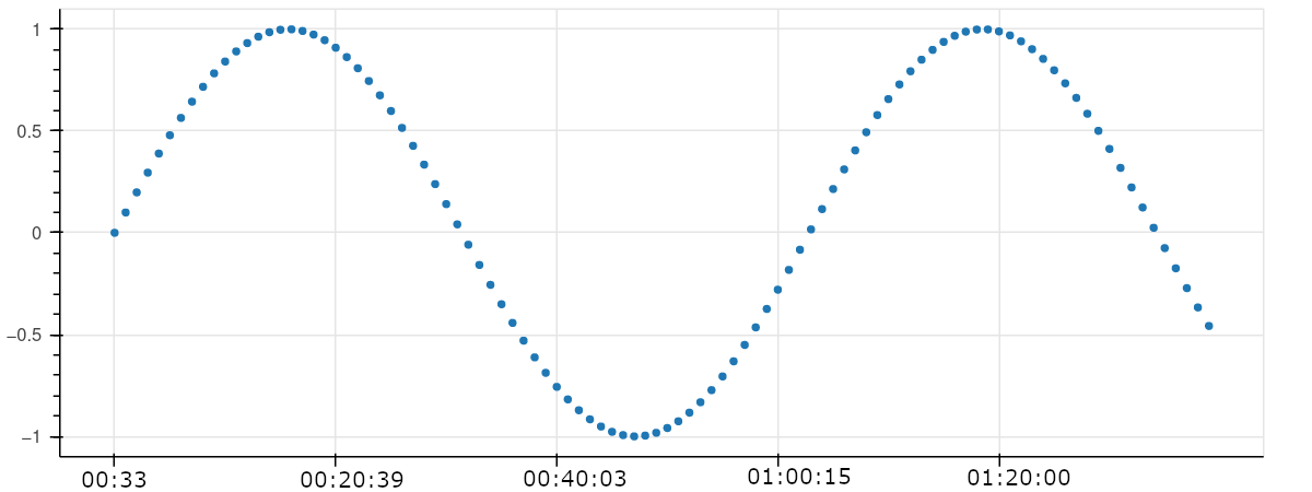
I see. Perhaps something like the following that uses major-label overrides will work.
#!/usr/bin/env python3
# -*- coding: utf-8 -*-
"""
"""

#!/usr/bin/env python3
# -*- coding: utf-8 -*-
"""
"""
import numpy as np
import pandas as pd

from bokeh.models import ColumnDataSource

from bokeh.plotting import figure
from bokeh.io import show

idx = np.arange(0, 101, 1)
x = idx/100.0
y = np.sin(2.0*np.pi*x)

ts = [pd.to_datetime(1636805740 + 60*i + 10*np.random.random(), unit='s').strftime('%H:%M:%S') for i in idx]

data = {'idx': idx,
        'x': x,
        'y': y,
        'x_label': ts}
source = ColumnDataSource(data=data)

p = figure(width=800, height=300)
p.scatter(x='idx', y='y', source=source)

# label overrides
ll = dict(zip([idx[i].item() for i in idx],ts)) # convert numpy int64 to int per dict key requirement
p.xaxis.major_label_overrides = ll

show(p)
1 Like
Thank you, it worked! Here is my final code:
import numpy as np
import pandas as pd
from bokeh.models import ColumnDataSource
from bokeh.plotting import figure
from bokeh.io import show, output_notebook

N=1E4
x = np.arange(N) #event ID
y = np.sin(x/N*np.pi)
ts = [pd.to_datetime((_x+np.random.random()), unit='s').strftime('%H:%M:%S') for _x in x]

data = {'x': x,
        'y': y,
        'x_label': ts}
source = ColumnDataSource(data=data)

p = figure()
p.scatter(x='x', y='y', source=source)
p.xaxis.major_label_overrides = dict(zip(map(int,x),ts))
show(p)
This topic was automatically closed 90 days after the last reply. New replies are no longer allowed.