I have been cleaning up my example as found in:
https://github.com/bokeh/bokeh/issues/1564
I realized there are some enhancements that could be made to make it easier to interpret.
so I added several more rect’s to get the attached visual output.
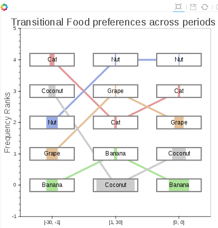
The issue is, I cannot seem to find anyway to set an offset for the colored rectangles.
I looked into:
https://github.com/bokeh/bokeh/blob/master/bokeh/_glyph_functions.py
On that page I see it is specifying line_properties and fill_properties:
"
In addition the the parameters specific to this glyph,
:ref:userguide_objects_line_properties and :ref:userguide_objects_fill_properties
are also accepted as keyword parameters.
"
The filled areas are the % of the column that is taken up by that food preference, but I think it would be quite preferable to have them left aligned within the gray box. I believe I could work that out with an offset.
Here is the full example:
import bokeh.plotting as bk
import pandas as pd
#output goes to the notebook
bk.output_notebook()
#prepare the data
df = pd.DataFrame([
[0, ‘Banana’, “[-30, -1]”, 0.25],
[1, ‘Grape’, “[-30, -1]”, 0.25],
[2, ‘Nut’, “[-30, -1]”, 0.25],
[3, ‘Coconut’, “[-30, -1]”, 0.15],
[4, ‘Cat’, “[-30, -1]”, 0.10],
[0, ‘Banana’, “[0, 0]”, 0.45],
[1, ‘Coconut’, “[0, 0]”, 0.30],
[2, ‘Grape’, “[0, 0]”, 0.20],
[3, ‘Cat’, “[0, 0]”, 0.04],
[4, ‘Nut’, “[0, 0]”, 0.01],
[0, ‘Coconut’, “[1, 30]”, 0.85],
[1, ‘Banana’, “[1, 30]”, 0.06],
[2, ‘Cat’, “[1, 30]”, 0.05],
[3, ‘Grape’, “[1, 30]”, 0.02],
[4, ‘Nut’, “[1, 30]”, 0.02],
],
columns=[‘rankof’,‘typeof’,‘periodof’, ‘perof’]
)
x_axis_labels = list(set(df.periodof))
color_list = [’#E39898’, ‘#E3C098’, ‘#ABE398’, ‘#98ABE3’, ‘#CCCCCC’ ]
#color_list = [‘red’,‘orange’,‘green’,‘blue’,‘black’]
list_of_levels = list(set(df.typeof))
shortened_text = [x[:14] for x in df.typeof]
colors = [color_list for x in
[list_of_levels.index(x) for x in df.typeof]
]
#build out segment data
segments =
for level in list_of_levels:
for i in range(len(x_axis_labels)-1):
segments.append([
(x_axis_labels[i], list(df.rankof[(df.typeof == level) & (df.periodof == x_axis_labels[i])])[0]),
(x_axis_labels[i+1], list(df.rankof[(df.typeof == level) & (df.periodof == x_axis_labels[i+1])])[0]),
color_list[list_of_levels.index(level)],
level
])
#create a new figure
p = bk.figure(
title=“Transitional Food preferences across periods”,
y_range=[-1,5],
x_range=x_axis_labels
)
#create the plot
p.segment(
[x[0][0] for x in segments],
[x[0][1] for x in segments],
[x[1][0] for x in segments],
[x[1][1] for x in segments],
color=[x[2] for x in segments],
line_alpha=1,
fill_alpha=1,
line_width=5
)
B_WIDTH = .7
B_HEIGHT = .4
#setup white rect to obscure the line in background
p.rect(df.periodof, df.rankof, B_WIDTH, B_HEIGHT, color="#FFFFFF",fill_alpha=1)
#setup color feels according to the percent
p.rect(df.periodof, df.rankof, B_WIDTH*df.perof, B_HEIGHT, color=colors,fill_alpha=1)
#setup outline to bound the effictive region.
p.rect(df.periodof, df.rankof, B_WIDTH, B_HEIGHT, color=None, fill_alpha=1, line_color="#808080", line_width=3)
#p.rect(df.periodof, df.rankof, B_WIDTH, B_HEIGHT, color=colors,fill_alpha=1, line_color="#808080")
p.text(df.periodof, df.rankof, shortened_text, 0,
text_align=“center”, text_baseline=“middle”)
nope p.line(df.periodof,df.rankof)
#customize axes
xa, ya = p.axis
xa.axis_label = ‘Day_sep ranges’
ya.axis_label = ‘Frequency Ranks’
p.xgrid.grid_line_color = None
p.ygrid.grid_line_color = None
#show the plots
bk.show(p)