I am trying to improve on my paired histogram, to make it look more like https://www.wolfram.com/mathematica/new-in-8/statistical-visualization/HTMLImages.en/created-paired-histograms-for-comparing-data/O_3.png.
Haven’t completely got there yet, and this is what I have at the moment…
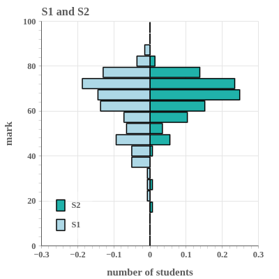
Any suggestion how to improve this? Especially with two linear axes over half the plot, or two equally sized plots with one set of numbers in the middle (and one axis from large to small). Any pointers welcome.
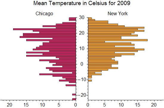
I’d try breaking up into two figures like you suggested, then turn off the left plot’s y axis visibility. Then I’d play with the min_border_left/right properties on the two figures to bring them closer together. Also, you probably want to set the y_range on both figures equal to each other.
1 Like
This topic was automatically closed 90 days after the last reply. New replies are no longer allowed.