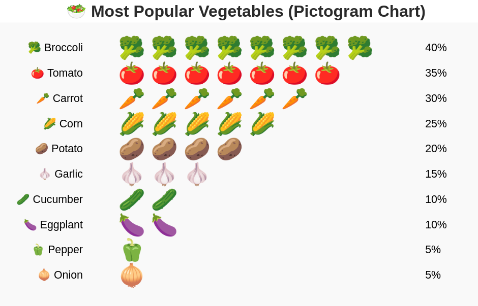
A pictogram example, either with emoji or PNG.
from bokeh.plotting import figure, output_file, show
from bokeh.models import ColumnDataSource
import math
import random

# ===== Data =====
vegetables = [
    '🥦 Broccoli', '🍅 Tomato', '🥕 Carrot', '🌽 Corn', '🥔 Potato',
    '🧄 Garlic', '🥒 Cucumber', '🍆 Eggplant', '🫑 Pepper', '🧅 Onion'
]
percentages = [40, 35, 30, 25, 20, 15, 10, 10, 5, 5]

# Turn percentages into "number of icons"
icon_counts = [math.ceil(p / 5) for p in percentages]

# Expand data
x = []
y = []
icons = []
labels = []
numbers = []

for i, count in enumerate(icon_counts):
    for j in range(count):
        x.append(j)
        y.append(-i)  # Downward layout (horizontal rows)
        icons.append(vegetables[i].split()[0])  # only emoji part
        labels.append(vegetables[i])
    numbers.append(percentages[i])

source = ColumnDataSource(data=dict(x=x, y=y, icon=icons, label=labels))

# ===== Plot =====
p = figure(
    height=650, width=1100,
    title="🥗 Most Popular Vegetables (Pictogram Chart)",
    toolbar_location=None,
    x_range=(-5, max(icon_counts)+4),
    y_range=(-len(vegetables)-1, 1),
)

p.text(
    x='x', y='y', text='icon', text_font_size="32pt",
    text_align='center', text_baseline='middle', source=source
)

# Add vegetable names at the start of each row
for i, veg in enumerate(vegetables):
    p.text(
        x=[-1.5], y=[-i],
        text=[veg],
        text_font_size="16pt",
        text_align='right',
        text_baseline='middle'
    )

# Add the random percentage number at the END of each row
for i, number in enumerate(numbers):
    p.text(
        x=[max(icon_counts)+1], y=[-i],
        text=[f"{number}%"],
        text_font_size="16pt",
        text_align='left',
        text_baseline='middle'
    )

# ===== Style tweaks for better look =====
p.axis.visible = False
p.grid.visible = False
p.outline_line_color = None
p.background_fill_color = "#f9f9f9"
p.title.text_font_size = "24pt"
p.title.align = "center"
p.title.text_color = "#2a2a2a"

# ===== Output =====
output_file("pictogram.html")
show(p)

from bokeh.plotting import figure, output_file, show
from bokeh.models import ColumnDataSource
import math

# ===== Data =====
vegetables = [
    'Broccoli', 'Tomato', 'Carrot', 'Corn', 'Potato'
]

# Good working public icons (small size)
vegetable_icons = {
    'Broccoli': 'https://cdn-icons-png.flaticon.com/512/188/188308.png',
    'Tomato': 'https://png.pngtree.com/png-vector/20221124/ourmid/pngtree-tomato-icon-png-image_6478357.png',
    'Carrot': 'https://cdn-icons-png.flaticon.com/512/7226/7226674.png',
    'Corn': 'https://www.vhv.rs/dpng/d/475-4755857_jason-b-graham-corn-icon-f2b523-free-download.png',
    'Potato': 'https://static.vecteezy.com/system/resources/thumbnails/012/227/446/small_2x/sliced-potatoes-color-png.png'
}

# Some more natural percentages
percentages = [41, 34, 29, 20, 18]
icon_counts = [math.ceil(p / 5) for p in percentages]

# Expand data
x = []
y = []
imgs = []
labels = []
numbers = []

for i, count in enumerate(icon_counts):
    for j in range(count):
        x.append(j)
        y.append(-i)
        imgs.append(vegetable_icons[vegetables[i]])
        labels.append(vegetables[i])
    numbers.append(percentages[i])

source = ColumnDataSource(data=dict(
    x=x, y=y, imgs=imgs, label=labels
))

# ===== Plot =====
p = figure(
    height=600, width=1000,
    title="🥗 Top Vegetables (Pictogram Chart)",
    toolbar_location=None,
    x_range=(-5, max(icon_counts)+7),
    y_range=(-len(vegetables)-1, 2),
    tools=""
)

# Plot the real images
p.image_url(
    url='imgs', x='x', y='y',
    w=0.8, h=0.8, anchor="center", source=source
)

# Vegetable names at left
for i, veg in enumerate(vegetables):
    p.text(
        x=[-2.5], y=[-i],
        text=[veg],
        text_font_size="18pt",
        text_color="#4a4a4a",
        text_align='right',
        text_baseline='middle'
    )

# Percentages at right
for i, number in enumerate(numbers):
    p.text(
        x=[max(icon_counts)+2], y=[-i],
        text=[f"{number}%"],
        text_font_size="16pt",
        text_color="#555555",
        text_align='left',
        text_baseline='middle'
    )

# ===== Style tweaks for better look =====
p.axis.visible = False
p.grid.visible = False
p.outline_line_color = None
p.background_fill_color = "#f9f9f9"
p.title.text_font_size = "24pt"
p.title.align = "center"
p.title.text_color = "#2a2a2a"

# ===== Output =====
output_file("vegetables_image_url.html")
show(p)