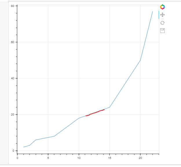
I was wondering if there was a way to color a line to follow the curve from the user specified input. Example is shown below. The user wants to color a line that starts from x = 11, to x = 14 (see image below for the result). I tried f.ex df.loc[…] where it tries to locate points closest to. But then it just colors it from x = 10 to 15. Anyone have an idea how to solve this? Do I need to add extra points between two points, how would I do that? The user might also add x = 11 to x = 19.
Appreciate any help or guidance.
from bokeh.plotting import figure, output_file, show
import pandas as pd

p = figure(width=600, height=600, tools="pan,reset,save")

data = {'x': [1, 2, 3, 6, 10, 15, 20, 22],
        'y': [2, 3, 6, 8, 18, 24, 50, 77]}

df = pd.DataFrame(data)
p.line(df.x, df.y)

show(p)
What the result should look like when user inputs x = 11 (start) and x = 14 (end):
Are you trying to do this with CustomJS or is pandas available? I kinda had to do something along these “lines” recently on the JS side but I think your problem is more complicated.
For my thing, the user would define a single x value and I had to find the y on the curve corresponding to that x. My approach was to iterate through the datasource until the next x was greater than the user x, then break the loop, and based on the index where it broke, do a linear interpolation to find y between the the current index and the next index.
That would get you started, but you also have a second user-defined x value, and you need to get all the CDS values between them as well. So you’d need to do the above to get the first coordinate pair for your new line (i.e. the left most), then retrieve all coordinate pairs from the datasource that lie between the two user defined xs, then do the same interpolation thing to find the last pair for your calculated line.
Of course, this approach only handle ascending x values (i.e. your line only moves left to right).
My thought was “programmatically”: they would have a second CDS for that drives a separate line renderer for their red line in the example screenshot → you just populate its data dynamically based on my logic above.
I asked the question on StackOverflow and got an answer to interpolate the data with pandas. It works with the small dummy data but not with real data.
I posted a follow up question with the full data:
The data I have is “undersampled” and user wants to add zones on the actual “well survey” data, so I did the loc in pandas, but not working optimally if the data does not have many data points. I will post the answer here if I get a solution on Stackoverflow.
Ok found the issue. Was due to the md column being a float with 2 decimals and the re indexing ignored the last points. Just converted it to int and now it works.
mdcol, tvdcol = 'md_m', 'tvd_m'
df = data[[mdcol, tvdcol]].copy()#.set_index(mdcol)#.reindex(index = range(int(df.index.min()), int(df.index.max())))
df[mdcol] = df[mdcol].astype('int')
df = df.set_index(mdcol)
df = df[~df.index.duplicated()]

data_intp = (df.reindex(index = range(int(df.index.min()), int(df.index.max()+ 1)))
               .reset_index() # optional, you could write 'index' in the second line plot, too.
               .interpolate()
              )