# main.py
import numpy as np
import json
from bokeh.io import curdoc
from bokeh.models import (
GeoJSONDataSource, HoverTool,
ColorBar, LinearColorMapper, BasicTicker, PrintfTickFormatter
)
from bokeh.plotting import figure
from bokeh.sampledata.us_states import data as states
from bokeh.layouts import column
from bokeh.palettes import Viridis256
# 🧩 Clean up states
states = {code: state for code, state in states.items() if state["name"] not in ["Hawaii", "Alaska"]}
# 🎲 Random value for each state
for state in states.values():
state["value"] = np.random.randint(10, 100)
# ✅ GeoJSON with MultiPolygon support + NaN fix
def states_to_geojson(states_dict):
features = []
for code, state in states_dict.items():
coords = []
current_poly = []
for lon, lat in zip(state["lons"], state["lats"]):
if np.isnan(lon) or np.isnan(lat):
if current_poly:
coords.append(current_poly)
current_poly = []
else:
current_poly.append((lon, lat))
if current_poly:
coords.append(current_poly)
features.append({
"type": "Feature",
"id": code,
"properties": {
"name": state["name"],
"value": state["value"]
},
"geometry": {
"type": "MultiPolygon",
"coordinates": [[[pt for pt in poly]] for poly in coords]
}
})
return json.dumps({
"type": "FeatureCollection",
"features": features
})
# 🧠 SVG Generator w/ Y-axis + dark theme
def bar_svg(values, years=None, width=180, height=100):
if years is None:
years = [str(2020 + i) for i in range(len(values))]
max_val = max(values)
y_ticks = np.linspace(0, max_val, 4).astype(int)
bar_width = (width - 40) // len(values) # reserve 40px for y-axis
svg_bars = ""
svg_labels = ""
svg_grid = ""
svg_y_ticks = ""
for tick in y_ticks:
y = height - 20 - int((tick / max_val) * (height - 40))
svg_grid += f'<line x1="35" y1="{y}" x2="{width}" y2="{y}" stroke="#444" stroke-dasharray="2"/>'
svg_y_ticks += f'<text x="30" y="{y + 4}" font-size="8" fill="#ccc" text-anchor="end">{tick}</text>'
for i, (val, label) in enumerate(zip(values, years)):
bar_height = int((val / max_val) * (height - 40))
x = 40 + i * bar_width
y = height - 20 - bar_height
svg_bars += f'<rect x="{x}" y="{y}" width="{bar_width - 4}" height="{bar_height}" fill="#00bfff" />'
svg_labels += f'<text x="{x + bar_width//2}" y="{height - 5}" font-size="8" fill="#ccc" text-anchor="middle">{label}</text>'
return f"""
<svg width="{width}" height="{height}" xmlns="http://www.w3.org/2000/svg">
<rect width="{width}" height="{height}" fill="black" />
{svg_grid}
{svg_y_ticks}
{svg_bars}
{svg_labels}
</svg>
""".replace('\n', '')
# 🔄 Embed SVGs into GeoJSON
geojson_obj = json.loads(states_to_geojson(states))
for feature in geojson_obj["features"]:
values = np.random.randint(10, 100, size=5)
years = [str(y) for y in range(2019, 2024)]
svg = bar_svg(values, years)
feature["properties"]["bar_svg"] = svg
# 📡 Data source
geo_source = GeoJSONDataSource(geojson=json.dumps(geojson_obj))
# 🎨 Color mapping
color_mapper = LinearColorMapper(palette=Viridis256, low=10, high=100)
# 🗺️ Choropleth map figure
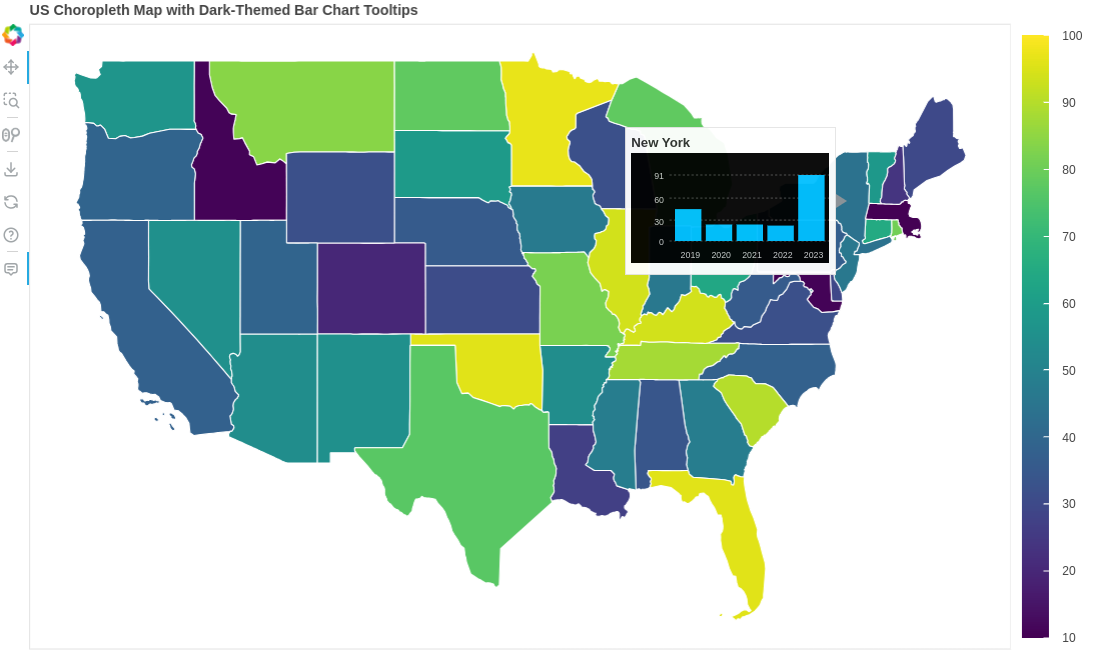
p = figure(
title="US Choropleth Map with Dark-Themed Bar Chart Tooltips",
toolbar_location="left",
x_axis_location=None,
y_axis_location=None,
width=1000,
height=600
)
p.grid.grid_line_color = None
# 🧱 Draw states
p.patches("xs", "ys", source=geo_source,
fill_color={'field': 'value', 'transform': color_mapper},
line_color="white", line_width=1)
# 🧠 Tooltip with dark SVG
hover = HoverTool(
tooltips="""
<div>
<div><strong>@name</strong></div>
<div>@bar_svg{safe}</div>
</div>
"""
)
p.add_tools(hover)
# 🎨 Add color bar (legend)
color_bar = ColorBar(color_mapper=color_mapper,
ticker=BasicTicker(desired_num_ticks=10),
formatter=PrintfTickFormatter(format="%d"),
label_standoff=12,
border_line_color=None,
location=(0, 0))
p.add_layout(color_bar, 'right')
# 🚀 Deploy
curdoc().add_root(column(p))
curdoc().title = "Choropleth + Dark SVG Bar Tooltips"
# main.py
import numpy as np
from bokeh.io import curdoc
from bokeh.models import ColumnDataSource, HoverTool
from bokeh.plotting import figure
from bokeh.layouts import column
# 📦 Parameters
NUM_POINTS = 25
TIME_SERIES_LENGTH = 40
WIDTH, HEIGHT = 150, 40
# 🎲 Generate station data
np.random.seed(1337)
x = np.random.rand(NUM_POINTS) * 100
y = np.random.rand(NUM_POINTS) * 100
station_ids = [f"Station {i}" for i in range(NUM_POINTS)]
# 🎨 Generate inline SVG with dark theme + gray tooltip
def timeseries_to_svg(ts, width=WIDTH, height=HEIGHT):
ts = np.array(ts)
ts -= ts.min()
ts /= ts.max() if ts.max() != 0 else 1
ts = height - (ts * (height - 6))
xvals = np.linspace(0, width, len(ts))
points = " ".join([f"{x:.2f},{y:.2f}" for x, y in zip(xvals, ts)])
return f"""
<svg width="{width}" height="{height}" xmlns="http://www.w3.org/2000/svg">
<rect width="100%" height="100%" fill="#333" />
<polyline points="{points}" fill="none" stroke="#00bfff" stroke-width="2"/>
</svg>
""".replace("\n", "")
station_series_map = {}
for i in range(NUM_POINTS):
station_id = f"Station {i}"
ts = np.cumsum(np.random.randn(TIME_SERIES_LENGTH))
station_series_map[station_id] = ts
svg_tooltips = [
timeseries_to_svg(station_series_map[station_id])
for station_id in station_ids
]
# 📊 Bokeh source
source = ColumnDataSource(data=dict(
x=x,
y=y,
station=station_ids,
svg=svg_tooltips
))
# 📉 Dark-themed figure
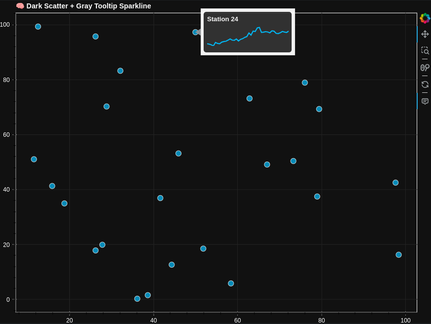
p = figure(
title="🧠 Dark Scatter + Gray Tooltip Sparkline",
width=800,
height=600,
tools="pan,wheel_zoom,box_zoom,reset,hover",
background_fill_color="#111",
border_fill_color="#111"
)
p.title.text_color = "white"
p.xaxis.major_label_text_color = "white"
p.yaxis.major_label_text_color = "white"
p.xaxis.axis_line_color = "#555"
p.yaxis.axis_line_color = "#555"
p.xaxis.major_tick_line_color = "#888"
p.yaxis.major_tick_line_color = "#888"
p.grid.grid_line_color = "#222"
# 🔵 Scatter dots
p.circle('x', 'y', size=10, source=source, color="#00bfff", alpha=0.7, line_color="white")
# 🧠 Hover tooltips
hover = p.select_one(HoverTool)
hover.tooltips = """
<div style="background-color:#333; padding:6px; border-radius:5px">
<div><strong style="color:white;">@station</strong></div>
<div>@svg{safe}</div>
</div>
"""
# 🚀 App launch
curdoc().add_root(column(p))
curdoc().title = "Dark Mode Tooltip Sparkline"
With Matplotlib:
import numpy as np
import matplotlib.pyplot as plt
import base64
from io import BytesIO
from bokeh.io import curdoc
from bokeh.models import ColumnDataSource, HoverTool
from bokeh.plotting import figure
from bokeh.layouts import column
# 📦 Parameters
NUM_POINTS = 25
TIME_SERIES_LENGTH = 40
# 🎲 Generate fake station data
np.random.seed(1337)
x = np.random.rand(NUM_POINTS) * 100
y = np.random.rand(NUM_POINTS) * 100
station_ids = [f"Station {i}" for i in range(NUM_POINTS)]
# 📈 Generate timeseries PNG from matplotlib
def generate_timeseries_png(ts):
fig, ax = plt.subplots(figsize=(2, 0.5), dpi=100)
ax.plot(ts, color='#0072B2', linewidth=2)
ax.set_axis_off()
buf = BytesIO()
plt.savefig(buf, format='png', bbox_inches='tight', pad_inches=0)
plt.close(fig)
buf.seek(0)
encoded = base64.b64encode(buf.read()).decode('utf-8')
return f"<img src='data:image/png;base64,{encoded}' width='150' height='40'/>"
# 🧠 Timeseries per station
station_series = {}
tooltips_png = []
for station in station_ids:
ts = np.cumsum(np.random.randn(TIME_SERIES_LENGTH))
station_series[station] = ts
tooltips_png.append(generate_timeseries_png(ts))
# 📊 Data source
source = ColumnDataSource(data=dict(
x=x,
y=y,
station=station_ids,
png=tooltips_png
))
# 📈 Standard white Bokeh figure
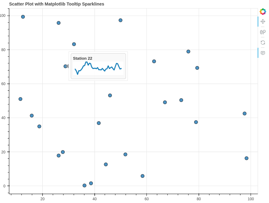
p = figure(
title="Scatter Plot with Matplotlib Tooltip Sparklines",
width=800,
height=600,
tools="pan,wheel_zoom,reset,hover"
)
p.circle('x', 'y', size=10, source=source, color="#1f77b4", line_color="black", alpha=0.8)
# 🧠 Tooltip with base64 PNG
hover = p.select_one(HoverTool)
hover.tooltips = """
<div style="background-color:#f9f9f9; padding:6px; border-radius:5px; border:1px solid #ccc;">
<div><strong>@station</strong></div>
<div>@png{safe}</div>
</div>
"""
# 🚀 Launch app
curdoc().add_root(column(p))
import numpy as np
import matplotlib.pyplot as plt
import geopandas as gpd
import base64
from io import BytesIO
import requests
import json
from bokeh.io import curdoc
from bokeh.layouts import column
from bokeh.models import GeoJSONDataSource, HoverTool
from bokeh.plotting import figure
from bokeh.palettes import Category10
# 🌐 Download from GADM mirror
url = "https://geodata.ucdavis.edu/gadm/gadm4.1/json/gadm41_AUS_1.json"
response = requests.get(url)
geojson_data = response.json() # ✅ GADM is valid JSON
# 📦 Load into GeoDataFrame
gdf = gpd.GeoDataFrame.from_features(geojson_data["features"])
regions = gdf["NAME_1"].tolist() # ✅ Column with state names
# 🧠 Simulate pie data
categories = ['A', 'B', 'C']
pie_data = {r: np.random.randint(10, 100, size=len(categories)) for r in regions}
# 🥧 Convert pie to base64
def pie_to_base64(values, labels=categories):
fig, ax = plt.subplots(figsize=(1.8, 1.8), dpi=100)
ax.pie(values, labels=labels, colors=Category10[3], textprops={'fontsize': 6})
plt.tight_layout()
buf = BytesIO()
plt.savefig(buf, format='png', bbox_inches='tight', pad_inches=0)
plt.close(fig)
return base64.b64encode(buf.getvalue()).decode()
# 🔌 Add to GeoDataFrame
gdf["region"] = regions
gdf["pie"] = [f"<img src='data:image/png;base64,{pie_to_base64(pie_data[r])}' width='120'>" for r in regions]
# 💾 Create Bokeh source
geo_source = GeoJSONDataSource(geojson=gdf.to_json())
# 🗺️ Plot
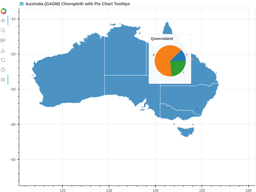
p = figure(
title="🗺️ Australia (GADM) Choropleth with Pie Chart Tooltips",
width=800,
height=600,
toolbar_location="left"
)
p.patches("xs", "ys", source=geo_source,
fill_color="#1f77b4", line_color="white", line_width=1, alpha=0.8)
# 🧠 HoverTool
hover = HoverTool(tooltips="""
<div>
<div><strong>@region</strong></div>
<div>@pie{safe}</div>
</div>
""")
p.add_tools(hover)
# 🚀 Serve it
curdoc().add_root(column(p))
curdoc().title = "Australia Choropleth with Pie Tooltips (GADM)"