Bokeh is responsive and is explained in the link below.
bokeh- The “Single object” section of the web page
But when I use it, my site scrolls horizontally!
The interesting thing is that even when we select the Inspect Browser option in the description page of the above link and test the responsiveness of that page from the Bokeh site, we see that the site is not responsive and has horizontal scrolling!!!
Do you have an explanation?
@Keyhan You have not given enough information to comment. Please provide a complete Minimal Reproducible Example.
Go to the above link and reduce your browser screen size. You will see that the browser will scroll horizontally.
This should not happen in a responsive website!
When the Bokeh website is not responsive, then we will not be able to create a responsive website with Bokeh. It is true?!?
@Keyhan The “single object” example has a dropdown to illustrate all the various modes, including “fixed” which is not responsive. The default state is “fixed” did you actually change to a different (responsive) mode? If so you need to provide the exact steps that you took, what browser you are using, etc. It is impossible for anyone to speculate or investigate a potential issue without complete information.
Yes, I tested different modes.
“plot” size changes.
But the problem is that when reducing the size of the browser, a horizontal scroll is created in the “website”. (in the above link)
I tried with chrome and edge browser.
@Keyhan I see a scrollbar if I make the window narrow enough, but I think this is to do with the Sphinx theme that generated the docs site, not with Bokeh itself. At this point, to avoid confusion and speculation, I have to again ask that you provide a Minimal Reproducible Example that demonstrates a problem in a context outside the docs.
I added the Bokeh plot to my website and had the same problem, I thought it was the Bokeh problem.
Because there is the same problem in Bokeh website!
So when you use bokeh on your website, you don’t have the above problem?
@Keyhan If you cannot provide a complete Minimal Reproducible Example that I can run myself to investigate directly, then I cannot help you further.
So when you use bokeh on your website, you don’t have the above problem?
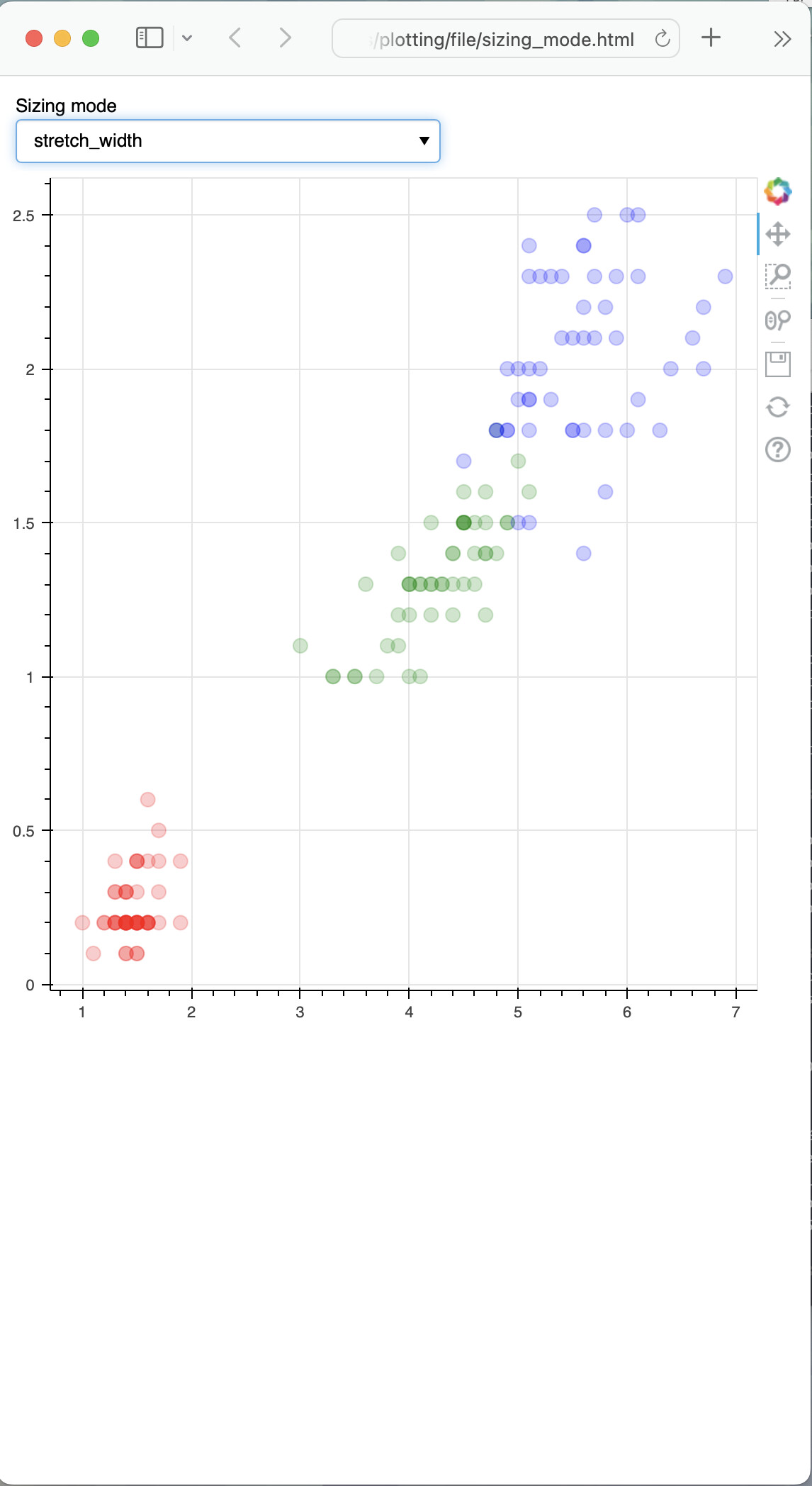
Also, no. Running the sizing_mode.py example standalone with a width-responsive mode does not result in any scrollbar when the window is made as narrow as possible:
The issue on the docs is probably a min viewport width on the Sphinx theme. Any issue on your site may be something similar. Or some other usage issue. Or maybe there is a bug that your specific usage uncovers. Or some other possibility. There is not way to say anything concrete at all without Minimal Reproducible Example to actually run directly and investigate. I am not going to engage in idle speculation absent a reproducer, because that is usually a waste of everyone’s time.
1 Like
This topic was automatically closed 90 days after the last reply. New replies are no longer allowed.