Plotting a chart with 2D-Array - Possible with large dataset?

Hi, Community of Bokeh!

I have this 2D-Array:

[[200, 200, 215], [161, 162, 172], [72, 45, 31], [116, 75, 33], [182, 182, 195], [103, 63, 26], [151, 152, 156], [211, 211, 228], [190, 191, 204], [98, 75, 49], [93, 51, 23], [135, 135, 135], [117, 107, 84], [163, 99, 35], [172, 173, 184], [172, 173, 184]]

I use a Numpy-Array and want to plot something like a histogram.
These are RGB values btw.

What I want to do is to plot the quantity of each Subarray (in this case 1) on X-Axis and the pairs printed as labels on Y-Axis. Is it possible to feed my Bokeh chart like that and colorize the bars with the corresponding colors?

Here is an example with Ruby and ChartJS and that’s how it should look like:

Additional question regarding Performance:
I have about 700.000 values so I want to have 700.000 bars. It has to be scrollable.

Is that possible?

Thank you!

Definitely not all at once. If you mean only a small fraction need to be visible in a view port at once, then there’s the possibility of dynamically updating the data based on the current viewport. [1] But you will have to explain your requirements in more detail.


  1. using Bokeh server application, most likely, though it might not be impossible in a standalone HTML output if the data is hosted behind some accessible web API ↩︎

Okay, thank you for your reply.

I have a lot of data as tuples and they all stand for colors in images (how often they appear in that image and so on.).

I want to have something like a histogram for it to export it as an Image or at least showing them in a window or HTML page.

Here is another example, where I used ChartJS and it failed. My browser died and couldn’t show me all bars. HighchartsJS failed, too.

I am confident that your browser would fall over if you sent 700k bars to a Bokeh plot as well. If you want a static image, the best bet is probably just Matplotlib, which will render Python, not the browser. If the single image is too large for a page you could break it up in to tiles for interactive use in lots of different ways.

But again, the requirements are still unclear. Backing up, presenting 700k bars to users all at once is just not efficacious from a UX / datavis POV, regardless of the tool used. There is no way that all of that can be taken in at once. What questions are you actually trying to allow users to answer?

It should be either a scrollable or a zoomable image to check the quantities of any color.
It’s a part of a bigger software which processes images and a histogram is needed to get the quantity of every color.

Mathplotlib dies too and it’s not resizable. The canvas is too small for the amount of data :frowning:
I’m checking every chartling lib out there which nearly can do that.

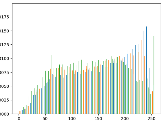
This is what I could do with Mathplotlib. I didn’t see any possibilities to make that interactive.
There aren’t even all values:

For this size maybe you should look at Datashader which can be made interactive via Holoviews+Bokeh.

This is what I don’t understand. A histogram is a summary aggregation. It should have ~70 bars, not 700k. Is this actually a histogram (i.e. is samples of a frequency distribution with the normalized “area under the curve” summing to 1)?

Yeah, absolutely right. That’s why I wrote ‘something like a histogram’. It should be a bar chart but the user will interprete it as a histogram.

This topic was automatically closed 90 days after the last reply. New replies are no longer allowed.